ToolBar
The ToolBar renders a tree view as a horizontal button bar with dropdown menus, typically placed in the NorthView of a layout. Folders become dropdown buttons; views become clickable menu items.
Overview
yaml
NorthView:
  Controller: ToolBar
  TreeView: MainMenu
The menu structure is defined in a separate tree view YAML file (e.g. MainMenu.yaml), shared with TreePanel and TilePanel.
Configuration
| Property | Type | Default | Description |
|---|---|---|---|
TreeView | String | MainMenu | Name of the tree view YAML file that defines the menu structure |
Tree view YAML
The same Type: Tree YAML used by TreePanel and TilePanel:
yaml
Type: Tree
Folder: Options
  View: Parties
Folder: Lookup tables
  View: Build AutoList
    Model: HAIR
    MainTable:
      Controller:
        PopupWindow:
          Width: 320
          Height: 160
Folder: User
  View:
    Controller: ChangePassword
  View:
    Controller: Logout
This is the result:
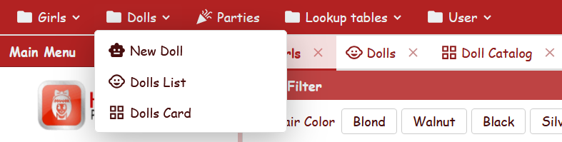
The same MainMenu is rendered as a ToolBar (red highlighted) and a TreePanel (blue highlighted).
View item properties
| Property | Type | Default | Description |
|---|---|---|---|
ImageName | String | (from view) | Override the icon displayed next to the menu item |
DisplayLabel | String | (from view) | Override the label shown in the menu item. Does not affect the tab caption (see below) |
Menu label and tab caption
The DisplayLabel node override controls only the text shown in the dropdown menu. When the view opens in a tab, the tab caption always uses the view's own DisplayLabel (defined in the view YAML file), regardless of the node override.
yaml
View: USER_ViewDocNominativi
  DisplayLabel: Riepilogo        # menu item shows "Riepilogo"
                                  # tab caption shows "Riepilogo Documenti" (from the view)
See also
- TreePanel — tree-based menu controller
- TilePanel — tile-based menu controller
- BorderPanel — layout with regions (North, Center, etc.)