Themes
Kittox ships with a built-in theme system that controls the global look-and-feel of an application (colors, fonts, icons, light/dark mode). Everything is configured from a single Theme: node in Config.yaml.
Overview
The Theme node holds a Mode sub-property (the active mode), the shared settings (font, icons, the user-selection opt-in) and two optional per-mode sub-nodes Light: / Dark: carrying mode-specific colours:
Theme:
  Mode: Auto              # Auto (default) | Light | Dark
  UserSelection: True     # let the end user switch theme (only when Mode=Auto)
  Font-Family: Segoe UI   # shared across modes
  Font-Size: 13px
  IconStyle: outlined
  IconSize: Medium
  Light:
    Primary-Color: SteelBlue
  Dark:
    Primary-Color: SkyBlue
If the Theme node is not specified at all, Kittox uses Auto with the default palette, system font and filled icons at Medium size.
| Node | Default | Description |
|---|---|---|
Mode | Auto | Theme mode: Light, Dark, or Auto (follows the OS preference via prefers-color-scheme) |
UserSelection | False | Show the ThemeSwitcher so users can pick a mode (honoured only when Mode: Auto) |
Font-Family | system UI stack | Font family used by the whole application (shared across modes) |
Font-Size | 13px | Base font size, any CSS size unit (shared across modes) |
IconStyle | filled | Material Design Icon style: filled, outlined, round, sharp, two-tone (server-side) |
IconSize | Medium | Default icon size: Small (1em), Medium (1.4em), Large (1.8em) (server-side) |
Light: / Dark: | (none) | Per-mode sub-nodes; each carries a Primary-Color. See Per-mode palettes |
Decorated config class
Theme is a fully decorated config class (TKThemeConfig), so KIDEx discovers and edits every property — Mode, UserSelection, the fonts/icons, and the Light/Dark sub-nodes — via its RTTI Config Designer, like Server or Auth.
Theme mode
The Mode sub-property selects the base palette:
| Mode | Behavior |
|---|---|
Light | Forces the light palette. Rendered as <html data-theme="light"> |
Dark | Forces the dark palette. Rendered as <html data-theme="dark"> |
Auto | No data-theme attribute is emitted; CSS @media (prefers-color-scheme: dark) decides at runtime based on the user's OS setting |
# Always light
Theme:
  Mode: Light

# Always dark
Theme:
  Mode: Dark

# Follow the OS (default)
Theme:
  Mode: Auto
TIP
Auto is the recommended default — it respects each user's OS/browser preference and switches dynamically when the user toggles dark mode without reloading the page.
Primary-Color
Setting Primary-Color generates a full chrome and accent palette from a single color. Internally, Kittox uses CSS color-mix() to derive:
- toolbar and panel header background (
--kx-chrome) - darker variant for status bar and hover states (
--kx-chrome-dark) - lighter variants for splitters and group headers (
--kx-chrome-light,--kx-chrome-mid) - accent color for focus rings, selected rows, active buttons (
--kx-accent,--kx-accent-bg,--kx-accent-ring) - chrome text color — automatically chosen between light and dark based on the perceived luminance (ITU-R BT.601) of the primary color
Both theme-name values (FireBrick, SteelBlue, Green…) and hex values (#2c3e50) are supported. Primary-Color lives in the per-mode Light: / Dark: sub-nodes (see Per-mode palettes):
# Ethea red in light, brighter red in dark
Theme:
  Mode: Auto
  Light:
    Primary-Color: FireBrick
  Dark:
    Primary-Color: "#ef4444"

# Always light, corporate blue
Theme:
  Mode: Light
  Light:
    Primary-Color: "#1e3a8a"
TIP
In Light mode the page text colors are also derived from the light Primary-Color (dark shades), giving a cohesive monochromatic look. In Dark mode only the chrome/accent overrides apply — page text stays on the default dark palette to preserve readability.
Font-Family and Font-Size
Font-Family and Font-Size are shared across modes (set directly on the Theme node) and override the CSS variables --kx-font and --kx-font-size. They affect the whole application — forms, grids, toolbars, menus.
Theme:
  Mode: Auto
  Font-Family: Comic Sans MS
  Font-Size: 12px
When omitted, Kittox uses the platform's native UI font stack: -apple-system, BlinkMacSystemFont, "Segoe UI", Roboto, "Helvetica Neue", Arial, sans-serif.
IconStyle
Kittox icons are Material Design Icons rendered via CSS mask-image. IconStyle picks one of the five Material variants — available for every icon:
| Value | Description |
|---|---|
filled (default) | Solid/filled glyphs |
outlined | Outline-only glyphs, thinner look |
round | Rounded corner variant |
sharp | Angular, geometric variant |
two-tone | Two-tone glyphs with primary and secondary shades |
Theme:
  Mode: Auto
  IconStyle: outlined
Because icons use CSS mask-image, their color follows the surrounding text color and automatically adapts to the active theme — no per-theme icon sets needed.
See Labels and Icons for the complete icon name map and per-view overrides.
IconSize
Sets the default icon size throughout the application:
| Value | Size |
|---|---|
Small | 1em |
Medium (default) | 1.4em |
Large | 1.8em |
Theme:
  Mode: Auto
  IconSize: Small
Individual icons can still override the default with the CSS classes kx-icon-sm, kx-icon-md, kx-icon-lg.
User-selectable theme
Theme: Auto is the recommended default precisely because it lets each user see the app in their preferred OS palette. Kittox can also expose a small three-button toggle (Light / Auto / Dark) to the end user, with the choice persisted in the browser. Two ingredients:
Opt-in in
Config.yaml— addUserSelection: TrueunderTheme:(withMode: Auto):yamlTheme: Mode: Auto UserSelection: True # default False Light: Primary-Color: SteelBlueThe flag is honoured only when
Mode: Auto. WithMode: LightorMode: Darkthe admin has fixed the palette and the switcher is suppressed — a server-side decision must not be silently overridden by a client-side widget.Place the switcher in any view via the
ThemeSwitchercontroller — typical spots are the login page and a topbar of the home view:yaml# LoginView.yaml — switcher below the form Controller: BorderPanel: NorthView: Controller: HtmlPanel Height: 110 Html: ... SouthView: Controller: ThemeSwitcheryaml# Home.yaml — switcher in a thin topbar Controller: BorderPanel NorthView: Height: 44 Controller: ThemeSwitcher CenterController: TabPanel ...The controller renders three small icon-buttons (☀ / ⊙ / 🌙). When
UserSelection: Trueis not in effect the controller emits nothing — the container collapses (or, for fixed-height regions, shows empty). Drop it in defensively; it stays invisible until the admin opts in.
Per-mode palettes (Light / Dark sub-nodes)
When you let the user switch themes, you usually want a different palette per mode — e.g. a red chrome in light but a brighter red (or a neutral slate) in dark. Add Light: and Dark: sub-nodes under Theme:, each with its own Primary-Color. The framework emits one CSS block per mode, so the switch applies the matching sub-node without a page reload:
Theme:
  Mode: Auto              # default mode + carries the shared/server-side settings
  UserSelection: True
  IconStyle: two-tone
  IconSize: small
  Light:
    Primary-Color: Green  # light mode → green chrome
  Dark:
    # no Primary-Color → dark mode keeps the framework's neutral slate
How each part is used:
| Node | Drives |
|---|---|
Mode | the default mode (data-theme on first load) |
Theme (shared) | UserSelection, Font-Family, Font-Size, and the server-side IconStyle / IconSize |
Light: | the light palette (:root). Falls back to a flat Primary-Color on the Theme node if omitted |
Dark: | the dark palette. With no Primary-Color, dark mode uses the framework's built-in neutral slate; give it a Primary-Color to tint the dark chrome too |
If you declare no Light:/Dark: sub-nodes but put a flat Primary-Color directly on Theme, that single colour applies to both light and dark — a convenient shorthand for a single-brand app.
Icon style/size do not switch live
IconStyle and IconSize are resolved server-side when the page is generated (the SVG icons are baked into the HTML), so they are taken from the shared Theme settings and do not change when the user flips the switcher. Only colours and fonts (CSS custom properties) update live. A different icon set per mode would need a server round-trip (reload) — out of scope for the live switch.
Encapsulated in TKThemeConfig
All theme reading and CSS generation lives in the TKThemeConfig config class (Kitto.Metadata.SubNodes). TKWebApplication and the ThemeSwitcher controller delegate to its class methods, and KIDEx discovers the same class via RTTI — one decorated source of truth for the whole theme.
Nested BorderPanel inside the login south band
The framework's .kx-border-panel selector defaults to height: 100vh (it is the top-level page layout). When you need to stack the ThemeSwitcher and another controller (e.g. an HtmlPanel with a support link) inside the login dialog's SouthView, wrapping them in a nested BorderPanel will make that inner panel claim the full viewport and explode the login dialog into a full-screen column. The framework only neutralises this height when the nested BorderPanel lives inside another BorderPanel's region (.kx-region-west|east|body); .kx-login-south is not in that whitelist.
Two clean ways out:
Skip the nested BorderPanel: put the
ThemeSwitcheralone inSouthViewand move the other content intoNorthView(next to the logo) or accept that the switcher only appears post-login.Scoped CSS override in your app's
Home/Resources/js/application.css, plus restructure the inner panel as North + South (no Center) so its grid sums to the natural row heights:css.kx-login-south > .kx-border-panel { height: auto; }yamlSouthView: Controller: BorderPanel NorthView: Height: 44 Controller: ThemeSwitcher SouthView: Controller: HtmlPanel Height: 60 Html: ...With
height: auto, the central1frgrid row collapses to 0 and the panel sums to44 + 60 = 104px.
Theme-aware inline HTML
Hardcoding style="color: white" (or any fixed hex) on HTML emitted from an HtmlPanel will break with Theme: Auto: white text on a white surface in light mode becomes invisible. Use the CSS variables exposed by the theme:
<center style="color: var(--kx-text); font-size: medium">
  Need help? <a href="..." style="color: orange">Open the guide</a>
</center>
var(--kx-text) switches automatically between dark (#333-equivalent) and light (#e5e7eb) following data-theme. The same applies to row-class CSS like .important-row / .semi-important-row in application.css — see CSS Theming for the color-mix(in srgb, var(--kx-surface), …) pattern that produces row tints readable in both themes.
South region background and theme button colour on chrome
.kx-region-south carries background: var(--kx-chrome) — the same chrome tint used by .kx-menubar at the top, so the bottom band sits symmetric with the toolbar above. Views that place a StatusBar in SouthView are unaffected: .kx-status-bar has its own --kx-status-bg (= --kx-chrome-dark) which paints over the parent. Views that put a bare ThemeSwitcher (or any other content without its own background) in SouthView inherit the chrome look automatically.
Because the chrome bar is a dark surface, the framework also overrides the ThemeSwitcher icon colour when it is rendered inside .kx-region-south:
.kx-region-south .kx-theme-btn {
  color: var(--kx-chrome-text);
}
.kx-region-south .kx-theme-btn:hover {
  background: var(--kx-chrome-btn-hover);
  color: var(--kx-chrome-text);
}
Without this override the default color: var(--kx-text-secondary) (≈ #555) on --kx-chrome (≈ #34495e) drops to 1.4 : 1 contrast — unreadable. The same switcher dropped into .kx-region-north (page-bg) or .kx-login-south (dialog surface) keeps the default neutral icon colour, so legibility holds in every context.
How it works under the hood
| Where | What happens |
|---|---|
Server (<head>) | When Theme: Auto + UserSelection: True, Kittox emits a tiny inline script in <head> that runs synchronously before CSS paints, reads localStorage['kx_theme:<AppName>'] and sets <html data-theme="..."> accordingly. This anti-FOUC step is what guarantees no theme flash on first paint or reload. |
Client (kxtheme.js) | Public API: kxTheme.set(appName, mode) writes localStorage and updates data-theme. kxTheme.get(appName) returns the saved value (or 'auto'). A kx-theme-changed event is dispatched on window so any other widget can react. |
| Persistence | Key is kx_theme:<AppName> — per-app scope. Two Kittox applications running in the same browser keep independent preferences. Value is 'light', 'dark', or removed ('auto' = follow OS). |
| Switch from "Auto" | When the user picks Auto, the JS removes data-theme from <html>; the CSS @media (prefers-color-scheme: dark) rule takes over again. |
Persistence scope
Persistence is per browser + per app (localStorage), not per server-side session — the choice survives logout, login as a different user, JWT expiry, and re-issue cookies. It is browser-private: clearing browser data resets it. To enforce a fixed palette regardless of user choice, set Theme: Light (or Dark) explicitly — the switcher disappears even if dropped in a view.
Live transitions
Switching theme is instant — no page reload. The CSS rules cascade on [data-theme] and the existing CSS custom-properties palette swaps over without any JavaScript orchestration beyond the attribute change. HTMX swaps that arrive after a theme change keep the chosen theme because data-theme lives on <html>, outside any HTMX target.
Charts and live theme refresh
Chart.js renders text on a <canvas> and reads Chart.defaults.color (a JS value) at the moment each chart instance is created — it does not re-read from CSS on every paint. Kittox integrates so that charts:
Match the active theme at creation time: before instantiating a chart,
kxChart.initprobesvar(--kx-tree-leaf-text)via a temporary DOM element and readsgetComputedStyle(probe).color. The probe forces the browser to resolve any functional CSS color notation (color-mix(),oklch(), …) into a plainrgb()string, which is the only form Chart.js's internal color parser understands.React to the user's switch live:
kxtheme.jsdispatches akx-theme-changedevent onwindowwhenever the user clicks the ThemeSwitcher.kxChartlistens for it, re-resolves the text color in arequestAnimationFrame(giving the browser one frame to apply the newdata-themeattribute), then writes the colour explicitly into every active chart instance —chart.options.color,plugins.legend.labels.color,plugins.title.color,scales.*.ticks.color,scales.*.title.color— and callschart.update('none'). Without this, only freshly created charts pick up the new theme; existing ones would stay frozen on the colour cached at theirnew Chart()time.
Cascade specificity in dark mode
The server emits a <style> block in <head> that derives the chrome palette from Primary-Color via color-mix(). The light palette (from the Light / default section) lands on :root; the dark palette (from the Dark section) on html[data-theme="dark"] (and the prefers-color-scheme: dark media query for Auto):
Dark:sub-node with aPrimary-Color→ the server emits ahtml[data-theme="dark"]block (specificity 0,1,1) that overrides the:rootlight values (0,1,0), including explicit neutral resets for--kx-text*so the light-mode primary-derived text never leaks into dark.Dark:sub-node without aPrimary-Color(or noDark:sub-node) → the server emits nothing for dark, andkittox.css's ownhtml[data-theme="dark"]block (0,1,1) supplies the built-in neutral slate palette, again winning over the server:root(0,1,0) by specificity.
Either way the dark mode is correct regardless of source order or a stale-cached kittox.css. --kx-accent-bg is split per scope too: light uses color-mix(Primary, white 85%) (pastel on a light surface), dark uses color-mix(Primary, transparent 88%) (translucent over a dark surface).
This per-mode split is why
Light: Primary-Color: Green+ aDark:with no colour gives green chrome in light and neutral slate in dark — exactly what you'd expect when toggling the switcher. A flatPrimary-ColoronThemeinstead reuses its colour in both modes.
Real-world examples
All four sample applications shipped with Kittox now use Theme: / Mode: Auto / UserSelection: True — the OS preference drives the initial palette and the end user can override it via the ThemeSwitcher. Each app keeps its own brand colour (where one is defined), font and icon style.
HelloKitto — per-mode red/gold + custom font
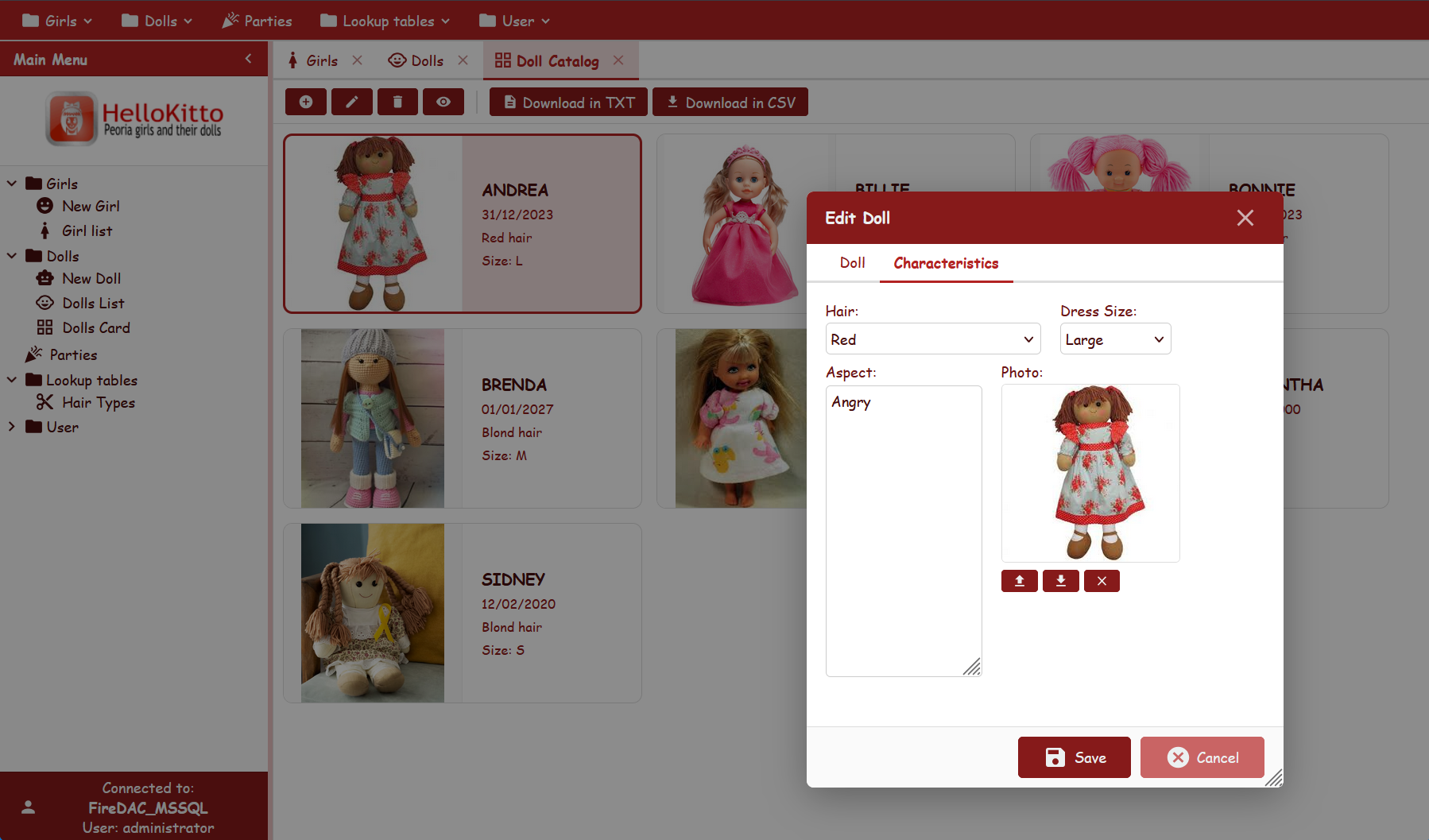
From Examples/HelloKitto/Home/Metadata/Config.yaml:
Theme:
  Mode: Auto
  UserSelection: True
  Font-Family: Comic Sans MS
  Font-Size: 12px
  IconStyle: filled
  Light:
    Primary-Color: FireBrick
  Dark:
    Primary-Color: Gold
A playful, strongly-branded UI: FireBrick chrome in light, Gold chrome in dark, with a casual font shared across modes — toggle the switcher and the brand colour changes per mode.
KEmployee — minimalist outlined
From Examples/KEmployee/Home/Metadata/Config.yaml:
Theme:
  Mode: Auto
  UserSelection: True
  IconStyle: outlined
No Primary-Color — clean corporate look on the framework's neutral palette, adapting to the user's OS preference.
TasKitto — green light, slate dark
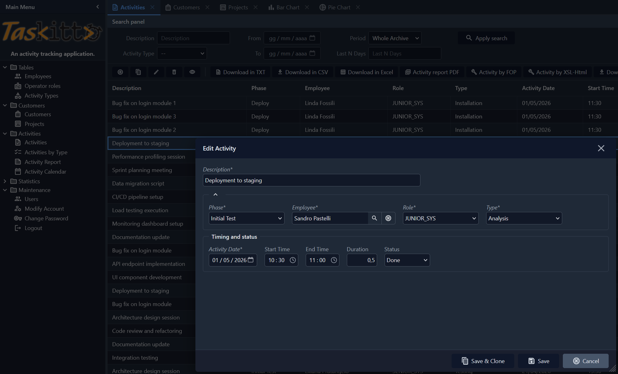
From Examples/TasKitto/Home/Metadata/Config.yaml:
Theme:
  Mode: Auto
  UserSelection: True
  Font-Size: 12px
  IconStyle: two-tone
  IconSize: small
  Light:
    Primary-Color: Green
  Dark:                    # no Primary-Color → neutral slate in dark
Light mode shows a green chrome; dark mode falls back to the framework's neutral slate; Auto follows the OS. Two-tone icons (shared) provide gentle colour cues. Switching is instant.
Northwind — neutral default
From Examples/Northwind/Home/Metadata/Config.yaml:
Theme:
  Mode: Auto
  UserSelection: True
  IconStyle: outlined
  IconSize: Medium
No Primary-Color — uses the framework's neutral chrome (#34495e blue-gray) in light, the neutral dark chrome in dark.
CSS custom properties
Every theme value is applied through a CSS variable on :root (light / auto) or [data-theme="dark"] (dark). The most relevant ones:
| Variable | Role |
|---|---|
--kx-font, --kx-font-size | Base font family and size |
--kx-bg | Page background |
--kx-surface, --kx-surface-alt | Panel and card surfaces |
--kx-text, --kx-text-secondary, --kx-text-muted | Primary text tones |
--kx-chrome, --kx-chrome-dark, --kx-chrome-hover, --kx-chrome-mid, --kx-chrome-light | Toolbar / header palette |
--kx-chrome-text, --kx-chrome-btn-hover | Text and button hover on chrome |
--kx-accent, --kx-accent-bg, --kx-accent-ring | Focus rings, selected rows, active buttons |
--kx-status-bg, --kx-status-text, --kx-status-border | Status bar |
--kx-input-bg, --kx-input-border | Form input fields |
--kx-border, --kx-border-light | Separators and rules |
--kx-error, --kx-error-surface, --kx-error-border | Validation / danger colors |
--kx-overlay, --kx-shadow | Modal overlay and drop shadows |
The complete list lives in Home/Resources/css/kittox.css. To override individual variables (without re-declaring the whole theme), see CSS Theming — it covers application.css, the custom-stylesheet file that is picked up automatically by every Kittox application.
See also
- Config File — full reference of the
Config.yamltop-level nodes - CSS Theming — customizing individual CSS rules in
application.css - Labels and Icons — Material Design icon name map and per-view overrides
- KIDE Config Editor — edit
Config.yamlvisually in KIDEx