Login Controller
By default, if you use standard authentication you will get a standard login window when navigating to the application. You can customize the login window by setting some controller properties or replacing it with a different controller altogether.
By default, a view named Login is used if present. As an example of a stand-alone login view, here is the entire content of a file named Login.yaml:
Controller: Login
  BorderPanel:
    NorthView:
      Controller: HtmlPanel
        Height: 180
        Html: |
          <div style="text-align: center">
            <p/>
            <p><img src="%IMAGE(main_logo)%"></img></p>
            <p><b>Application Name</b></p>
            <p style="margin-left: 10px">A link <a href="mailto:one@domain.com">one@domain.com</a><br>
              Another link <a href="mailto:two@domain.com">two@domain.com</a><br><br>
            </p>
            <p/>
          </div>
    SouthView:
      Controller: HtmlPanel
        Height: 60
        Html: |
          <div style="text-align: center; font-size: 11px;">
            <p>Technical support: <a href="mailto:support@domain.com">support@domain.com</a></p>
          </div>
  ExtraWidth: 300
  ExtraHeight: 180
As you can see in the example above, the Login controller hosts a BorderPanel which allows you to integrate other controllers in it, such as an HtmlPanel.
Here is an example of a login view defined inline in Config.yaml (from the HelloKitto example):
Login:
  Controller:
    Title: Login to "HelloKitto" %APP_VERSION%
    BorderPanel:
      NorthView:
        Controller: HtmlPanel
          Height: 80
          Html: |
            <div style="text-align: center">
              <p/>
              <p><img src="%IMAGE(hello_kitto_150)%"></img></p>
              <p/>
            </div>
    LabelWidth: 150
    ExtraWidth: 350
    ExtraHeight: 100
    LocalStorage:
      Mode: Password
      AskUser: True
        .Default: False
      AutoLogin: False
Title Bar
The login dialog always shows a title bar at the top. By default the application title (from Config.yaml → AppTitle) is used. You can override it with the Title property:
Controller: Login
  Title: Welcome to My Application
The title bar uses the same dark chrome style as dialog headers (--kx-chrome-dark background).
BorderPanel
The BorderPanel node lets you embed custom content around the login form on four regions — above (NorthView), below (SouthView), to the left (WestView) and to the right (EastView). Each region hosts a single child controller (an HtmlPanel for a logo, a ThemeSwitcher, etc.). All four are optional and can be combined freely; undeclared regions collapse.
The form is the centre. NorthView/SouthView stack above/below the fields within the centre column; WestView/EastView flank that whole centre column as full-height side panels. The title bar and the Login footer (status/error + button) span the full dialog width:
┌──────────────────────────────────────┐
│              title bar                │  full width
├────────┬────────────────────┬────────┤
│        │     NorthView      │        │
│ West   │     fields         │ East   │
│ View   │     links          │ View   │
│        │     SouthView      │        │
├────────┴────────────────────┴────────┤
│  status / error .......... [ Login ] │  full-width footer
└──────────────────────────────────────┘
So a logo in WestView sits beside the form, while the Login button stays in a full-width bar at the very bottom with the error message to its left.
NorthView
Rendered above the fields (inside the centre column), typically a logo or branding banner:
BorderPanel:
  NorthView:
    Controller: HtmlPanel
      Height: 100
      Html: <center><img src="%IMAGE(logo)%"></center>
SouthView
Rendered below the fields at the bottom of the centre column — just above the full-width footer (Login button). Typically support info, disclaimers, or a theme switcher. The South region right-aligns its content:
BorderPanel:
  SouthView:
    Controller: HtmlPanel
      Height: 60
      Html: |
        <div style="text-align: center; font-size: 11px;">
          Technical support: +39 0123 456789
        </div>
WestView / EastView
Rendered to the left and right of the form as full-height side columns — ideal for a vertical logo or branding next to the credentials, instead of stacked on top:
BorderPanel:
  WestView:
    Controller: HtmlPanel
      Html: <center><img src="%IMAGE(logo)%"></center>
The side regions size to their content and are separated from the form by a hairline. On narrow screens (≤480px) West/East stack vertically (West above, East below the form) so the layout never squeezes the credentials.
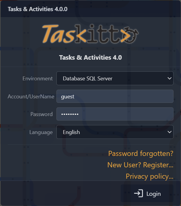
Logo on the side
A common layout is the logo in WestView and the theme switcher in SouthView — see the TasKitto login. Move the logo to NorthView for the classic logo-on-top look.
All four regions are optional and can be used in any combination.
Dialog Sizing
Use ExtraWidth and ExtraHeight to adjust the dialog dimensions:
Controller: Login
  ExtraWidth: 300
  ExtraHeight: 180
These values are added to the base dialog size. You can also set a freeform CSS Style property.
Form Customization
The FormPanel sub-node controls the form fields:
| Property | Default | Description |
|---|---|---|
FormPanel/UserName | User Name | Label for the user name field |
FormPanel/Password | Password | Label for the password field |
FormPanel/Language | Language | Label for the language selector |
FormPanel/LabelWidth | 100 | Width in pixels for field labels |
FormPanel/InputStyle | (empty) | Extra CSS for input fields |
FormPanel/ButtonStyle | (empty) | Extra CSS for the login button |
FormPanel/BodyStyle | (empty) | Extra CSS for the form body |
FormPanel/RememberCredentials | Remember Credentials | Checkbox label when LocalStorage/Mode is Password |
FormPanel/RememberUserName | Remember User Name | Checkbox label when LocalStorage/Mode is UserName |
LocalStorage
The LocalStorage sub-node controls persistent credential storage in the browser's localStorage:
Controller: Login
  LocalStorage:
    Mode: Password
    AskUser: True
      .Default: False
AutoLogin: False| Property | Values | Description |
|---|---|---|
Mode | UserName, Password, (empty) | What to store. Password stores both user name and password. UserName stores only the user name. Empty or missing disables storage. |
AskUser | True / False | If True, shows a checkbox letting the user opt in/out of storage. |
AskUser/Default | True / False | Default checked state of the checkbox (default: True). |
AutoLogin | True / False | If True and both fields are pre-filled from localStorage, the form is automatically submitted after a short delay. |
WARNING
The LocalStorageMode shorthand (e.g. LocalStorageMode: Password) is still accepted for backwards compatibility but the LocalStorage sub-node form is preferred as it allows full control.
Links
You can enable clickable links below the credential fields by adding boolean nodes:
Controller: Login
  ResetPassword: True
  RegisterNewUser: True
  PrivacyPolicy: True
Each link triggers a view request (kx/view/ResetPassword, etc.) so the corresponding views must be defined. You can customize the link style with HrefStyle:
ResetPassword: True
  HrefStyle: color: blue; font-size: 11px;
Default labels (translatable):
- ResetPassword →
Password forgotten? - RegisterNewUser →
New User? Register... - PrivacyPolicy →
Privacy policy...
Pre-login views must declare ACName: empty
The link targets are routes the user reaches before authenticating, so they must be declared public — otherwise the authentication gate returns 404 + empty body. Add an empty ACName: at the top of each linked view's YAML:
# Views/RegisterNewUser.yaml
ACName:                   # explicit empty value → public view
Controller: ...
TKMetadata.GetACURI returns '' for views with empty ACName:, which TKAccessController.GetAccessGrantValue treats as "always granted" — the auth gate detects this and lets every related route through (the GET that renders the view, the POST that submits the form, any Blob/Upload/Tool used inside it). Same convention applies to any custom landing view that must be reachable pre-login.
HtmlPanel pre-login also needs IsModal: True
Form and TKXFormController descendants are modal by default; everything else (including HtmlPanel) is embedded in a tab. Pre-login views linked from the Login form have no tab system to attach to, so an HtmlPanel-based PrivacyPolicy (or any informational page reached pre-login) must declare IsModal: True explicitly to render as a dialog overlay instead of being appended to the page background.
# Views/PrivacyPolicy.yaml
ACName:
Controller: HtmlPanel
  IsModal: True
  AllowClose: True
  FileName: Privacy.htm
  Width: 600
  Height: 500
The dialog overlay does not add inner padding to the embedded HTML body — if the source .htm is a bare fragment, wrap it in a styled root element (e.g. <div style="padding: 1.25rem 1.75rem; line-height: 1.6;">…</div>) so the text gets sensible margins.
Language Selector
If LanguagePerSession: True is set in Config.yaml, the login form displays a language drop-down that lets the user choose the UI language before logging in. The selected language is stored in the session and used for all subsequent localized strings.
# Config.yaml
LanguagePerSession: True
Environment / database choice
When the application supports multiple databases (typical of business management software with separate "company" or "fiscal year" environments), you can let the user pick which one to log into via a drop-down placed before the user name field.
The model is self-contained: each database is a complete environment (auth + data). The authentication query runs against the chosen database, so the KITTO_USERS table can be different in each environment. The selected database becomes the active one for the entire session, overriding DefaultDatabaseName. With legacy authenticators (Auth: DB | TextFile | custom) the choice is persisted in a kx_db cookie (30 days) so the same environment is pre-selected on the next visit. With Auth: JWT the choice travels in the db claim of the signed token, so no separate kx_db cookie is set; the JWT cookie path is scoped to the AppPath, eliminating cross-app environment leakage. Trade-off under JWT: once the token expires the next login form pre-selects DefaultDatabaseName instead of the last picked environment (the JWT typically lives 1 hour and slides on every active request, so this only matters after extended idle time).
The feature is opt-in: with no Auth/DatabaseChoices node in Config.yaml, the combo is not rendered and the legacy behavior is preserved.
Configuration
Add DatabaseChoices under the Auth node. The value is a comma-separated list of database names defined under Databases:
# Config.yaml
Databases:
  FireDAC_MSSQL: FD
    DisplayLabel: Database SQL Server          # Optional: shown in the combo.
    Connection:
      DriverID: MSSQL
      ...
  FireDAC_PostgreSQL: FD
    DisplayLabel: Database PostgreSQL
    Connection:
      DriverID: PG
      ...
  FireDAC_Firebird: FD
    DisplayLabel: Database Firebird
    Connection:
      DriverID: FB
      ...

Auth: TasKitto
  DatabaseChoices: FireDAC_MSSQL, FireDAC_PostgreSQL, FireDAC_Firebird
  ...
Each database entry can carry a DisplayLabel sub-node for a friendlier label in the combo; if absent, the raw config name is shown.
Combo label
The combo uses the standard FormPanel label vocabulary. You can override the label text with:
Controller: Login
  FormPanel:
    Database: Environment   # Default: 'Environment'
Default selection priority
The pre-selected option is determined in this order:
- Cookie
kx_db(legacy auth, set on the previous successful login, 30-day lifetime) — replaced by thedbclaim of the JWT cookie when the app runs onAuth: JWT. - The currently active
Session.DatabaseName(rare — first visit of the page). DefaultDatabaseNamefromConfig.yaml.
Showing the active environment elsewhere
Two macros are exposed after a successful login:
%Auth:Environment%— the user-friendly label (Databases/<Name>/DisplayLabel), falling back to the raw config name. Use this in the StatusBar or dialog titles so the displayed text matches what the user picked in the combo.%Auth:DatabaseName%— the raw config name (e.g.FireDAC_PostgreSQL). Useful when you need the exact identifier for diagnostic logs or routing decisions.
Example StatusBar:
# Views/Home.yaml
SouthView:
  Controller: StatusBar
    Text: Environment: %Auth:Environment% - user: %Auth:USER_NAME%
Routing under the hood
TKConfig.GetDatabaseName (the single source of truth used by TKConfig.Database, CreateDBConnection, and every other connection-resolution path in the framework) gives priority to TKWebSession.Current.DatabaseName when set, falling back to DatabaseRouter and then DefaultDatabaseName. So a single per-session value redirects every database operation — including the auth query itself, since the session value is applied before Authenticate runs.
Authentication
The Login controller works with Kittox's pluggable authentication system. The authenticator type is configured in Config.yaml:
Auth: DB
  IsClearPassword: False
  IsPassepartoutEnabled: True
  PassepartoutPassword: password
  .Defaults:
    UserName: administrator
    Password: password
Available authenticator types:
| Type | Description |
|---|---|
DB | Database-backed authentication using KITTO_USERS table with MD5 password hashing |
DBCrypt | Like DB but uses BCrypt for password hashing (recommended). Auto-migrates from MD5 on first login |
TextFile | File-based user list |
OSDB | Operating system user authentication |
| (empty) | No authentication required |
See Authentication for full configuration details.
Footer
The login footer is a full-width bar at the bottom of the dialog, below the North/West/Center/East body row — so it spans the entire width even when a logo occupies a WestView/EastView side column. It holds the login status / error message on the left (which expands to fill the available space) and the Login button on the right. It has a styled background matching the form toolbar, with a top border separator. This is automatic and requires no configuration.
A SouthView controller (e.g. a theme switcher) renders inside the centre column, just above this full-width footer.
The Login controller renders as a centered dialog window. The login form uses HTMX to submit credentials and receive the server response (success redirect or error message) without a full page reload.