
CalendarPanel
Kittox Enterprise feature
The CalendarPanel is part of the Kittoˣ Enterprise edition. See the Feature Matrix for the full comparison with the Open-Source edition.
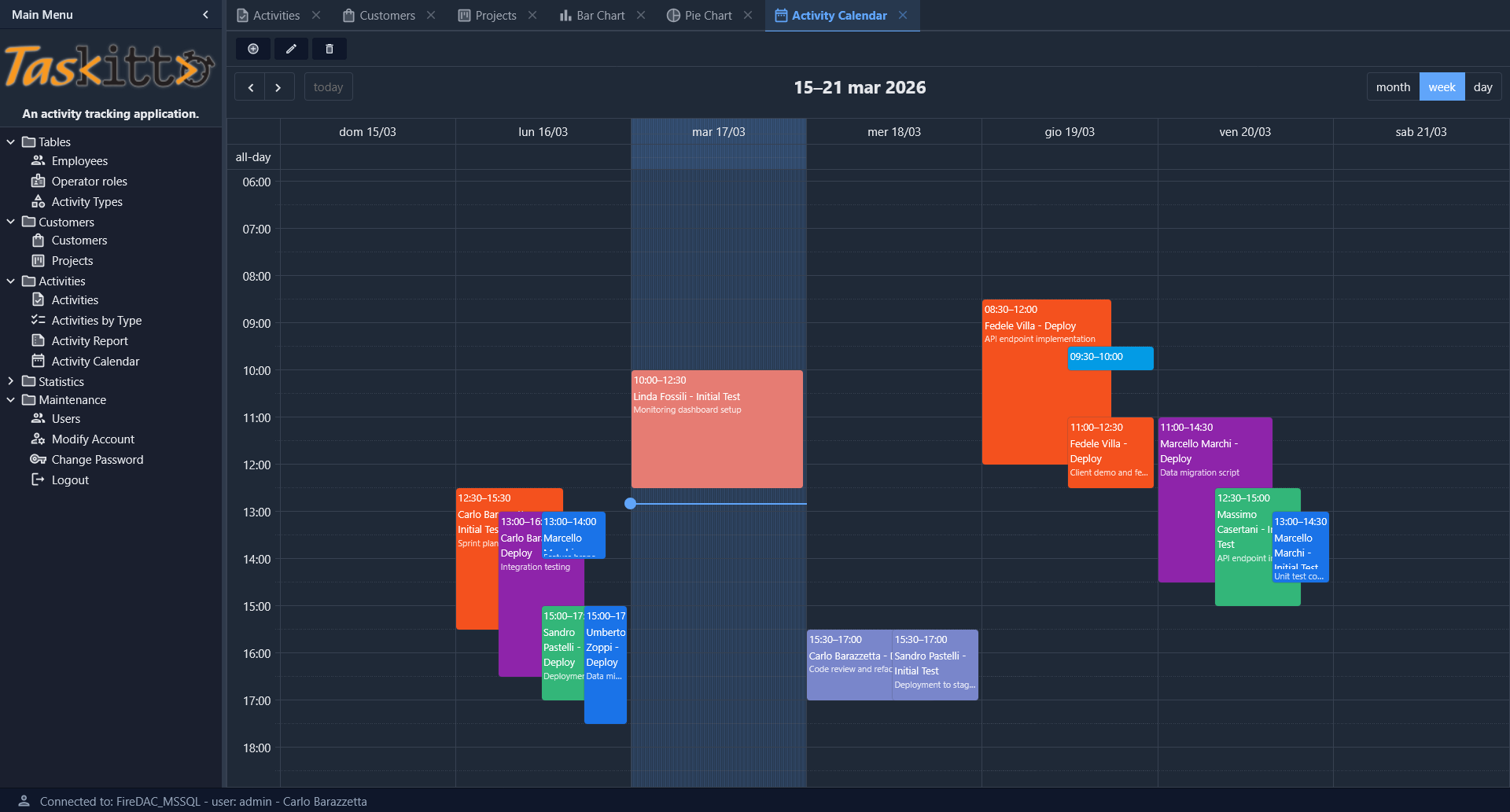
The CalendarPanel is a data panel controller that renders an interactive calendar using EventCalendar. It displays a ViewTable's records as events on a calendar with month, week, and day views.
The CalendarPanel is typically used as a CenterController inside a List controller, following the same pattern as ChartPanel. The calendar auto-fetches events from the server based on the visible date range.
Basic usage
Controller: List
  CenterController: CalendarPanel
    EventTemplate: CalendarActivity.html
MainTable:
  Model: ACTIVITY_CALENDAR
    CalendarId: EventId
    CalendarStartDate: StartDate
    CalendarEndDate: EndDate
    CalendarEventType: EventType
    CalendarEventNotes: Notes
  EditController:
    Width: 800
    Height: 600
The MainTable/Model node contains the field mappings that tell the calendar which model fields to use for the event ID, start/end dates, title, type (for color-coding), and notes.
Field mapping
Field mappings are defined under the MainTable/Model node. All mappings are optional — sensible defaults are used when a mapping is not specified:
| Property | Default | Description |
|---|---|---|
CalendarId | First key field of the model | Field containing the unique event identifier |
CalendarStartDate | StartDate | Field containing the event start date/time |
CalendarEndDate | EndDate | Field containing the event end date/time. If omitted, or when it maps to the same field as CalendarStartDate, events are treated as point-in-time and drawn with the DefaultEventMinutes duration |
CalendarTitle | Title | Field displayed as the event title in the calendar |
CalendarEventType | EventType | Field used for automatic color grouping (optional) |
CalendarEventNotes | EventNotes | Field displayed as a secondary line below the title in the week and day views (optional, auto-detected) |
If CalendarEventNotes is not explicitly mapped, the controller looks for a field named EventNotes in the model. If no such field exists, notes are simply not shown.
Calendar options
Calendar display options are set in the CenterController node:
| Property | Default | Description |
|---|---|---|
DefaultView | timeGridWeek | Initial calendar view: dayGridMonth, timeGridWeek, or timeGridDay |
SlotMinTime | 00:00 | Earliest time displayed in week/day views (e.g., 08:00 to hide night hours) |
SlotMaxTime | 24:00 | Latest time displayed in week/day views (e.g., 20:00) |
DefaultEventMinutes | 60 | Duration, in minutes, given to events that have no end date or whose end is not after the start (for example a record with a single date/time). Without it such events would be drawn as a zero-height strip in the week and day views |
EventTemplate | HTML template file (from Home/Resources/) used to render event content inside calendar cells. The template can use field placeholders to display custom event details |
Example with custom options:
Controller: List
  CenterController: CalendarPanel
    DefaultView: dayGridMonth
    SlotMinTime: 08:00
    SlotMaxTime: 20:00
    DefaultEventMinutes: 180
Event content
What an event shows depends on the view:
- Month view (
dayGridMonth): one line per event, with the start time followed by the title. - Week and day views (
timeGridWeek,timeGridDay): the block's position already tells the time, so the event shows the title and, below it, the notes field mapped byCalendarEventNotes(for example an address or a description).
An EventTemplate replaces this default rendering in every view.
Event colors
When a CalendarEventType field is mapped (or an EventType field exists in the model), each distinct value receives a color from a built-in palette of 10 colors. Colors are assigned automatically in order of first appearance — no manual color configuration is required.
The palette provides visually distinct colors that work well on both light and dark themes.
Event selection and CRUD
The CalendarPanel supports the same CRUD operations as List, with a toolbar containing Add, Edit, Delete, and View buttons. Button visibility and permissions follow the standard action rules (IsActionVisible, IsActionAllowed).
Event interaction follows the same pattern as grid row selection:
- Single click on an event selects it (visual highlight) and enables the Edit/Delete/View toolbar buttons.
- Double click on an event opens the Edit form (or View form if editing is not allowed).
- Click on an empty cell opens the Add form.
- Toolbar buttons work on the currently selected event.
After a form save or delete, the calendar refreshes automatically and the selection is cleared.
Edit form
The calendar uses the same Form controller as List views. Configure the form layout via EditController:
MainTable:
  Model: ACTIVITY_CALENDAR
    CalendarId: EventId
    CalendarStartDate: StartDate
    CalendarEndDate: EndDate
  EditController:
    Width: 800
    Height: 600
    CloneButton:
All EditController options (Width, Height, CloneButton, layout nodes, etc.) work exactly as they do in List views.
Theme integration
The calendar automatically adapts to the current Kittox theme (light, dark, or auto). All EventCalendar colors are mapped to Kittox CSS custom properties:
- Background, text, and borders follow
--kx-surface,--kx-text,--kx-border - Active buttons and today's column highlight use
--kx-accent - Selected event outline uses
--kx-accent(same style as grid row selection) - The "now" indicator line uses
--kx-accent
No additional configuration is needed for theme support.
Model example
A typical model for calendar events combines date and time fields into DateTime expressions:
ModelName: ACTIVITY_CALENDAR
PhysicalName: ACTIVITY
Fields:
  Title:
    Expression: CONCAT(Employee.EMPLOYEE_NAME, ' - ', Phase.PHASE_NAME)
  EventId: String(32) primary key
    PhysicalName: ACTIVITY_ID
  StartDate: DateTime
    Expression: CAST({Q}ACTIVITY_DATE AS datetime) + CAST({Q}START_TIME AS datetime)
  EndDate: DateTime
    Expression: CAST({Q}ACTIVITY_DATE AS datetime) + CAST({Q}END_TIME AS datetime)
  Notes: String(80)
    PhysicalName: DESCRIPTION
  EventType: Reference(ACTIVITY_TYPE) not null
    Fields:
      TYPE_ID:
The {Q} prefix is the standard Kittox table qualification marker, resolved automatically in SQL queries.
The CAST ... + CAST ... expression above is SQL Server syntax. When the same model must run on several database engines, combine a date column and a time column with the %DB.DATETIME_FROM% macro, which expands to the right expression for the active engine (SQL Server, PostgreSQL, Firebird, Oracle). This is how the HelloKitto example builds the start of a party from PARTY_DATE and PARTY_TIME, in a hidden field that only the calendar uses:
Party_DateTime: DateTime
  DisplayLabel: _(Party Date and Time)
  IsVisible: False
  Expression: %DB.DATETIME_FROM({Q}PARTY_DATE, {Q}PARTY_TIME)%
When a record has no end (start and end map to the same field, or the end field is empty), the event gets the DefaultEventMinutes duration.
Data endpoint
The calendar fetches events from the server via an automatic JSON endpoint:
kx/view/{ViewName}/calendar-data?start=...&end=...EventCalendar sends the start and end parameters automatically as the user navigates between dates, together with the current values of the hosting List's filter panel, if any. The server builds a parameterized query (using ftDateTime parameters for database independence), applies the filter expression and returns a JSON array of events.
This endpoint is handled internally — no configuration is needed.