
List Controller
Displays a list of records of a data view, with options for filtering, viewing, editing and deleting records, and composes the presenters that show them.
The List is the data-list host. It owns what concerns the list of data: the filter panel (rendered above its content), the action flags (AllowViewing, PreventAdding, ...), the lookup context. It does not draw the data itself: that is the job of the presenters it hosts in its regions, each showing the same filtered records in one way:
| Presenter | Shows | Typical use |
|---|---|---|
| GridPanel | a paged, sortable grid | the default Center of every List |
| ChartPanel | a Chart.js chart | CenterController: ChartPanel, often with a GridPanel beside it |
| CalendarPanel | events on a calendar | CenterController: CalendarPanel |
| TemplateDataPanel | records rendered through an HTML template | CenterController: TemplateDataPanel (read-only) |
| Form | the current record | EastController: Form beside the grid |
Every presenter of the same List reads the same view table and the same filters: changing a filter or pressing Refresh reloads all of them.
Composing the panels
A List arranges its presenters in the five regions of a border layout: Center plus North, West, East, South. Each region is declared with a {Region}Controller node whose value is the controller type, or with a {Region}View node naming another view.
The grid is the default Center
Controller: List alone is a grid: when no CenterController is declared the List creates a GridPanel in its Center. A CenterController node without a value (only options as children) still means the grid, so this view is a grid with a View button:
Type: Data
Controller: List
  CenterController:
    AllowViewing: True
MainTable:
  Model: PROJECT
Replacing the grid
Give CenterController a value to show the data another way. The options of the presenter go inside its region node:
Type: Data
Controller: List
  CenterController: CalendarPanel
    DefaultView: dayGridMonth
    EventTemplate: CalendarActivity.html
MainTable:
  Model: ACTIVITY_CALENDAR
Adding a presenter beside the grid
Put a second presenter in a side region. Here the chart is the Center and a real grid sits to its left, sharing the data; Width sizes the region and Split: True adds a draggable splitter (TasKitto, ActivityBarChart):
Type: Data
Controller: List
  CenterController: ChartPanel
    Chart:
      # ...chart config...
  WestController: GridPanel
    Width: 500
    Split: True
MainTable:
  IsReadOnly: True
  Model: ACTIVITY_BY_TYPE
Any controller can go in a side region, not only a presenter: HelloKitto's Girls view puts an HtmlPanel legend in an EastView.
The form of the current record beside the grid
A List can host the Form of the current record in one of its regions. The List keeps the form on the row selected in the grid, in view mode; Edit and Save happen in place, and after a save the grid reloads and the form shows the saved record again. This is TasKitto's Employees view, complete:
Type: Data
IsLookup: True
Controller: List
  Width: 1000
  Height: 600
  Filters:
    DisplayLabel: _(Employee Filter)
    Items:
      FreeSearch: _(Search Name)
        # ExpressionTemplate should contain a {value} placeholder for the search term.
        ExpressionTemplate: >
          upper(EMPLOYEE_NAME) like upper('%{value}%')
  # The form of the current record beside the grid: the List keeps it on the
  # selected row, in view mode; Edit and Save happen in place.
  EastController: Form
    Width: 450
    Split: True
    NorthController: StatusBar
      ImageName: visibility
      Text: Current record values
MainTable:
  Model: EMPLOYEE
  Fields:
    EMPLOYEE_ID:
    EMPLOYEE_NAME:
    EMPLOYEE_TYPE:
  Controller:
    AutoOpen: True
Reading it top-down:
Filtersbelongs to the List: the search box filters both the grid and, through the selection, what the form shows.- The Center is not declared, so it is the default GridPanel.
EastController: Formhosts the form in the East region, 450 pixels wide, with a splitter. Its ownNorthController: StatusBarshows a header above the form: a hosted presenter can have regions of its own.MainTable/Controller/AutoOpen: Truemakes the grid load at once even though the view is also a lookup (IsLookup: True). Opened as a lookup dialog the view shows only the grid: a modal List renders no regions.
How the hosted form behaves:
- When the view opens, the first row of the grid is selected and its record is shown in the panel. When the grid is empty the panel shows "No record selected.".
- Clicking a row loads that record into the panel. Sorting or paging the grid keeps the current record if its row is still there, otherwise the first row of the page is selected.
- With a hosted form, every form operation of the view (Add, Duplicate, Edit, View, double click) happens in the panel instead of a dialog. Delete re-aligns the panel to the first row.
Layout: <LayoutName>on theFormnode selects a form layout other than the view table's, since a side panel usually wants fewer fields per row.SouthController: Form(withHeight) puts the form under the grid instead.
This replaces Kitto1's AutoFormPlacement option of the GridPanel, which is no longer read.
Where the options go
Options that govern the data belong at the List level: Filters, AllowViewing, AllowDuplicating, PreventAdding, PreventEditing, PreventDeleting, PreventRefreshing, ToolButtonScale, TemplateFileName. Options that govern one presentation go in that presenter's region node: Chart, EventTemplate, DefaultView, Layout, Width, Height, Split. Options of the underlying table (AutoOpen, PagingTools, SortFieldNames, ToolViews, Grid/Layout, Form/Layout) stay under MainTable/Controller, where all presenters read them.
Filters
Filters allow the user to apply search predicates to lists of records. The Filters/Items node has a set of subnodes, each of which represents a filter of a specified type. Each filter renders a user interface (a search box, a combo box, a set of buttons, etc.) and can build a Boolean SQL filter expression. Expressions are concatenated through a Connector (which can be "and" or "or" - default: "and").
Filter types are pluggable. Here is a list of current filter types provided with Kittox:
List: Displays a drop-down list of options, each of which has an associated expression which is used as the user selects the corresponding option.ButtonList: A set of buttons, each of which has an associated expression. The user can push multiple buttons, in which case expressions are combined through a specifiedConnector(default: "or").FreeSearch: A free search box. Whether to search in one or multiple fields, and the type of search, depend on theExpression. The search is triggered automatically as the user types, after a short debounce.DynaList: A dynamic drop-down list, generated by a SQL select statement.DynaButtonList: A dynamic set of buttons, generated by a SQL select statement.DateSearch: Displays a native date picker with an associated expression.TimeSearch: Displays a native time picker with an associated expression.DateTimeSearch: Displays a date picker and a time picker side by side. The combined value replaces{value}in theExpressionTemplate.NumericSearch: Displays a numeric input field with debounced triggering (300ms delay).BooleanSearch: Displays a checkbox. The expression is applied only when checked.
Example of ButtonList filter:
Filters:
  DisplayLabel: Girls Filter
  Connector: and
  Items:
    ButtonList: Hair Color
      Items:
        All: All
          Expression: 1 = 1
          IsDefault: True
        Blond: Blond
          Expression: HAIR.HAIR_COLOR = 'Blond'
        Walnut: Walnut
          Expression: HAIR.HAIR_COLOR = 'Walnut'
        Black: Black
          Expression: HAIR.HAIR_COLOR = 'Black'
        Silver: Silver
          Expression: HAIR.HAIR_COLOR = 'Silver'
        Red: Red
          Expression: HAIR.HAIR_COLOR = 'Red'
Example of DynaList filter:
Filters:
  DisplayLabel: Choose Mom
  Items:
    DynaList: Mom
      # CommandText - mandatory - must select the value field and
      # the display field as the first two fields.
      CommandText: |
        select GIRL_ID, GIRL_NAME
        from GIRL    {query}
        order by GIRL_NAME
      # ExpressionTemplate - mandatory - should contain a {value} placeholder
      # for the value field selected by the CommandText.
      ExpressionTemplate: DOLL.MOM_ID = '{value}'
      # QueryTemplate - mandatory to allow incremental search - should contain '{queryValue}%' -
      # it will be copied in {query} placeholder of Expression Template
      QueryTemplate: where GIRL_NAME like '{queryValue}%'
      # AutoCompleteMinChars: not mandatory - default is 4 characters - number of characters before incremental search starts
        AutoCompleteMinChars: 1
      # Combo width - not mandatory
        Width: 30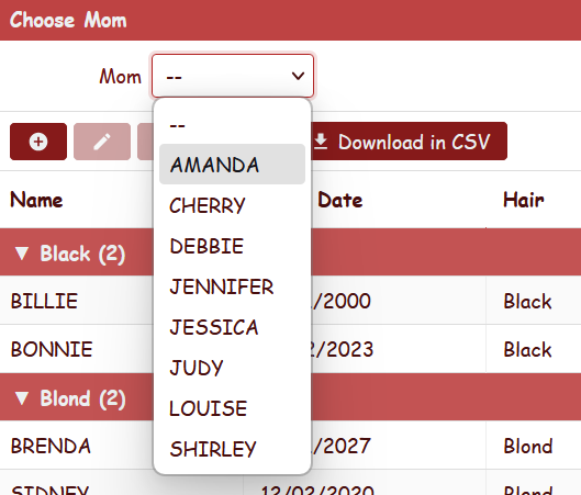
Example of DynaList filter with a where condition:
Filters:
  DisplayLabel: Choose employee
  Items:
      DynaList: Employee
        CommandText: |
          select EMPLOYEE_ID, EMPLOYEE_NAME
            from EMPLOYEE
            where EMPLOYEE_ID in (%Auth:ALLOWED_USERS%)    {query}
            order by EMPLOYEE_NAME
        ExpressionTemplate: {Q}EMPL like '{value}'
        QueryTemplate: and EMPLOYEE_NAME like '{queryValue}%'
Example of TimeSearch and BooleanSearch filters:
Filters:
  DisplayLabel: Search
  Connector: and
  Items:
    TimeSearch: Start Time
      ExpressionTemplate: START_TIME >= '{value}'
    BooleanSearch: Active Only
      ExpressionTemplate: IS_ACTIVE = 1
Example of NumericSearch filter:
Filters:
  Items:
    NumericSearch: Min Amount
      ExpressionTemplate: AMOUNT >= {value}
Example of DateTimeSearch filter:
Filters:
  Items:
    DateTimeSearch: From
      ExpressionTemplate: CREATED_AT >= '{value}'
Filters are applied to all presenters of the List, meaning that if you have for example a grid and a chart, both are filtered and refreshed when you change filter criteria in the user interface. The chart and calendar data endpoints receive the same filter values as the grid rows.
Customize Layout of filters
Filters layout can be organized in colums. Simply add a ColumnBreak node to force column layout. You can also specify width of search items and width of space for labels.
Example of a complex filter with column layout:
  Filters:
    DisplayLabel: Types
    LabelWidth: 90
    Connector: and
    Items:
      FreeSearch: Description
        ExpressionTemplate: (UPPER(Activity.Description) like UPPER('%{value}%'))
      DynaList: Activity Type
        Width: 20
        CommandText: |
          select first 1 '%' TYPE_ID, '(All)' TYPE_NAME from kitto_users
            union all
          select TYPE_ID, TYPE_NAME from ACTIVITY_TYPE
            order by 2
        ExpressionTemplate: Activity.TYPE_ID like '{value}'
      ColumnBreak:
        LabelWidth: 50
      DateSearch: From
        ExpressionTemplate: ACTIVITY_DATE >= '{value}'
      DateSearch: To
        ExpressionTemplate: ACTIVITY_DATE <= '{value}'
      ColumnBreak:
        LabelWidth: 80
      List: Period
        Items:
          Today: Today
            Expression: (ACTIVITY_DATE > %DB.CURRENT_DATE%-1)
          LastWeek: Last Week
            Expression: (ACTIVITY_DATE <= %DB.CURRENT_DATE%) and (ACTIVITY_DATE >= %DB.CURRENT_DATE% - 7)
          CurrMonth: Current Month
            Expression: |
              EXTRACT(month FROM ACTIVITY_DATE) = EXTRACT(month FROM %DB.CURRENT_DATE%)
              and EXTRACT(year FROM ACTIVITY_DATE) = EXTRACT(year FROM %DB.CURRENT_DATE%)
          CurrYear: Current Year
            Expression: EXTRACT(year FROM ACTIVITY_DATE) = EXTRACT(year FROM %DB.CURRENT_DATE%)
          All: Whole Archive
            Expression: 1=1
            IsDefault: True
      FreeSearch: Last N Days
        ExpressionTemplate: ACTIVITY_DATE >= (getDate() - {value})
Standard actions
The toolbar of the presenter (the grid's, the calendar's) offers the standard actions Add, Duplicate, Edit, Delete, View, Refresh, followed by the custom ToolViews. Which of them appear is decided by the List through its flags, combined with the view table's read-only state and the user's permissions:
| Property | Default | Description |
|---|---|---|
PreventAdding | False | Hide the Add button |
PreventEditing | False | Hide the Edit button |
PreventDeleting | False | Hide the Delete button |
PreventRefreshing | False | Hide the Refresh button |
AllowViewing | False | Show the View (read-only) button |
AllowDuplicating | False | Show the Duplicate button. See Duplicating records |
ToolButtonScale | small | small (icon only), medium or large (icon and text) |
The same flags are also read from MainTable/Controller, and for compatibility with Kitto1 views from a CenterController node without a value.
Double-clicking a row opens the record: in edit mode if Edit is allowed, in view mode if View is; with a hosted form, in the form panel. See GridPanel.
Card View with TemplateFileName
The List controller supports an alternative rendering mode: instead of a tabular grid, records can be displayed as custom HTML cards using a template file. This mode preserves the full CRUD functionality (Add, Edit, Delete, View), toolbar, filters, and paging — unlike the read-only TemplateDataPanel.
To enable card mode, add TemplateFileName to the controller configuration:
Type: Data
DisplayLabel: Doll Catalog

Controller: List
  TemplateFileName: DollsCard.html

MainTable:
  Model: Doll
  Fields:
    Doll_Id:
    Doll_Name:
    Date_Bought:
    Hair:
    Dress_Size:
    Picture:

  Controller:
    AllowViewing: True
    Form:
      Layout: Dolls_Form
    ToolViews:
      DownloadCSV:
        DisplayLabel: Download in CSV
        ImageName: download
        Controller: ExportCSVTool
          RequireSelection: False
When TemplateFileName is specified, the grid table is replaced by a card container where each record is rendered using the given HTML template. All other List features work as usual: CRUD buttons in the toolbar, double-click to edit, filters, ToolViews, and region views (East, West, etc.).
Template file
The template file is placed in the application's Home/Resources/ directory and defines the HTML for a single card. Field values are inserted using {FieldName} placeholders (matching the aliased field names in the view definition). Date fields can be formatted with {FieldName:date}.
Example DollsCard.html:
<div class="kx-card-body" style="width:300px;height:150px">
  <div class="kx-card-photo">
    <img src="{Picture}" alt="Doll Picture"
         onerror="this.onerror=null;this.outerHTML='<span class=kx-no-pic>No Picture</span>'">
  </div>
  <div class="kx-card-info">
    <span class="kx-card-name">{Doll_Name}</span>
    <span class="kx-card-detail">{Date_Bought:date}</span>
    <span class="kx-card-detail">{Hair} hair</span>
    <span class="kx-card-detail">Size: {Dress_Size}</span>
  </div>
</div>
Card dimensions (width and height) are set via the style attribute on the root element of the template, not in CSS. This allows each view to define its own card size.
Built-in CSS classes
Kittox provides default CSS classes for common card layouts:
| Class | Description |
|---|---|
.kx-card-body | Root card element. Use flex layout (horizontal by default). |
.kx-card-photo | Photo area (left side). Centered content, border-right separator. |
.kx-card-info | Info area (right side). Vertical flex with gap between lines. |
.kx-card-name | Record title (bold, slightly larger font). |
.kx-card-detail | Secondary information line (muted color, smaller font). |
.kx-no-pic | Fallback text when the image fails to load (italic, muted). |
Card selection and hover effects are automatically applied and use the same accent colors as grid rows:
- Hover: accent background + accent border
- Selected: accent background + 2px accent outline
You are free to use your own CSS classes in the template instead of the built-in ones. The only requirement is that the template defines the HTML for a single record.
Image fallback
Use the onerror attribute on <img> tags to handle missing or empty images gracefully:
<img src="{Picture}" alt=""
     onerror="this.onerror=null;this.outerHTML='<span class=kx-no-pic>No Picture</span>'">
This replaces the broken image icon with a text label when the field is empty or the image URL is invalid.
Form layout
Card views use the same form dialog as grid views for Add/Edit/View operations. If you need a specific form layout, define it in the Controller/Form/Layout node:
  Controller:
    Form:
      Layout: Dolls_Form
This tells the List controller to use the Dolls_Form layout (from Home/Metadata/Layouts/Dolls_Form.yaml) when opening the form dialog. Without this setting, the framework looks for a layout named {ViewName}_Form by convention.
AutoOpen and PagingTools
Two flags under MainTable/Controller govern how the data loads when the view is first opened:
| Property | Default | Effect |
|---|---|---|
Controller/AutoOpen | not IsLarge | When True, the server runs the SELECT and the grid renders already populated. When False, the grid opens empty and the user populates it by applying a filter or clicking Refresh in the toolbar. |
Controller/PagingTools | IsLarge | When True, a pager bar (first/previous/next/last + "Showing X-Y of N") is shown at the bottom and the SELECT is paged server-side. When False, all records are loaded at once and there is no pager. |
The defaults are derived from the IsLarge flag declared on the underlying Model (or overridden on the ViewTable). Set IsLarge: True on a Model that grows with business activity (transactions, accumulating registries, large lookups like municipalities) and the framework will automatically:
- skip the auto-load (the grid waits for an explicit user action),
- enable the pager so navigation never has to walk thousands of rows.
For naturally bounded lookups (types, statuses, categories, geographic regions) leave IsLarge at its default (False) and the grid auto-opens with all records, no pager.
Paging is a property of the grid: a chart or a calendar beside it always shows all the filtered records.
Override per view
Both flags can be overridden in the view YAML when the model-level default is wrong for a specific use case:
MainTable:
  Model: Foo
  Controller:
    AutoOpen: True       # force auto-load even on a large model
PagingTools: False # …or hide the pagerMainTable:
Model: Bar
Controller:
AutoOpen: False # force "open empty" on a small model that you
# want to behave like a search panelPage size
The default page size is 20 records. To customize it, add PageRecordCount under the PagingTools node:
MainTable:
  Model: Girl
  Controller:
    PagingTools: True
      PageRecordCount: 30
Refresh
A Refresh button is always present in the main toolbar (regardless of PagingTools and AutoOpen) and re-runs the SELECT with the current filters, for every presenter of the List. It is the standard way for the user to populate a grid that opened empty because of AutoOpen: False. To hide it, set Controller/PreventRefreshing: True.
Modes
These flags work with all List controller modes: standard grid, card view (with TemplateFileName), and lookup dialogs (where IsLarge on the referenced model also drives the dialog opening behavior).
See also
- GridPanel — the grid presenter: columns, sorting, layouts, row colors
- GroupingList — a grid with collapsible groups
- ChartPanel, CalendarPanel, TemplateDataPanel — the other presenters
- Form — the record form, in a dialog or beside the grid
- DataPanelLeaf — what all data panels share