ChartPanel
Kittox Enterprise feature
The ChartPanel is part of the Kittoˣ Enterprise edition. See the Feature Matrix for the full comparison with the Open-Source edition.
The ChartPanel is a data panel controller that renders interactive charts using Chart.js. It displays a ViewTable's records as a chart with an optional data grid sidebar.
The ChartPanel is typically used as a CenterController inside a List controller, which provides filtering capability and a grid sidebar. The chart refreshes automatically when filters change.
The available chart types are: Bar, Line, Pie, and Doughnut. Bar and Line are cartesian charts (with X and Y axes), while Pie and Doughnut display slices proportional to data values.
Cartesian charts (Bar, Line)
Cartesian charts map a category field to one axis and a numeric field to the other. The chart type is determined by the Series/Series/Type value.
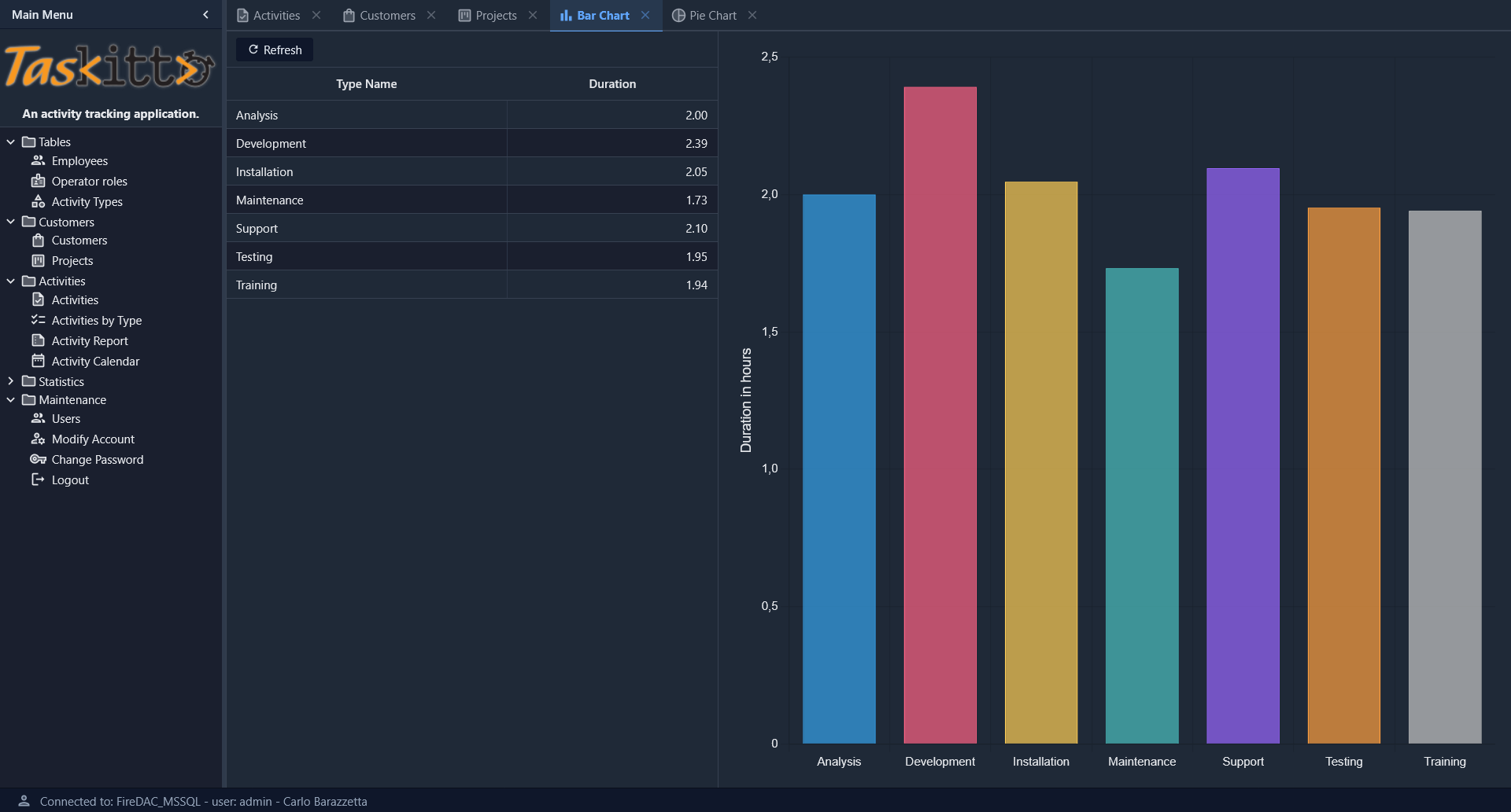
Bar chart example
Controller: List
  CenterController: ChartPanel
    Chart:
      Type: Cartesian
      Axes:
        Axis:
          Position: Left
          Title: _(Duration in hours)
        Axis:
          Type: Category
          Position: Bottom
      Series:
        Series:
          Type: Bar
          XField: TYPE_NAME
          YField: DURATION
          Highlight:
            StrokeStyle: black
            FillStyle: gold
          Label:
            Field: DURATION
            Display: insideEnd
  WestController: GridPanel
    Width: 500

MainTable:
  IsReadOnly: True
  Model: ACTIVITY_BY_TYPE
The WestController: GridPanel places a data grid to the left of the chart, showing the same data in tabular form. You can also use EastController: GridPanel to place the grid to the right. A draggable splitter between the grid and the chart allows the user to resize both areas interactively.
Series configuration
Each Series node under Chart/Series defines a data series:
| Property | Description |
|---|---|
Type | Chart type: Bar or Line |
XField | Field name for the X axis (category labels) |
YField | Field name for the Y axis (numeric values) |
Title | Display name for the series (shown in legend and tooltips) |
Highlight/StrokeStyle | Stroke color when hovering a bar (e.g., black) |
Highlight/FillStyle | Fill color when hovering a bar (e.g., gold) |
Label/Field | Field name whose value is displayed as a label on each bar |
Label/Display | Label position: insideEnd, insideStart, outside |
Axes configuration
Axes are defined under Chart/Axes as Axis subnodes:
| Property | Description |
|---|---|
Position | Axis position: Left, Right, Bottom, Top |
Title | Axis title (localizable with _()) |
Type | Axis type: Category for labels (default for X), numeric for values |
Polar charts (Pie, Doughnut)
Polar charts display data as slices of a circle. The chart type is Polar, and the series type determines the specific rendering.
Pie chart example
Controller: List
  EastController: GridPanel
    Width: 400
  CenterController: ChartPanel
    Chart:
      Type: Polar
      Theme: Muted
      Sprites:
        Sprite:
          X: 20
          Y: 35
          Text: _(Activities By Type)
          FontSize: 22
      Series:
        Series:
          Type: Pie3D
          AngleField: DURATION
          Label:
            Field: TYPE_NAME
            CalloutLine:
              Length: 60
              Width: 2
          Highlight:
            Margin: 40
          Title: _(Duration)
          Thickness: 50
          Distortion: 60
          Bevel: 20
          Donut: 50
      Legend:
        Docked: left
        Padding: 10
        Toggleable: True
      InnerPadding: 20
      InsetPadding: 50

MainTable:
  IsReadOnly: True
  Model: ACTIVITY_BY_TYPE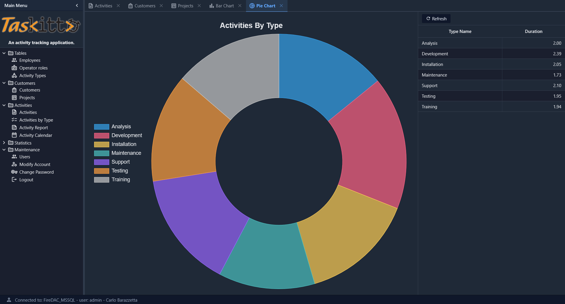
Pie/Doughnut series properties
| Property | Description |
|---|---|
Type | Pie, Pie3D |
AngleField | Field name whose values determine slice sizes |
Label/Field | Field name for slice labels |
Label/CalloutLine/Length | Length of the callout line connecting the label to the slice |
Label/CalloutLine/Width | Width of the callout line |
Title | Series title (displayed in tooltips) |
Donut | If > 0, renders as a doughnut chart with the specified hole size |
Thickness | Thickness of the 3D effect (Pie3D only) |
Distortion | Perspective distortion amount (Pie3D only) |
Bevel | Bevel size of the 3D effect (Pie3D only) |
Highlight/Margin | Expansion margin when hovering a slice |
Chart options
General options defined directly under the Chart node:
| Property | Default | Description |
|---|---|---|
Type | Chart type: Cartesian or Polar | |
Theme | Color theme for the chart (e.g., Muted) | |
InnerPadding | 0 | Padding between the chart area and the series |
InsetPadding | 0 | Padding between the chart container and the chart area |
Chart title
Use the Sprites/Sprite node to set a chart title:
Chart:
  Sprites:
    Sprite:
      Text: _(My Chart Title)
      FontSize: 22
      X: 20
Y: 35| Property | Description |
|---|---|
Text | Title text (localizable with _()) |
FontSize | Font size in pixels |
X | Horizontal position offset |
Y | Vertical position offset |
If X and Y are omitted, the title is rendered centered above the chart area.
Legend
Configure the legend under Chart/Legend:
| Property | Default | Description |
|---|---|---|
Docked | top | Legend position: top, bottom, left, right |
Padding | 0 | Padding around the legend area |
Toggleable | False | If True, clicking a legend item toggles the visibility of the corresponding data series |
If no Legend node is defined, the legend is hidden for cartesian charts and shown at the top for polar charts.
Grid sidebar
A common pattern is to display both the chart and a data grid. Use WestController or EastController to place a GridPanel alongside the chart:
Controller: List
  CenterController: ChartPanel
    Chart:
      # ...chart config...
  WestController: GridPanel
    Width: 500
The grid and chart share the same data source and both respond to filter changes.
Automatic colors
Chart.js colors are automatically assigned from a built-in palette of 12 colors. Each data point (or series) receives a distinct color in a cyclic pattern. No manual color configuration is required.
Tooltip on hover
A tooltip showing the data point label and value is displayed automatically when the mouse hovers over a chart element:
- Bar / Pie / Doughnut: hit detection covers the whole bar or slice, so the tooltip is triggered as soon as the cursor enters the shape.
- Line: line charts use
pointRadius: 4andpointHitRadius: 4so the hit area matches the visible dot. The tooltip is triggered when the cursor covers the dot itself.
No configuration is required. The chart automatically resizes to fit its container (e.g. when used inside a Dashboard tile or after a window resize) and the hover hit area is kept aligned with the rendered points.
Layout and spacing
The chart canvas keeps a consistent 16 px gap from the edges of its host card on all four sides, regardless of chart type. This is applied automatically by the framework — no configuration is needed.
For pie/doughnut charts, the visible margin between the pie circle itself and the canvas may be larger than 16 px on some sides. This is inherent to Chart.js's pie geometry: the pie is inscribed in the chart area (a square fitting inside a possibly-rectangular canvas), and the legend, when docked, occupies space within the chart area, reducing the side opposite to its position.