
TStyledToolbar
| Component | Description |
|---|---|
 | TStyledToolbar is a toolbar that contains TStyledToolButton components. Every button can be styled with the same StyleFamily / StyleClass / StyleAppearance of the other styled buttons, and the size of the buttons is under your control: it never depends on the width of the captions, as it does in the classic TToolBar. |
Unit: Vcl.StyledToolbar. Inheritance: TWinControl > TCustomPanel > TCustomFlowPanel > TStyledToolbar. Platforms: Win32 and Win64.
When to use it
Use TStyledToolbar instead of TToolBar when you want:
- the same look of the rest of your styled application (Bootstrap, Angular, Angular-M3, colour families...) with or without VCL Styles;
- buttons with a fixed size (
ButtonWidthxButtonHeight) also whenShowCaptionsisTrue: in the standardTToolBarthe width of a button is the one of its largest caption; - buttons that wrap on more rows (
Wrapable) and a toolbar that grows with them (AutoSize); - rounded or circular buttons, a notification badge on any button, a different style for a single button.
Differences from the VCL TToolBar
| Aspect | TToolBar | TStyledToolbar |
|---|---|---|
| Base class | TToolWindow / common control | TCustomFlowPanel (buttons are graphic controls, no handle per button) |
| Button class | TToolButton | TStyledToolButton |
| Button width with captions | the largest caption | always ButtonWidth |
| Style of the buttons | the VCL Style / the theme | Family / Class / Appearance, shape, radius, per button override |
| Buttons | Buttons[], ButtonCount | the same (Buttons[], ButtonCount) |
Gradient, DrawingStyle | used | published only for compatibility, ignored |
Customizable, HideClippedButtons | used | published only for compatibility, no effect on the layout |
The properties of TToolBar that you normally use (Images, DisabledImages, ShowCaptions, List, Flat, ButtonWidth, ButtonHeight, Wrapable, AutoSize, Indent, EdgeBorders...) have the same name, so most of the code can be moved with a change of class name.
Style of the toolbar and of the buttons
Three values define the look of the buttons:
- StyleFamily: Classic, Bootstrap, Angular-Light, Angular-Dark, Angular-M3-Light, Angular-M3-Dark, Basic-Colors, SVG-Colors (see Angular-M3-Families) or a custom family;
- StyleClass: the predefined colour inside the family (
Primary,Success,Basic...); - StyleAppearance: the variant (
Normal,Outline,Raised,Stroked,Filled...).
Together with StyleDrawType (shape), StyleRadius, StyleShadowSize (the shadow below the buttons: -1 = the one of the style family, 0 = none) and ButtonsCursor they are applied to all the buttons. A button follows the toolbar only while its own value is the same of the toolbar: if you assign a different StyleClass to a single button, that button keeps it when the toolbar changes class (see the per-button override example).
AutoSize and Wrapable:
Wrapable(defaultTrue): buttons go to the next row when the toolbar is too narrow. It is theAutoWrapofTFlowPanel;AutoWrapis also readable at run-time.AutoSizewithWrapable = True: the toolbar changes its height (Align=alTop/alBottom) or its width (Align=alLeft/alRight) to show all the rows, up to the size of the parent.AutoSizewithWrapable = False: the standard auto size of theTFlowPanel(a single row).
Setting Wrapable := True resets the inherited AutoSize of the flow panel: the toolbar keeps its own AutoSize value and uses it as described above.
Design-time use and Component Editor
Drop a TStyledToolbar on the form, assign an Images list, then right-click it:
| Verb | Action |
|---|---|
| Styled Toolbar Editor... | opens the Component Editor to choose Family/Class/Appearance, shape, radius: the style is applied to the toolbar and to all its buttons (SetToolbarStyle) |
| Add StyledToolbar Button | adds a TStyledToolButton (NewButton(..., tbsButton)) and selects it |
| Add StyledToolbar Separator | adds a separator (tbsSeparator) |
| Ver. x.y.z - Open Web Help... | opens the web help |
At design time you can also drag a button over another one to change its position, and resize a button to change ButtonWidth / ButtonHeight of the whole toolbar. Buttons added from the verbs get the name StyledToolButtonN.
Run-time creation
uses
  Vcl.StyledToolbar, Vcl.StyledButton, Vcl.ButtonStylesAttributes,
  Vcl.BootstrapButtonStyles;

var
  LToolbar: TStyledToolbar;
  LButton: TStyledToolButton;
begin
  LToolbar := TStyledToolbar.CreateStyled(Self,
    BOOTSTRAP_FAMILY, btn_primary, BOOTSTRAP_OUTLINE);
  LToolbar.Parent := Self;          //Align is alTop by default
  LToolbar.Images := ImageList1;
  LToolbar.ButtonWidth := 40;
  LToolbar.ButtonHeight := 40;

  if LToolbar.NewButton(LButton) then
  begin
    LButton.ImageIndex := 0;
    LButton.Hint := 'New';
    LButton.ShowHint := True;
    LButton.OnClick := NewClick;
  end;
end;
NewButton creates the button, sets the toolbar style on it and gives it the toolbar size. More examples (captions, wrapping, separators, check and drop-down buttons, badge) are in StyledToolbar-Examples.
Default style for all the toolbars
You can change at application level the default style of the new toolbars, in the project file after Application.Initialize:
uses
  Vcl.StyledToolbar, Vcl.ButtonStylesAttributes, Vcl.BootstrapButtonStyles;
...
  TStyledToolbar.RegisterDefaultRenderingStyle(btRounded);
  //or with a Family/Class/Appearance
  TStyledToolbar.RegisterDefaultRenderingStyle(btRoundRect,
    BOOTSTRAP_FAMILY, btn_primary, BOOTSTRAP_NORMAL);
You can also use the Interposer Unit (Vcl.StyledComponentsHooks) to replace all the buttons of an application.
Notification Badge
Every TStyledToolButton has a NotificationBadge: see the Notification Badge guide.
Demo and reference
- Demo: StyledToolbarDemo (in
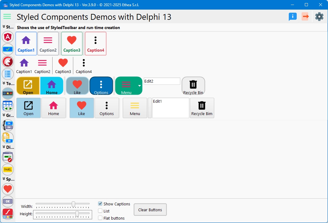
Demos\DelphiVersion\build StyledComponentsDemo), where the toolbar is compared with the classicTToolBar.
In this picture the demo compares the StyledToolbar and the classic Toolbar:
- Reference of properties, methods and events: TStyledToolbar-Reference.