
Description of TStyledAnimatedTaskDialog (animated dialogs)
| Component | Description |
|---|---|
 | TStyledAnimatedTaskDialog is a TStyledTaskDialog whose icons (Information, Warning, Error, Question, Shield, Notify, Custom) are Lottie animations shown with Skia4Delphi. |
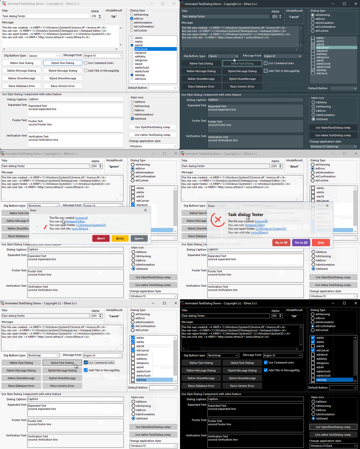
Units: Vcl.StyledAnimatedTaskDialog.pas (the component), Skia.Vcl.StyledTaskDialogAnimatedUnit.pas (the animated dialog form TStyledTaskDialogAnimatedForm, with the Lottie files linked in Animations.RES). Palette page: Styled Animated Components.
Prerequisites
- Skia4Delphi installed in the IDE (already included in Delphi 12 and 13; for the other versions install it from here).
- The packages StyledAnimatedComponents (runtime) and dclStyledAnimatedComponents (design-time) of the group
2.Vcl.StyledAnimatedComponents.groupproj, available from Delphi XE7 to Delphi 13 (not for XE6). See Installation. - In the application the unit
Skia.Vcl.StyledTaskDialogAnimatedUnitmust be linked: it is pulled in automatically if the project usesVcl.StyledAnimatedTaskDialog(component) and you must add it by hand if you only useTStyledTaskDialogor theStyled...message routines.
How it works
- The animated form is registered by the
initializationsection ofSkia.Vcl.StyledTaskDialogAnimatedUnit, withRegisterTaskDialogFormClass(TStyledTaskDialogAnimatedForm)(itsCanUseAnimationsis True), and it callsInitializeStyledTaskDialogs(True). From then on all theStyled...message routines (StyledMessageDlg,StyledShowMessage...) and the Vcl.StyledMessagesHooks calls show animated dialogs. - A
TStyledTaskDialog/TStyledAnimatedTaskDialogcomponent shows the animated form when itsUseAnimationsproperty is True (its default is False, also forTStyledAnimatedTaskDialog: set it, together withUseAnimationLoop/UseAnimationInverse, which setUseAnimationsto True when you turn them on). IfUseAnimationsis True and the unitSkia.Vcl.StyledTaskDialogAnimatedUnitis not in the project, anEStyledTaskDialogExceptionis raised. - The animation is chosen by the icon:
MainIcon(andFooterIcon)tdiInformation,tdiWarning,tdiError,tdiQuestion,tdiShield,tdiNone(the "Custom" animation) load the resourceSTYLEDTASKLOTTIE_INFORMATION,_WARNING,_ERROR,_QUESTION,_SHIELD,_CUSTOM(_NOTIFYis also available). ACustomMainIcon/CustomFooterIconis a normal icon: it is not animated in the animated form. - At each dialog the animation starts, once by default, or in loop (
UseAnimationLoop) and/or reversed (UseAnimationInverse).
Replacing the Lottie animations
The animations are the files of the folder Animations (information.json, warning.json, error.json, question.json, shield.json, notify.json, custom.json) listed in source\Animations.rc; the resource file Animations.RES is rebuilt with source\BuildResFileOfAnimations.cmd. To use your own animations replace those files and rebuild the .RES, or derive your own form (below).
Differences from TStyledTaskDialog
TStyledAnimatedTaskDialog adds no members: it is an empty descendant of TStyledTaskDialog whose unit links the animated form, to have the component, the units and the packages ready for the animated dialogs. All the properties, methods and events are those of the TStyledTaskDialog Reference. It is useful as the "palette entry" for Skia, while the animation itself is selected by the property UseAnimations.
Design-time
The component is on the Styled Animated Components palette page. Use the Test Dialog... verb of the Component Editor to see the dialog with its animation in the IDE (the design-time package requires Skia.Package.VCL.Designtime).
Demos
- StyledComponentsDemo compiled with the
SKIAconditional define ("Enable SKIA" in the context menu of the project): the dialogs demo setsStyledTaskDialog.UseAnimations := True, and the Animated Buttons form (AnimatedButtonsForm.pas) reuses the same Lottie resources, see TStyledAnimatedButton. Demos\source\StyledTaskDialogAnimCustomForm.pas(a commented-out unit in the demo project) is a custom form for animated dialogs: it moves the icon to the right of the dialog.
Code examples
1. Animated component
uses
  Vcl.StyledTaskDialog, Vcl.StyledAnimatedTaskDialog;

var
  Dlg: TStyledAnimatedTaskDialog;
begin
  Dlg := TStyledAnimatedTaskDialog.Create(Self);
  try
    Dlg.Title := 'Upload completed';
    Dlg.Text := 'All files have been uploaded.';
    Dlg.MainIcon := tdiInformation;
    Dlg.CommonButtons := [tcbOk];
    Dlg.UseAnimations := True;
    Dlg.Execute;
  finally
    Dlg.Free;
  end;
end;
2. Looping and reversed animation
Dlg.UseAnimationLoop := True;     //also sets UseAnimations
Dlg.UseAnimationInverse := True;
3. All the message dialogs animated (project file)
uses
  Vcl.StyledTaskDialog,
  Skia.Vcl.StyledTaskDialogAnimatedUnit; //registers the animated form

begin
  Application.Initialize;
  InitializeStyledTaskDialogs(True);     //animated dialogs on (already done by the unit)
  ...
end.//anywhere: animated dialog with the usual routines
StyledMessageDlg('Delete the file?', mtConfirmation, [mbYes, mbNo], 0);4. Switch the animations off at run-time
InitializeStyledTaskDialogs(False); //the message routines use the standard form5. Custom animated form
unit MyAnimatedDialogForm;

interface

uses
  Skia.Vcl.StyledTaskDialogAnimatedUnit; //TStyledTaskDialogAnimatedForm

type
  TfmMyAnimatedDialog = class(TStyledTaskDialogAnimatedForm)
    procedure FormCreate(Sender: TObject);
  end;

implementation

{$R *.dfm}

uses
  Vcl.Controls, Vcl.StyledTaskDialogFormUnit;

procedure TfmMyAnimatedDialog.FormCreate(Sender: TObject);
begin
  inherited;
  ImagePanel.Align := alRight;   //icon on the right
end;

initialization
  RegisterTaskDialogFormClass(TfmMyAnimatedDialog);

finalization
  UnregisterTaskDialogFormClass(TfmMyAnimatedDialog);

end.
The form is created with the DFM of the ancestor visually inherited (File > New > Inherited Item of the animated form).