
TStyledToolbar Demo
Overview
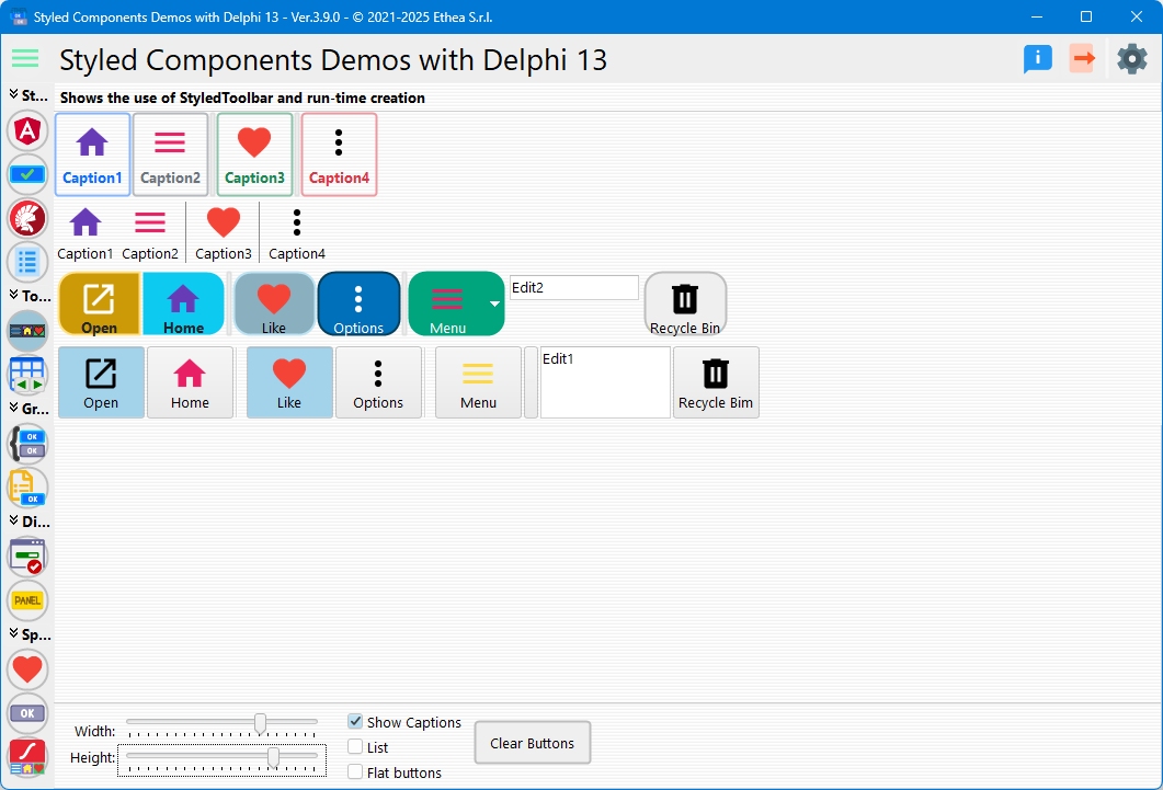
This demo compares TStyledToolbar with the standard VCL TToolBar, showing how to create modern-looking toolbars with styled buttons while maintaining full compatibility.
What You'll Learn
- How to create TStyledToolbar dynamically
- Adding styled tool buttons with different styles
- Comparison with standard TToolBar
- Using separators and dividers
- Configuring toolbar appearance options
- Button sizing and layout
Toolbar Comparison
The demo creates two toolbars side-by-side:
Standard TToolBar (Left)
Shows the classic VCL TToolBar for comparison.
TStyledToolbar (Right)
Modern styled toolbar with:
- Individual button styling (Family/Class/Appearance)
- Consistent appearance across Windows versions
- Full customization options
Dynamic Toolbar Creation
Creating Standard ToolBar
procedure TfmStyledToolbar.CreateToolBar;
begin
  FToolBar := TToolBar.Create(Self);
  FToolBar.Flat := True;
  FToolBar.ShowCaptions := SHOW_CAPTIONS;
  FToolBar.AutoSize := TOOLBAR_AUTOSIZE;
  FToolBar.Images := VirtualImageList;
  FToolBar.ButtonWidth := BUTTON_WIDTH;
  FToolBar.ButtonHeight := BUTTON_HEIGHT;
  FToolBar.Parent := Self;
end;
Creating TStyledToolbar
procedure TfmStyledToolbar.CreateStyledToolBar;
begin
  FStyledToolBar := TStyledToolBar.Create(Self);
  FStyledToolBar.ShowCaptions := SHOW_CAPTIONS;
  FStyledToolBar.Parent := Self;
  FStyledToolBar.AutoSize := TOOLBAR_AUTOSIZE;
  FStyledToolBar.Wrapable := not TOOLBAR_AUTOSIZE;
  FStyledToolBar.Images := VirtualImageList;
  FStyledToolBar.ButtonWidth := BUTTON_WIDTH;
  FStyledToolBar.ButtonHeight := BUTTON_HEIGHT;
end;
Adding Toolbar Buttons
Standard Buttons
function TfmStyledToolbar.AddButtonToToolbar(
  var AToolbar: TToolBar;
  ACaption: string;
  AStyle: TToolButtonStyle;
  AImageIndex: Integer): TToolButton;
begin
  Result := TToolButton.Create(Self);
  Result.Style := AStyle;
  Result.Caption := ACaption;
  Result.ImageIndex := AImageIndex;
  Result.Parent := AToolbar;
end;
Styled Buttons
function TfmStyledToolbar.AddStyledButtonToToolbar(
  var AToolbar: TStyledToolBar;
  const ACaption: string;
  const AStyle: TToolButtonStyle;
  AImageIndex: Integer;
  const AFamily: TStyledButtonFamily;
  const AClass: TStyledButtonClass;
  const AAppearance: TStyledButtonAppearance): TStyledToolButton;
begin
  if AToolbar.NewButton(Result, AStyle) then
  begin
    Result.Caption := ACaption;
    Result.ImageIndex := AImageIndex;
    Result.SetButtonStyle(AFamily, AClass, AAppearance);
  end;
end;
Button Styles
The demo uses different Bootstrap styles for each button:
// Button 1 - Primary Outline
AddStyledButtonToToolbar(FStyledToolBar, 'Caption1', tbsButton, 0,
  BOOTSTRAP_FAMILY, btn_primary, BOOTSTRAP_OUTLINE);

// Button 2 - Secondary Outline
AddStyledButtonToToolbar(FStyledToolBar, 'Caption2', tbsButton, 5,
  BOOTSTRAP_FAMILY, btn_secondary, BOOTSTRAP_OUTLINE);

// Divider
AddStyledButtonToToolbar(FStyledToolBar, '', tbsDivider);

// Button 3 - Success Outline
AddStyledButtonToToolbar(FStyledToolBar, 'Caption3', tbsButton, 8,
  BOOTSTRAP_FAMILY, btn_success, BOOTSTRAP_OUTLINE);

// Separator
AddStyledButtonToToolbar(FStyledToolBar, '', tbsSeparator);

// Button 4 - Danger Outline
AddStyledButtonToToolbar(FStyledToolBar, 'Caption4', tbsButton, 10,
  BOOTSTRAP_FAMILY, btn_danger, BOOTSTRAP_OUTLINE);
Toolbar Appearance Options
Show Captions
Toggle button captions on/off:
StyledToolBar.ShowCaptions := ShowCaptionCheckBox.Checked;Flat Style
Enable/disable flat appearance:
StyledToolBar.Flat := FlatCheckBox.Checked;List Mode
Display buttons in list style:
StyledToolBar.List := ListCheckBox.Checked;Button Sizing
Adjust button dimensions with trackbars:
StyledToolBar.ButtonWidth := tbWidth.Position;
StyledToolBar.ButtonHeight := tbHeight.Position;
Button Types
Normal Buttons (tbsButton)
Standard clickable toolbar buttons.
Separators (tbsSeparator)
Thin vertical divider between buttons.
Dividers (tbsDivider)
Thicker visual separation between button groups.
Check Buttons (tbsCheck)
Toggle buttons that stay pressed.
Dropdown Buttons (tbsDropDown)
Buttons with dropdown menus (with popup menu assigned).
Interactive Controls
The demo includes controls to modify toolbar appearance:
| Control | Function |
|---|---|
| Width Trackbar | Adjust button width |
| Height Trackbar | Adjust button height |
| Show Caption | Toggle captions visibility |
| List | Switch to list mode |
| Flat | Toggle flat appearance |
Changes apply to both toolbars simultaneously for easy comparison.
Creating Toolbar Programmatically
Full example of creating a styled toolbar:
var
  Toolbar: TStyledToolbar;
  Btn: TStyledToolButton;
begin
  // Create toolbar
  Toolbar := TStyledToolbar.Create(Self);
  Toolbar.Parent := Self;
  Toolbar.Images := ImageList1;
  Toolbar.ShowCaptions := True;

  // Add button
  if Toolbar.NewButton(Btn, tbsButton) then
  begin
    Btn.Caption := 'New';
    Btn.ImageIndex := 0;
    Btn.SetButtonStyle(BOOTSTRAP_FAMILY, btn_primary, BOOTSTRAP_NORMAL);
    Btn.OnClick := NewButtonClick;
  end;

  // Add separator
  Toolbar.NewButton(Btn, tbsSeparator);

  // Add more buttons...
end;
Popup Menus
Toolbar buttons support popup menus:
TlbButton.DropDownMenu := PopupMenu1;When clicked, the dropdown menu appears.
Key Differences from TToolBar
While fully compatible, TStyledToolbar adds:
- Per-Button Styling: Each button can have its own Family/Class/Appearance
- Consistent Rendering: Same look across all Windows versions
- Modern Appearance: Bootstrap, Angular, or custom styles
- Better DPI Support: Automatic scaling
- Enhanced Customization: More control over appearance
Design-Time vs. Runtime
The demo shows both approaches:
- Design-Time: Toolbar created in form designer (visible at startup)
- Runtime: Toolbar created dynamically when clicking "Create" button
Both approaches support the same features.
Technical Details
Source Location
Demos/source/StyledToolbarForm.pas
Supported Versions
All Delphi versions (XE6+)
Key Properties
| Property | Description |
|---|---|
ButtonWidth | Width of toolbar buttons |
ButtonHeight | Height of toolbar buttons |
ShowCaptions | Display button captions |
Flat | Flat appearance mode |
List | List display mode |
AutoSize | Auto-resize to fit content |
Wrapable | Allow buttons to wrap |
Images | ImageList for button icons |
Key Methods
| Method | Description |
|---|---|
NewButton() | Create and add new toolbar button |
ClearButtons() | Remove all buttons |
SetToolbarStyle() | Apply style to all buttons |
BeginUpdate() / EndUpdate() | Batch changes with a single resize of the buttons |
See Also
- TStyledToolbar - Component page
- TStyledToolButton - The button of the toolbar
- StyledToolbar-Examples - More examples
- TStyledToolbar Reference - Complete technical documentation
- TStyledButton Reference - Base button component