
Description of TStyledDbNavigator
TStyledDbNavigator (and its buttons, TStyledNavButton) shows a navigator like the classic VCL TDBNavigator, but every button is a styled button: you can give it the same StyleFamily / StyleClass / StyleAppearance used by the Styled Graphic Buttons, show captions, and use your own images.
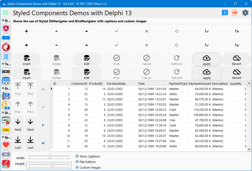
In this picture, the StyledDbNavigator with a custom imagelist for images and Captions visible
- Unit:
Vcl.StyledDbNavigator - Palette: Styled Components
- Inheritance:
TCustomPanel>TCustomStyledDBNavigator>TStyledDBNavigator - All properties, methods and events: TStyledDbNavigator Reference
- Live demo: TStyledDbNavigator Demo
- To navigate a LiveBindings source (TBindSourceDB, TPrototypeBindSource...) use TStyledBindNavigator.
When to use it
Use TStyledDbNavigator when you need a record navigator with the same look as the rest of a styled application (Bootstrap, Angular, Angular Material 3 ...), readable with light and dark VCL Styles, or showing captions together with the icons. It is a drop-in replacement for TDBNavigator: DataSource, VisibleButtons, Hints, ConfirmDelete, Kind, BeforeAction, OnClick work in the same way.
Differences from TDBNavigator
- You can set and show Captions (
ShowCaptions,Captions) on the buttons. - Every button is a
TStyledNavButton: the navigator-levelStyleFamily,StyleClass,StyleAppearance,StyleDrawType,StyleRadius,StyleShadowSize(the shadow below the buttons:-1= the one of the style family) are applied to all the buttons, and each button can then override them (see below). - The icons are more readable (like the "Edit" one) and work in light and dark mode: the navigator chooses the colored, black or white version of the built-in icons according to the active style.
- Up/down icons when the navigator is displayed in vertical position (
Kind := dbnVertical). - Custom images using your own image list (
Images,DisabledImages). OnEnableNavBtn: an event to enable/disable each button with your own rule.Flatbuttons, andAsVCLComponentto go back to the VCL Style look.- The buttons use a hand cursor by default (
Cursor).
Design-time
Drop a TStyledDbNavigator from the Styled Components palette, set DataSource and the style properties in the Object Inspector (StyleFamily, StyleClass and StyleAppearance show the list of the registered values).
Right click on the component to open the Component Editor (verb Styled DbNavigator Editor...): it shows a preview button and lets you choose family, class, appearance and shape for the whole navigator. See Component Editor. The second verb opens the online help.
The buttons are not components you can select in the form designer: to change a single button use ButtonItems[...] in code (see the examples).
Styling the whole navigator and a single button
The style of the navigator is propagated to the buttons. When you change StyleFamily, StyleAppearance, StyleDrawType, StyleRadius or StyleShadowSize of the navigator, only the buttons that still have the previous navigator value are updated; StyleClass is assigned to all the buttons. A button you customized keeps its own family, appearance, shape and radius. The buttons are created by the navigator and are not saved in the .dfm: a customization of a single button must be done in code (for example in FormCreate).
Examples
Create a styled navigator at runtime
uses
  Vcl.StyledDbNavigator, Vcl.BootstrapButtonStyles;

var
  Nav: TStyledDbNavigator;
begin
  Nav := TStyledDbNavigator.CreateStyled(Self,
    BOOTSTRAP_FAMILY, btn_primary, BOOTSTRAP_NORMAL);
  Nav.Parent := Self;
  Nav.Align := alBottom;
  Nav.DataSource := DataSource1;
end;
Captions, flat buttons and visible buttons
Nav.ShowCaptions := True;
Nav.Flat := True;
Nav.VisibleButtons := [nbFirst, nbPrior, nbNext, nbLast, nbRefresh];
// nbApplyUpdates and nbCancelUpdates are not visible by default
Nav.VisibleButtons := Nav.VisibleButtons + [nbApplyUpdates, nbCancelUpdates];
Vertical navigator with Angular style
uses
  Vcl.AngularButtonStyles;

Nav.SetDbNavigatorStyle(ANGULAR_LIGHT_FAMILY, btn_PrimaryIndigo, RaisedAttr);
Nav.Kind := dbnVertical;
Nav.Align := alLeft;
SetDbNavigatorStyle raises an exception if the combination Family/Class/Appearance is not registered.
Angular Material 3 style
Nav.StyleFamily := ANGULAR_M3_LIGHT_FAMILY;
Nav.StyleClass := btn_Basic;
Nav.StyleAppearance := TonalAttr;
See Angular Material 3 families.
Style a single button
// Delete in red, Post in green with its own caption
Nav.ButtonItems[nbDelete].StyleClass := btn_danger;
Nav.ButtonItems[nbDelete].Hint := 'Delete this record';
Nav.ButtonItems[nbPost].StyleClass := btn_success;
Nav.ButtonItems[nbPost].Caption := 'Save';
// Notification badge on a button
Nav.ButtonItems[nbRefresh].NotificationBadge.NotificationCount := 3;
(The Bootstrap constants btn_danger and btn_success are declared in Vcl.BootstrapButtonStyles; see the Notification Badge guide.)
Custom captions, hints and images
// One line for each button, in the order First, Prior, Next...; an empty line keeps the default text
Nav.Captions.Text := 'Start'#13#10'Back'#13#10'Forward'#13#10'End';
Nav.Hints.Add('Go to the first record');   // first line = hint of the First button
Nav.Images := VirtualImageList1;
Nav.ShowCaptions := True;
With your own Images list the image of each button is Ord(TNavigateBtn): 0=First, 1=Prior, 2=Next, 3=Last, 4=Insert, 5=Delete, 6=Edit, 7=Post, 8=Cancel, 9=Refresh, 10=ApplyUpdates, 11=CancelUpdates. In vertical orientation the four move buttons use the images from index 12 on (12=First, 13=Prior, 14=Next, 15=Last). When Images is not assigned (Delphi 10.4 and later) the navigator uses its built-in icons.
Events: BeforeAction, OnClick, OnEnableNavBtn
procedure TForm1.NavBeforeAction(Sender: TObject; Button: TNavigateBtn);
begin
  // Abort skips the action
  if (Button = nbDelete) and not UserCanDelete then
    Abort;
end;

procedure TForm1.NavEnableNavBtn(const ADbNavigator: TCustomStyledDBNavigator;
  const ABtn: TStyledNavButton; var AEnabled: Boolean);
begin
  // the Delete button is always disabled
  if ABtn.Index = nbDelete then
    AEnabled := False;
end;
Replacing TDBNavigator globally
Adding the unit Vcl.StyledComponentsHooks to the uses clause of a unit replaces TDbNavigator with TStyledDbNavigator for the forms of that unit, without changing the code (the same unit also replaces TBindNavigator, TButtonGroup, TCategoryButtons and TButtonCategory). See Interposer Unit.
To define a default look for all the navigators of the application, call once at startup:
TCustomStyledDBNavigator.RegisterDefaultRenderingStyle(btRounded,
  BOOTSTRAP_FAMILY, btn_primary, BOOTSTRAP_NORMAL);