
TStyledPanel
| Component | Description |
|---|---|
 | TStyledPanel is a container panel with the same style system of the styled buttons: StyleFamily, StyleClass and StyleAppearance, a shape (StyleDrawType, StyleRadius, StyleRoundedCorners) and a caption with alignment and margin. It is a drop-in replacement of TPanel. |
Unit: Vcl.StyledPanel. Inheritance: TWinControl > TCustomPanel > TStyledPanel. Platforms: Win32 and Win64.
When to use it
Use TStyledPanel when a plain TPanel is not enough: cards with rounded corners, coloured alert boxes (Bootstrap Success / Warning / Danger), headers and sidebars with the colours of Angular or Angular Material 3, panels with the colour of a family (Basic-Colors, SVG-Colors), or panels that must look the same under any VCL Style. And, with AsVCLComponent, when you want the panel to follow the active VCL Style like a standard TPanel.
Differences from the VCL TPanel
| Aspect | TPanel | TStyledPanel |
|---|---|---|
| Background and border | bevels, Color | Family / Class / Appearance, shape with radius and rounded corners, border from the style |
| States | enabled / disabled | PanelStyleNormal and PanelStyleDisabled (TStyledButtonAttributes), chosen by Enabled |
| Caption | Alignment, VerticalAlignment | CaptionAlignment and CaptionMargin, drawn on one line |
Default BevelOuter | bvRaised | bvNone |
| VCL Styles | always follows the active style | only in the Classic family with AsVCLComponent (see below) |
| Rendering | VCL | TStyledButtonAttributes and GDI+-based shape drawing, no TStyledButtonRender (lighter than a button) |
All the other properties, events and docking features of TCustomPanel are published as in TPanel.
Style: Family, Class, Appearance
Panel.StyleFamily := BOOTSTRAP_FAMILY;
Panel.StyleClass := btn_success;
Panel.StyleAppearance := BOOTSTRAP_OUTLINE;
Or all together, raising EStyledPanelError when the combination does not exist:
Panel.SetPanelStyle(ANGULAR_M3_LIGHT_FAMILY, btn_Basic, TonalAttr);The families are the ones of the buttons (see Angular-M3-Families for the Angular Material 3 ones). The panel uses the Normal and Disabled colours of the style; Hot, Pressed and Selected do not exist for a panel.
StyleName (Delphi 10.4+)
StyleName is the per-control VCL Style of Delphi. Assigning it to a panel selects the Classic family and uses the name as StyleClass: the panel shows the colours that a TPanel has in that VCL Style, also when the application uses another style. Clearing StyleName restores the active style. ActiveStyleName (read-only) is the name of the VCL Style in use.
Shape
| Property | Description |
|---|---|
StyleDrawType | btRect, btRoundRect, btRounded (full round), btEllipse |
StyleRadius | corner radius for btRoundRect (default 6) |
StyleShadowSize | shadow below the face in pixels (default -1 = the one of the style family, 0 = none); the children stay above the shadow |
StyleRoundedCorners | the rounded corners (rcTopLeft, rcTopRight, rcBottomRight, rcBottomLeft; default all) |
When you set StyleDrawType the panel also sets ParentBackground: rounded shapes (btRoundRect, btRounded, btEllipse) get ParentBackground = True, so the corners outside the shape show the parent; btRect gets False. You can change ParentBackground afterwards.
Caption
CaptionAlignment (taLeftJustify, taCenter, taRightJustify; default taCenter) and CaptionMargin (default 4) position the text, that is drawn only if ShowCaption is True and Caption is not empty. The font colour comes from the style.
Own colours
PanelStyleNormal and PanelStyleDisabled are sub-components with ButtonColor, BorderColor, BorderWidth, FontColor, FontStyle, DrawType, Radius, RoundedCorners... that you can override after choosing a style. Setting Color changes PanelStyleNormal.ButtonColor; the next change of Family/Class/Appearance resolves the colour again from the style.
Shadow
StyleShadowSize draws a soft shadow below the face of the panel:
-1(default): the shadow of the style family (for example theElevatedandFabappearances of the Angular-M3 families, 2 and 3 pixels); the other families have none.0: no shadow, even if the family has one.- greater than zero: that shadow, in any family. Like
StyleRadiusit is a size in pixels at the current scale, so it follows the DPI.
The shadow is seen only below the panel, as in Angular: the top and the sides are unchanged. It is drawn inside the area of the panel: the face is shorter by the size of the shadow and the controls placed in the panel stay above the shadow, so an alClient child does not cover it. Give the panel a few pixels more height than you want for the face. The property is stored only when it is not -1, and it is ignored when AsVCLComponent is True (Classic family): the panel then looks like a TPanel.
StyledPanel1.StyleFamily := ANGULAR_M3_LIGHT_FAMILY;
StyledPanel1.StyleClass := btn_Basic;
StyledPanel1.StyleAppearance := ElevatedAttr;   // shadow from the family
StyledPanel2.StyleFamily := BOOTSTRAP_FAMILY;
StyledPanel2.StyleShadowSize := 4;              // a shadow on any family
AsVCLComponent, VCL Styles and ParentBackground
AsVCLComponent (published, not stored) is True when the family is Classic and StyleElements contains seClient. In this mode the panel mimics a standard TPanel in the active VCL Style (or in the StyleName of the control):
- colours of background, border and font are the ones a
TPanelhas in that style (not the colours of a button: in Coral a panel is light grey and the button is orange); - the shape is always rectangular (
btRect), whateverStyleDrawTypesays; - setting it to
Trueon a panel of another family changes it to Classic/Windows/Normal; setting it toFalseremovesseClient, so the panel keeps the Classic colours of the current class without following the active style.
Choosing in the Classic family a class different from Windows removes seClient (the panel is then not "As VCL" but it still draws the colours of that VCL Style for a panel). With the other families the look is independent from VCL Styles.
ParentBackground is honoured when the panel is erased: with a VCL Style the background of the parent is reproduced as the style draws it, with the system theme as in TWinControl, with themes off the parent is asked to erase. Together with a rounded shape it is what makes the corners transparent.
Design-time use and Component Editor
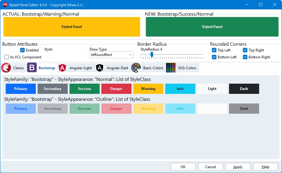
Select the panel, right-click and choose Styled Panel Editor... (the same verb is at the bottom of the Object Inspector). The Component Editor shows one tab for each family; every item is a panel drawn with the colours a panel has in that style. Click an item to copy Family, Class, Appearance and shape to the NEW panel, change Draw Type, Rounded Corners and Border Radius, check As VCL Component, and press OK or Apply.
Examples
Panel with a style:
var
  LPanel: TStyledPanel;
begin
  LPanel := TStyledPanel.CreateStyled(Self,
    BOOTSTRAP_FAMILY, btn_primary, BOOTSTRAP_NORMAL);
  LPanel.Parent := Self;
  LPanel.Align := alTop;
  LPanel.Height := 50;
  LPanel.Caption := 'Header';
  LPanel.StyleDrawType := btRoundRect;
  LPanel.StyleRadius := 8;
end;
Card with only the top corners rounded and a left aligned title:
LPanel.StyleDrawType := btRoundRect;
LPanel.StyleRadius := 16;
LPanel.StyleRoundedCorners := [rcTopLeft, rcTopRight];
LPanel.CaptionAlignment := taLeftJustify;
LPanel.CaptionMargin := 12;
Status changes the style:
if HasError then
  StatusPanel.SetPanelStyle(BOOTSTRAP_FAMILY, btn_danger, BOOTSTRAP_NORMAL)
else
  StatusPanel.SetPanelStyle(BOOTSTRAP_FAMILY, btn_success, BOOTSTRAP_NORMAL);
Default style of all the panels (in the project file after Application.Initialize):
uses
  Vcl.StyledPanel, Vcl.ButtonStylesAttributes, Vcl.BootstrapButtonStyles;
...
  TStyledPanel.RegisterDefaultRenderingStyle(btRoundRect,
    BOOTSTRAP_FAMILY, btn_light, BOOTSTRAP_NORMAL, 8);
Panel that follows the VCL Style, or that shows another VCL Style:
Panel1.AsVCLComponent := True;      //colours of a TPanel in the active style
Panel2.StyleName := 'Ruby Graphite'; //Delphi 10.4+: panel of that style
Own colours:
Panel.PanelStyleNormal.ButtonColor := clWebLightYellow;
Panel.PanelStyleNormal.BorderColor := clWebGoldenRod;
Panel.PanelStyleDisabled.FontColor := clGray;
Copy the style of a panel to another one:
Panel1.AssignStyleTo(Panel2); //family, class, appearance, shape, caption alignmentDemo and reference
- Demos: StyledPanelDemo (all the families) and the Styled Panels tab of StyledButtonVCLStylesDemo (one panel for each VCL Style).
- Reference: TStyledPanel-Reference.