
Description of TStyledCategoryButtons
TStyledCategoryButtons shows a list of buttons organized in collapsible categories, like a classic TCategoryButtons, with the styled rendering of the library.
You can define StyleFamily/StyleClass/StyleAppearance for every button at component level or change the Style on a single "Button" Item.
TStyledCategoryButtons inherits from TCategoryButtons, so you can continue to use it as the VCL component as showed in the Demo:
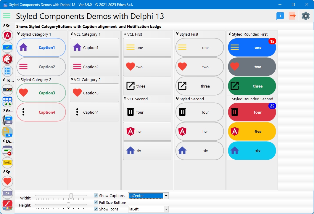
- Unit:
Vcl.StyledCategoryButtons - Palette: Styled Components
- Inheritance:
TCategoryButtons>TStyledCategoryButtons; the categories areTStyledButtonCategory(collectionTStyledButtonCategories), the buttonsTStyledButtonItem - All properties, methods and events: TStyledCategoryButtons Reference
- Live demo: TStyledCategoryButtons Demo
When to use it
Use it for application menus, navigation panels and toolboxes where the buttons are grouped in categories that the user can collapse and expand, and you want every button to have its own color or a notification badge, keeping the TCategoryButtons programming model (Categories, SelectedItem, ButtonOptions, OnButtonClicked).
Differences from TCategoryButtons
- You can define a custom style for every button in the "Categories": each
TStyledButtonItemhas its own StyleFamily, StyleClass, StyleAppearance, StyleDrawType, StyleRadius and StyleRoundedCorners. - You can specify
Flatbuttons. - The Buttons caption can be aligned also at center or right (
CaptionAlignment). - The Buttons icons can be aligned left, top, bottom, right, center (
ImageAlignment). - Additional
SpacingandImageMarginsto control the exact position of the icon and of the caption. - You can use a Notification Badge on every Button, supplied by the
OnGetNotificationBadgeInfoevent. - The buttons use a hand cursor (
ButtonsCursor) while the component keeps its ownCursor. - All the styles of the library (Classic, Bootstrap, Angular, Angular Material 3, colors) work in light and dark mode.
Design-time
Drop a TStyledCategoryButtons from the Styled Components palette. Set StyleFamily, StyleClass and StyleAppearance in the Object Inspector (the lists show the registered values), then add the categories and the buttons with the Categories collection editor.
Right click on the component to open the Component Editor (verb Styled CategoryButtons Editor...): it lets you choose family, class, appearance and shape (see Component Editor). The standard verbs of TCategoryButtons are still available.
Every button item shows its own StyleFamily, StyleClass, StyleAppearance, StyleDrawType, StyleRadius, StyleShadowSize, StyleRoundedCorners in the Object Inspector.
How an item overrides the component style
A new item copies the style of the component when it is created. The style properties of the item are saved in the .dfm only if they differ from those of the component. An item with a family, class or appearance different from the component is drawn with its own attributes (resolved once and cached); otherwise it shares the attributes of the component (ButtonStyleNormal, ButtonStyleHot...). The shape (StyleDrawType, StyleRadius, StyleRoundedCorners) and the shadow (StyleShadowSize: -1 = the one of the style family, 0 = none, greater than zero = that shadow, seen below the item and inside its area) are also taken from the item.
Examples
Create categories and buttons at runtime
uses
  Vcl.StyledCategoryButtons, Vcl.BootstrapButtonStyles;

var
  CatButtons: TStyledCategoryButtons;
  Cat: TStyledButtonCategory;
  Item: TStyledButtonItem;
begin
  CatButtons := TStyledCategoryButtons.CreateStyled(Self,
    BOOTSTRAP_FAMILY, btn_secondary, BOOTSTRAP_NORMAL);
  CatButtons.Parent := Self;
  CatButtons.Align := alLeft;
  CatButtons.Images := ImageList1;
  CatButtons.ButtonOptions := [boFullSize, boShowCaptions];

  Cat := CatButtons.Categories.Add;
  Cat.Caption := 'Navigation';

  // Items of a category are TButtonItem: cast to TStyledButtonItem
  Item := Cat.Items.Add as TStyledButtonItem;
  Item.Caption := 'Home';
  Item.ImageIndex := 0;
end;
Per-item style
// SetButtonStyle sets family, class and appearance together (an empty value keeps the component value)
Item.SetButtonStyle(BOOTSTRAP_FAMILY, btn_primary, BOOTSTRAP_OUTLINE);
// or property by property
Item.StyleClass := btn_danger;
Item.StyleDrawType := btRounded;
SetButtonStyle raises EStyledCategoryButtonsError if the combination is not registered.
Collapse a category, select a button
CatButtons.Categories[1].Collapsed := True;
if Assigned(CatButtons.SelectedItem) then
  ShowMessage(CatButtons.SelectedItem.Caption);
Image above the caption, flat buttons
CatButtons.ImageAlignment := iaTop;
CatButtons.CaptionAlignment := taCenter;
CatButtons.Flat := True;
Angular Material 3 style
uses
  Vcl.AngularButtonStyles;

CatButtons.SetCategoryButtonsStyle(ANGULAR_M3_LIGHT_FAMILY, btn_Basic, TonalAttr);
See Angular Material 3 families. SetCategoryButtonsStyle raises an exception if the combination is not available.
Notification badge
The badge of a button is provided by an event, called when each button is drawn:
procedure TForm1.CatButtonsGetNotificationBadgeInfo(
  const ACategoryIndex, AButtonItemIndex: Integer;
  var ABadgeContent: string; var ASize: TNotificationBadgeSize;
  var APosition: TNotificationBadgePosition; var AColor, AFontColor: TColor;
  var AFontStyle: TFontStyles);
begin
  if (ACategoryIndex = 0) and (AButtonItemIndex = 0) then
    ABadgeContent := IntToStr(FUnreadMessages);   // empty content = no badge
end;
Assign it to OnGetNotificationBadgeInfo and call CatButtons.Invalidate when the count changes. See the Notification Badge guide.
Replacing TCategoryButtons globally
The unit Vcl.StyledComponentsHooks declares TCategoryButtons = class(TStyledCategoryButtons) and TButtonCategory = class(TStyledButtonCategory): with it in the uses clause the TCategoryButtons of the forms become styled ones, without changing the code (the buttons are created as TStyledButtonItem). See Interposer Unit.
To define a default look for all the components of the application call once at startup:
TStyledCategoryButtons.RegisterDefaultRenderingStyle(btRounded,
  BOOTSTRAP_FAMILY, btn_primary, BOOTSTRAP_OUTLINE);