
Family, Class & Appearance Demo
Overview
This demo showcases the three-tier styling system of StyledComponents, allowing you to explore all available Families, Classes, and Appearances combinations.
What You'll Learn
- How to use different StyleFamily options
- Available StyleClass values for each family
- Different StyleAppearance variants
- How to combine families, classes, and appearances
- Icon positioning and alignment options
- Notification badges on buttons
Style Families
The demo organizes button examples into tabs for each style family:
1. Bootstrap Family

Inspired by Bootstrap framework styles:
- Classes: Primary, Secondary, Success, Danger, Warning, Info, Light, Dark
- Appearances: Normal, Outline
- Use Case: Modern web-like interfaces
Bootstrap Normal
Full-colored buttons with solid backgrounds.
Bootstrap Outline
Border-only buttons with transparent backgrounds.
2. Angular Family
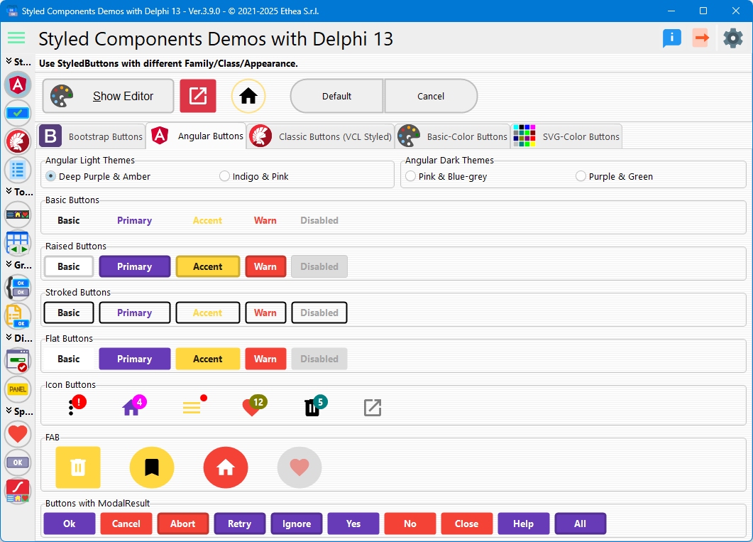
Based on Angular Material Design:
- Light Theme: Deep Purple, Indigo, Pink, Amber, Blue-Grey, Green
- Dark Theme: Pink, Purple with complementary accents
- Appearances: Raised, Stroked, Flat, Basic
- Special Buttons: FAB (Floating Action Buttons), Icon Buttons
Angular Raised
Elevated buttons with shadows (Material Design elevation).
Angular Stroked
Outlined buttons with border emphasis.
Angular Flat
Flat buttons without borders or backgrounds.
Angular Basic
Minimal style with text-only appearance.
FAB Buttons (Floating Action Buttons)
Circular buttons using StyleDrawType := btEllipse:
- Icon-only display
- Perfect for primary actions
- Material Design compliant
Icon Buttons
Square buttons with only icons:
- No captions
ImageAlignment := iaCenter- Compact layout
3. Classic Family
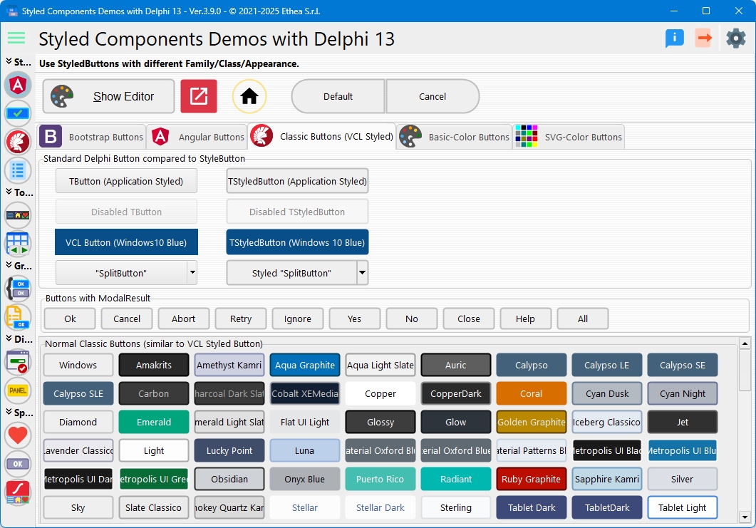
Traditional Windows-style buttons:
- Classes: Named after standard colors (Red, Blue, Green, etc.)
- Appearances: Normal, Outline
- Use Case: Classic Windows applications
4. Basic-Color Family
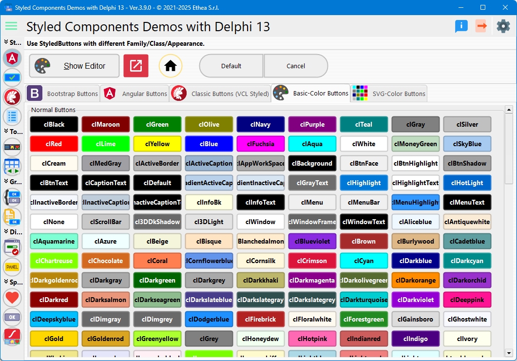
Buttons styled with actual color values:
- Classes: Actual color names (Red, Blue, Green, Yellow, etc.)
- Appearances: Normal, Outline
- Use Case: Quick color-coded interfaces
5. SVG-Color Family
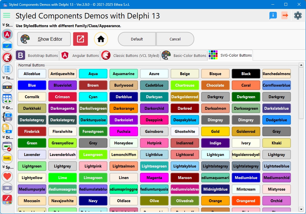
Extended color palette from SVG color names:
- Classes: Full SVG color spectrum (Crimson, DodgerBlue, ForestGreen, etc.)
- Appearances: Normal, Outline
- Use Case: Rich color variety
Dynamic Button Creation
The demo dynamically creates buttons for all available classes in each family:
procedure TfmStyledButtons.BuildFamilyPreview(
  const AFamily: TStyledButtonFamily;
  const AAppearance: TStyledButtonAppearance;
  const AFlowPanel: TFlowPanel);
var
  LClasses: TButtonClasses;
  LStyledButton: TStyledButton;
begin
  LClasses := GetButtonFamilyClasses(AFamily);

  for J := 0 to Length(LClasses)-1 do
  begin
    LStyledButton := TStyledButton.CreateStyled(Self,
      AFamily, LClasses[J], AAppearance);
    LStyledButton.Caption := LClasses[J];
    LStyledButton.Parent := AFlowPanel;
  end;
end;
Modal Result Integration
The demo includes sections showing how buttons automatically style based on ModalResult:
Bootstrap ModalResult Buttons
- mrOk, mrYes: btn_success (green)
- mrNo, mrAbort: btn_danger (red)
- mrCancel: btn_secondary (gray)
- mrHelp: btn_info (blue)
Angular ModalResult Buttons
- mrOk, mrYes: Primary color
- mrNo, mrAbort: Warn color
- mrCancel: Basic style
- mrHelp: Accent color
Classic ModalResult Buttons
- Uses appropriate classic colors based on action type
Special Features
Notification Badges
The demo includes a timer-based notification badge example:
procedure TfmStyledButtons.BadgeTimerTimer(Sender: TObject);
begin
  Inc(FNotificationCount);
  btn_IconHome.NotificationBadge.NotificationCount := FNotificationCount;
end;
Image Positioning
Examples of ImageAlignment property:
iaLeft: Icon on the left of captioniaRight: Icon on the right of captioniaTop: Icon above captioniaBottom: Icon below captioniaCenter: Icon only, no caption
Caption Alignment
Examples of CaptionAlignment property:
taLeftJustify: Left-aligned texttaCenter: Centered texttaRightJustify: Right-aligned text
Theme Switching
The Angular tab includes theme switchers:
Light Themes
- Deep Purple & Amber: Purple primary with amber accents
- Indigo & Pink: Indigo primary with pink accents
Dark Themes
- Pink & Blue-Grey: Pink primary with blue-grey accents
- Purple & Green: Purple primary with green accents
Changing themes updates all Angular buttons and icons dynamically.
Interactive Features
Button Style Editor
Click the "Edit Style" button to open the Styled Button Editor:
- Visual style selection
- Real-time preview
- All properties exposed
Square and Circular Buttons
Special buttons demonstrate different StyleDrawType:
- Square:
btRect- Perfect rectangles - Circular:
btEllipse- Perfect circles
Technical Details
Source Location
Demos/source/StyledButtonsForm.pas
Supported Versions
- Delphi 10.3+ (with ImageCollection support)
- Delphi XE6-10.2 (with legacy ImageList)
Key Components Used
TStyledButtonTFlowPanel(for dynamic layout)TPageControl(for family tabs)TVirtualImageListorTImageList
See Also
- TStyledButton Reference - Complete button documentation
- TStyledGraphicButton Reference - Graphic button variant