
TStyledPanel Demo
Overview
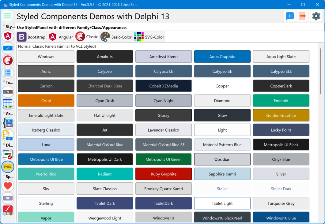
This demo showcases the TStyledPanel component across all available style families, demonstrating how panels can be styled with the same three-tier system used for buttons (Family/Class/Appearance).
What You'll Learn
- How to use TStyledPanel with different families
- Available style classes for panels
- Different appearance variants (Normal, Outline)
- Creating card-like containers
- Info, warning, and error panels
- Dynamic panel creation
- DPI-aware panel scaling
Style Families
The demo organizes panels into tabs for each style family:
1. Classic Family
Traditional Windows-style panels:
- Appearances: Normal, Outline
- Use Case: Classic application interfaces
Classic Normal
Solid-colored panels with full backgrounds.
Classic Outline
Panels with the Outline appearance of the Classic family.
2. Bootstrap Family
Bootstrap-inspired panel styles:
- Classes: Primary, Secondary, Success, Danger, Warning, Info, Light, Dark
- Appearances: Normal, Outline
- Use Case: Modern web-like interfaces, alert panels, card containers
Bootstrap Normal
Full-colored panels perfect for:
- Alert boxes
- Information cards
- Status indicators
- Section containers
Bootstrap Outline
Outlined panels ideal for:
- Card borders
- Section dividers
- Subtle containers
3. Angular Family
Material Design-inspired panels:
- Family used by the demo: Angular-Light (Angular-Dark, Angular-M3-Light and Angular-M3-Dark are available too, see Angular-M3-Families)
- Classes: Basic, Warn, Link, DeepPurple, Amber, Indigo, Pink
- Appearances: Raised, Stroked, Flat, Basic
- Use Case: Material Design applications
Angular Raised
Panels with the Raised appearance of Angular.
Angular Stroked
Panels with the Stroked appearance (border emphasis).
Angular Flat
Panels with the Flat appearance.
Angular Basic
Panels with the Basic appearance.
4. Basic-Color Family
Panels using standard color names:
- Classes: Red, Blue, Green, Yellow, etc.
- Appearances: Normal, Outline
- Use Case: Quick color-coded containers
5. SVG-Color Family
Extended color palette from SVG names:
- Classes: Full SVG color spectrum
- Appearances: Normal, Outline
- Use Case: Rich color variety for categorization
Dynamic Panel Creation
The demo dynamically creates panels for all classes in each family:
procedure TfmStyledPanel.BuildFamilyPreview(
  const AFamily: TStyledButtonFamily;
  const AAppearance: TStyledButtonAppearance;
  const AFlowPanel: TFlowPanel);
var
  J: Integer;
  LClasses: TButtonClasses;
  LStyledPanel: TStyledPanel;
begin
  LClasses := GetButtonFamilyClasses(AFamily);

  for J := 0 to Length(LClasses) - 1 do
  begin
    LStyledPanel := TStyledPanel.CreateStyled(Self,
      AFamily, LClasses[J], AAppearance);
    LStyledPanel.Width := PANEL_WIDTH;
    LStyledPanel.Height := PANEL_HEIGHT;
    LStyledPanel.Caption := LClasses[J];
    LStyledPanel.Hint := Format('%s/%s/%s',
      [AFamily, LClasses[J], AAppearance]);
    LStyledPanel.Parent := AFlowPanel;
  end;
end;
Common Use Cases
1. Alert Panels
Create informative alert boxes:
// Success alert
SuccessPanel := TStyledPanel.CreateStyled(Self,
  BOOTSTRAP_FAMILY,
  btn_success,
  BOOTSTRAP_NORMAL);
SuccessPanel.Caption := 'Operation completed successfully!';

// Warning alert
WarningPanel := TStyledPanel.CreateStyled(Self,
  BOOTSTRAP_FAMILY,
  btn_warning,
  BOOTSTRAP_NORMAL);
WarningPanel.Caption := 'Please review before proceeding';

// Error alert
ErrorPanel := TStyledPanel.CreateStyled(Self,
  BOOTSTRAP_FAMILY,
  btn_danger,
  BOOTSTRAP_NORMAL);
ErrorPanel.Caption := 'An error occurred';
2. Card Containers
Create card-style containers:
CardPanel := TStyledPanel.CreateStyled(Self,
  BOOTSTRAP_FAMILY,
  btn_light,
  BOOTSTRAP_OUTLINE);
CardPanel.StyleDrawType := btRoundRect;
CardPanel.StyleRadius := 8;
CardPanel.Caption := '';  // No caption for card
CardPanel.BevelOuter := bvNone;

// Add content controls inside
Label1.Parent := CardPanel;
Button1.Parent := CardPanel;
3. Section Dividers
Create visual section separators:
SectionPanel := TStyledPanel.CreateStyled(Self,
  BOOTSTRAP_FAMILY,
  btn_primary,
  BOOTSTRAP_NORMAL);
SectionPanel.Height := 40;
SectionPanel.Align := alTop;
SectionPanel.Caption := 'Settings Section';
SectionPanel.Font.Style := [fsBold];
4. Status Indicators
Show status with colored panels:
case Status of
  stActive:
    StatusPanel.SetPanelStyle(BOOTSTRAP_FAMILY, btn_success, BOOTSTRAP_NORMAL);
  stPending:
    StatusPanel.SetPanelStyle(BOOTSTRAP_FAMILY, btn_warning, BOOTSTRAP_NORMAL);
  stError:
    StatusPanel.SetPanelStyle(BOOTSTRAP_FAMILY, btn_danger, BOOTSTRAP_NORMAL);
  stInactive:
    StatusPanel.SetPanelStyle(BOOTSTRAP_FAMILY, btn_secondary, BOOTSTRAP_NORMAL);
end;
Panel Properties
StyleDrawType
Control panel shape:
Panel.StyleDrawType := btRoundRect;  // Rounded corners
Panel.StyleDrawType := btRounded;    // Fully rounded
Panel.StyleDrawType := btRect;       // Rectangle
Panel.StyleDrawType := btEllipse;    // Circular (width = height)
StyleRadius
Set corner radius (for btRoundRect):
Panel.StyleRadius := 8; // 8-pixel corner radiusStyleShadowSize
Set a soft shadow below the panel (it is drawn inside the area of the panel, the children stay above it; see TStyledPanel):
Panel.StyleShadowSize := 4; // 4-pixel shadow, in any family but ClassicShowCaption
Control caption visibility:
Panel.ShowCaption := True;   // Show caption
Panel.ShowCaption := False;  // Hide caption (container only)
Unique Architecture
Unlike buttons, TStyledPanel uses a simplified architecture:
- Uses
TStyledButtonAttributesdirectly (not TStyledButtonRender) - Lightweight rendering
- Optimized for container use
- Full DPI awareness
This was developed using the Vibe Coding technique with Claude Code, making it highly efficient for panel scenarios.
Creating Panels Programmatically
Simple Panel
var
  Panel: TStyledPanel;
begin
  Panel := TStyledPanel.CreateStyled(Self,
    BOOTSTRAP_FAMILY,
    btn_primary,
    BOOTSTRAP_NORMAL);
  Panel.Parent := Self;
  Panel.Align := alTop;
  Panel.Height := 50;
  Panel.Caption := 'Header';
end;
Info Panel with Content
var
  InfoPanel: TStyledPanel;
  InfoLabel: TLabel;
begin
  InfoPanel := TStyledPanel.CreateStyled(Self,
    BOOTSTRAP_FAMILY,
    btn_info,
    BOOTSTRAP_OUTLINE);
  InfoPanel.Parent := Self;
  InfoPanel.Align := alTop;
  InfoPanel.StyleDrawType := btRoundRect;
  InfoPanel.StyleRadius := 6;
  InfoPanel.ShowCaption := False;

  InfoLabel := TLabel.Create(Self);
  InfoLabel.Parent := InfoPanel;
  InfoLabel.Caption := 'This is an informational message';
  InfoLabel.Align := alClient;
  InfoLabel.Alignment := taCenter;
  InfoLabel.Layout := tlCenter;
end;
Nested Panels
var
  OuterPanel, InnerPanel: TStyledPanel;
begin
  OuterPanel := TStyledPanel.CreateStyled(Self,
    BOOTSTRAP_FAMILY,
    btn_light,
    BOOTSTRAP_OUTLINE);
  OuterPanel.Parent := Self;
  OuterPanel.ShowCaption := False;

  InnerPanel := TStyledPanel.CreateStyled(OuterPanel,
    BOOTSTRAP_FAMILY,
    btn_primary,
    BOOTSTRAP_NORMAL);
  InnerPanel.Parent := OuterPanel;
  InnerPanel.Align := alTop;
end;
Layout with Panels
Dashboard Layout
// Top header
HeaderPanel.Align := alTop;
HeaderPanel.SetPanelStyle(BOOTSTRAP_FAMILY, btn_dark, BOOTSTRAP_NORMAL);

// Left sidebar
SidebarPanel.Align := alLeft;
SidebarPanel.SetPanelStyle(BOOTSTRAP_FAMILY, btn_light, BOOTSTRAP_OUTLINE);

// Client area
ClientPanel.Align := alClient;
ClientPanel.ShowCaption := False;

// Bottom status bar
StatusPanel.Align := alBottom;
StatusPanel.SetPanelStyle(BOOTSTRAP_FAMILY, btn_secondary, BOOTSTRAP_NORMAL);
Scrolling with Many Panels
The demo uses ScrollBox containers with mouse wheel support:
procedure TfmStyledPanel.ScrollBoxMouseWheel(
  Sender: TObject;
  Shift: TShiftState;
  WheelDelta: Integer;
  MousePos: TPoint;
  var Handled: Boolean);
var
  LScrollBox: TScrollBox;
begin
  if Sender is TScrollBox then
  begin
    LScrollBox := TScrollBox(Sender);
    LScrollBox.VertScrollBar.Position :=
      LScrollBox.VertScrollBar.Position - (WheelDelta div 4);
    Handled := True;
  end;
end;
Key Differences from TPanel
TStyledPanel adds:
- StyleFamily Property: Choose from multiple families
- StyleClass Property: Select specific color/style
- StyleAppearance Property: Normal, Outline, etc.
- StyleDrawType: Rounded, RoundRect, Rect, Ellipse
- Modern Rendering: GDI+ antialiased graphics
- DPI Awareness: Automatic scaling
- Consistent Look: independent of VCL Styles in every family; the Classic family with
AsVCLComponent = True(or aStyleName) follows the VCL Style instead (see TStyledPanel)
Migration from TPanel
// Old code:
// var
//   Panel1: TPanel;

// New code:
var
  Panel1: TStyledPanel;

// All TPanel properties still work!
Panel1.Caption := 'My Panel';
Panel1.Align := alTop;
Panel1.BevelOuter := bvNone;

// Plus new styling:
Panel1.StyleFamily := BOOTSTRAP_FAMILY;
Panel1.StyleClass := btn_primary;
Panel1.StyleAppearance := BOOTSTRAP_NORMAL;
Panel1.StyleDrawType := btRoundRect;
Technical Details
Source Location
Demos/source/StyledPanelForm.pas
Component Source
source/Vcl.StyledPanel.pas
Supported Versions
All Delphi versions (XE6+)
Key Properties
| Property | Description |
|---|---|
StyleFamily | Style family (Bootstrap, Angular, etc.) |
StyleClass | Color/style class |
StyleAppearance | Appearance variant |
StyleDrawType | Panel shape |
StyleRadius | Corner radius |
StyleShadowSize | Shadow below the panel (-1 = the one of the style family, 0 = none) |
ShowCaption | Display caption |
Caption | Panel caption text |
CaptionAlignment / CaptionMargin | Alignment and margin of the caption |
StyleRoundedCorners | Corners to round |
AsVCLComponent | Follow the active VCL Style (Classic family) |
Development Notes
This component was developed using Vibe Coding with Claude Code, an AI-assisted development technique that enabled rapid prototyping and implementation.
See Also
- TStyledPanel - Component page
- TStyledPanel Reference - Complete technical documentation
- Component-Editor - Design-time editor with panel previews
- TStyledButton Reference - Related button component