
Styled Buttons and Panels with VCL Styles Demo
Overview
In the first page of this demo shows a comprehensive side-by-side comparison of standard VCL buttons and TStyledButton across all installed VCL Styles, demonstrating how StyledComponents maintain consistent appearance regardless of the active VCL Style.
The second page shows a comprehensive side-by-side comparison of the standard VCL panels and TStyledPanel across all installed VCL styles, demonstrating how StyledComponents maintain a consistent look regardless of the active VCL style.
What You'll Learn
- How TStyledButton renders independently of VCL Styles
- Comparison with standard TButton across all VCL Styles
- Different button styles (PushButton, SplitButton, CommandLink)
- Creating hundreds of buttons dynamically
- FAB (Floating Action Button) mode
- TStyledPanel rendering with VCL Styles
- Per-button VCL Style assignment (Delphi 10.4+)
Demo Layout
The demo has two main tabs:
1. Styled Buttons Tab
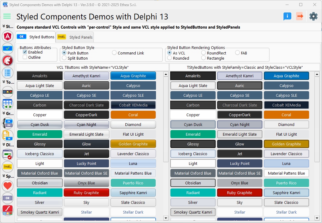
Two side-by-side scrollable panels:
Left Panel: Standard VCL Buttons
- One TButton for each installed VCL Style
- Buttons use StyleName property (Delphi 10.4+)
- Shows how each VCL Style affects standard buttons
- Renders differently based on active style
Right Panel: TStyledButton
- One TStyledButton for each VCL Style name
- Uses StyleClass to identify each style
- Consistent rendering regardless of active VCL Style
- Modern, predictable appearance
2. Styled Panels Tab
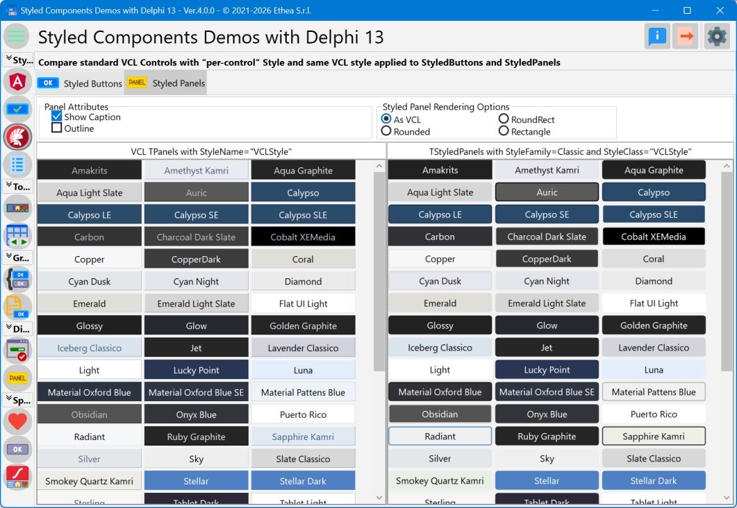
Similar layout comparing:
- Standard TPanel (left)
- TStyledPanel (right)
Both with StyleName for each VCL Style.
Render Options
Same as VCL (AsVCLComponent)
StyledButton.AsVCLComponent := True;Renders like standard VCL button (maintains VCL Style appearance).
Rounded Buttons
// All buttons with btRounded
RenderRadioGroup.ItemIndex := RENDER_ROUNDED;
Round Rectangle Buttons
// All buttons with btRoundRect
RenderRadioGroup.ItemIndex := RENDER_ROUNDRECT;
Rectangle Buttons
// All buttons with btRect
RenderRadioGroup.ItemIndex := RENDER_RECTANGLE;
FAB (Floating Action Buttons)
// Circular icon buttons
RenderRadioGroup.ItemIndex := RENDER_FAB;
Button.StyleDrawType := btEllipse;
Button.Images := ImageList;
Button.ImageAlignment := iaCenter;
Button Style Options
Push Button (bsPushButton)
Standard clickable button:
Button.Style := bsPushButton;Split Button (bsSplitButton)
Button with dropdown menu:
Button.Style := bsSplitButton;
Button.DropDownMenu := PopupMenu1;
Command Link (bsCommandLink)
Button with main caption and hint:
Button.Style := bsCommandLink;
Button.Caption := 'Action';
Button.CommandLinkHint := 'Description of action...';
Command links are taller and include explanatory text.
Dynamic Button Creation
The demo creates buttons dynamically for all installed VCL Styles:
Get Available Styles
procedure BuildStyleList;
var
  I: integer;
begin
  FStyleNames := TStringList.Create;
  for I := 0 to High(TStyleManager.StyleNames) do
    FStyleNames.Add(TStyleManager.StyleNames[i]);
  FStyleNames.Sorted := True;
end;
Create VCL Buttons
procedure CreateVCLButton(AColumn, ATop: Integer; AStyleName: string);
var
  LButton: TButton;
begin
  LButton := TButton.Create(Self);
  LButton.SetBounds(AColumn * LWidth + MARGIN,
    ATop, LWidth, LHeight);
  LButton.Style := bsPushButton;  // or bsSplitButton, bsCommandLink
  {$IFDEF D10_4+}
  LButton.StyleName := AStyleName;  // Per-button style
  {$ENDIF}
  LButton.Caption := AStyleName;
  LButton.Parent := LeftScrollBox;
end;
Create Styled Buttons
procedure CreateStyledButton(AColumn, ATop: Integer; AStyleName: string);
var
  LButton: TStyledButton;
  LAsVcl: Boolean;
begin
  LAsVcl := RenderRadioGroup.ItemIndex = RENDER_SAME_AS_VCL;

  LButton := TStyledButton.CreateStyled(Self,
    DEFAULT_CLASSIC_FAMILY,
    AStyleName,  // Use style name as class
    DEFAULT_APPEARANCE,
    DEFAULT_STYLEDRAWTYPE,
    DEFAULT_CURSOR,
    not LAsVcl);  // AsVCLComponent parameter

  LButton.SetBounds(AColumn * LWidth + MARGIN,
    ATop, LWidth, LHeight);

  case RenderRadioGroup.ItemIndex of
    RENDER_ROUNDED: LButton.StyleDrawType := btRounded;
    RENDER_ROUNDRECT: LButton.StyleDrawType := btRoundRect;
    RENDER_RECTANGLE: LButton.StyleDrawType := btRect;
    RENDER_FAB:
    begin
      LButton.StyleDrawType := btEllipse;
      LButton.Images := ImageList;
      LButton.ImageAlignment := iaCenter;
      LButton.ImageIndex := I mod ImageList.Count;
    end;
  end;

  LButton.Caption := AStyleName;
  LButton.Parent := RightScrollBox;
end;
Layout Algorithm
Buttons are arranged in a grid:
LColumn := (I mod ButtonsInColumn);  // Column position
LRow := (I div ButtonsInColumn);     // Row position
Top := LRow * (ButtonHeight + MARGIN);
Left := LColumn * (ButtonWidth + MARGIN);
The number of columns adjusts based on panel width.
Responsive Resizing
The demo recalculates layout on resize:
procedure TfmStyledButtonVCLStyles.FormResize(Sender: TObject);
begin
  if LeftPanel.Width <> ClientWidth div 2 then
  begin
    LeftPanel.Width := ClientWidth div 2;
    CreateAllButtons(False);  // Rebuild layout
  end;
end;
Mouse Wheel Scrolling
Enhanced scrolling for large button lists:
procedure ScrollBoxMouseWheel(Sender: TObject; Shift: TShiftState;
  WheelDelta: Integer; MousePos: TPoint; var Handled: Boolean);
var
  msg, code: Cardinal;
  i, n: Integer;
begin
  Handled := True;
  if ssShift in Shift then
    msg := WM_HSCROLL
  else
    msg := WM_VSCROLL;

  if WheelDelta > 0 then
    code := SB_LINEUP
  else
    code := SB_LINEDOWN;

  n := Mouse.WheelScrollLines * 4;  // Speed up
  for i := 1 to n do
  begin
    LeftScrollBox.Perform(msg, code, 0);
    RightScrollBox.Perform(msg, code, 0);
  end;

  LeftScrollBox.Perform(msg, SB_ENDSCROLL, 0);
  RightScrollBox.Perform(msg, SB_ENDSCROLL, 0);
end;
VCL Styles Comparison
The demo shows how each VCL Style affects rendering:
Standard TButton
- Appearance changes with active VCL Style
- Each button can have StyleName (10.4+)
- Inconsistent across styles
- Limited customization
TStyledButton
- Consistent appearance across all VCL Styles
- Independent rendering (GDI+)
- Full customization options
- Modern, predictable look
Key Observations
1. Independence from VCL Styles
TStyledButton renders the same regardless of:
- Active VCL Style
- Windows theme
- System colors
2. Per-Button Styling (Delphi 10.4+)
Standard TButton can use StyleName:
Button1.StyleName := 'Windows10 Blue';
Button2.StyleName := 'Glow';
But still limited compared to TStyledButton customization.
3. AsVCLComponent Property
When set to True, TStyledButton mimics VCL rendering:
StyledButton.AsVCLComponent := True;Useful for gradual migration or hybrid interfaces.
Styled Panels Comparison
The second tab shows TStyledPanel vs. TPanel:
Standard TPanel
- Uses VCL Style colors
- Requires ParentBackground := False for styling
- Appearance varies by style
TStyledPanel
- Consistent styled rendering
- Independent of VCL Styles
- Full customization options
Interactive Controls
For Buttons
- Render Options: Same as VCL, Rounded, RoundRect, Rectangle, FAB
- Style Options: PushButton, SplitButton, CommandLink
- Enabled Checkbox: Enable/disable all buttons
- Outline Checkbox: Use outline appearance
For Panels
- Render Options: Same as VCL, Rounded, RoundRect, Rectangle
- Show Caption: Toggle panel captions
- Outline Checkbox: Use outline appearance
Performance
The demo creates hundreds of buttons:
- ~50+ VCL Styles × 2 = 100+ buttons total
- Dynamic creation/destruction
- Efficient layout calculation
- Smooth scrolling
Use Cases
1. Style Independence
Applications that must look the same regardless of VCL Style.
2. Custom Branding
Corporate colors and styles that don't match any VCL Style.
3. Modern UI
Web-like or Material Design interfaces.
4. Consistent Multi-Platform
Same look across different Windows versions.
Technical Details
Source Location
Demos/source/StyledButtonVCLStylesForm.pas
Supported Versions
- All Delphi versions (XE6+)
- Per-button StyleName requires Delphi 10.4+
Key Constants
const
  RENDER_SAME_AS_VCL = 0;
  RENDER_ROUNDED = 1;
  RENDER_ROUNDRECT = 2;
  RENDER_RECTANGLE = 3;
  RENDER_FAB = 4;

  STYLE_PUSHBUTTON = 0;
  STYLE_SPLITBUTTON = 1;
  STYLE_COMMANDLINK = 2;
Button Sizing
- Width: 150px (180px for CommandLinks)
- Height: 28px (68px for CommandLinks)
- Margin: 4px
- FAB: 56x56px
Best Practices
1. Consistent Rendering
Use TStyledButton when you need:
- Same look across VCL Styles
- Custom branding
- Modern appearance
2. VCL Compatibility
Use AsVCLComponent := True when:
- Migrating gradually
- Need VCL Style integration
- Hybrid interfaces
3. Performance
For large button counts:
- Create dynamically
- Use flow panels
- Implement virtual scrolling
See Also
- TStyledButton Reference - Complete button documentation
- TStyledPanel Reference - Panel documentation