
TStyledToolbar examples
Short examples for TStyledToolbar and TStyledToolButton. The properties are described in TStyledToolbar-Reference and TStyledToolButton-Reference; the demo is StyledToolbarDemo.
In this picture, the Toolbar Demo compares the StyledToolbar and the classic Toolbar:
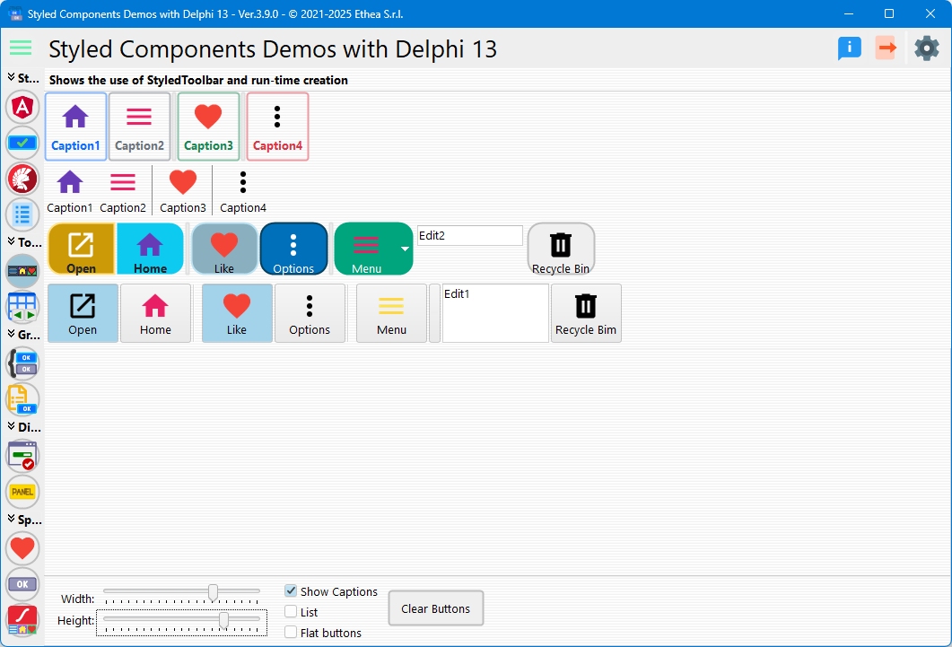
The major difference is the control of the "size" of the buttons when ShowCaptions is True: in the standard TToolBar the width is defined by the largest caption, in the TStyledToolbar it is always defined by ButtonWidth.
All the examples use these units:
uses
  Vcl.StyledToolbar, Vcl.StyledButton, Vcl.ButtonStylesAttributes,
  Vcl.StandardButtonStyles, Vcl.BootstrapButtonStyles, Vcl.AngularButtonStyles;
Run-time creation
NewButton creates a button of the class returned by the toolbar, applies the toolbar style and size and returns True if the button was created. The second parameter is the style of the button (default tbsButton).
procedure TMainForm.CreateToolbar;
var
  LToolbar: TStyledToolbar;
  LButton: TStyledToolButton;
begin
  LToolbar := TStyledToolbar.Create(Self);
  LToolbar.Parent := Self;
  LToolbar.Images := VirtualImageList;
  LToolbar.ShowCaptions := True;
  LToolbar.ButtonWidth := 80;
  LToolbar.ButtonHeight := 48;

  if LToolbar.NewButton(LButton) then
  begin
    LButton.Caption := 'New';
    LButton.ImageIndex := 0;
    LButton.OnClick := NewClick;
  end;
end;
To remove all the buttons call LToolbar.ClearButtons. When you add or change many buttons you can wrap the work in BeginUpdate / EndUpdate: the resize of the buttons is executed once, at EndUpdate.
LToolbar.BeginUpdate;
try
  LToolbar.ClearButtons;
  for I := 0 to 9 do
    if LToolbar.NewButton(LButton) then
    begin
      LButton.Caption := Format('Item %d', [I]);
      LButton.ImageIndex := I;
    end;
finally
  LToolbar.EndUpdate;
end;
Wrapping, Wrapable and AutoSize
With Wrapable = True (the default) the buttons that do not fit go on the next row. With AutoSize = True the toolbar grows to show all the rows (a toolbar with Align = alTop changes its height, one with alLeft its width).
LToolbar.Align := alTop;
LToolbar.Wrapable := True;
LToolbar.AutoSize := True;   //the height follows the rows of buttons
A single row, as the classic toolbar, does not wrap:
LToolbar.Wrapable := False;
LToolbar.AutoSize := True;
ButtonWidth and ButtonHeight are scaled with the DPI of the monitor together with the toolbar.
Button styles
The style of the toolbar is used by all the buttons:
//Bootstrap, outline buttons
LToolbar.SetToolbarStyle(BOOTSTRAP_FAMILY, btn_primary, BOOTSTRAP_OUTLINE);
//Angular Material 3, filled buttons
LToolbar.SetToolbarStyle(ANGULAR_M3_LIGHT_FAMILY, btn_Basic, FilledAttr);
//Round buttons
LToolbar.StyleDrawType := btRounded;
//Rectangular buttons with a radius of 4 pixels
LToolbar.StyleDrawType := btRoundRect;
LToolbar.StyleRadius := 4;
Or, when you create it:
LToolbar := TStyledToolbar.CreateStyled(Self,
  ANGULAR_LIGHT_FAMILY, btn_PrimaryIndigo, RaisedAttr);
SetToolbarStyle raises EStyledButtonError if the combination Family/Class/Appearance does not exist.
A different style for one button
A button that has its own style keeps it when the style of the toolbar changes:
if LToolbar.NewButton(LButton) then
begin
  LButton.Caption := 'Delete';
  LButton.ImageIndex := 3;
  LButton.SetButtonStyle(BOOTSTRAP_FAMILY, btn_danger, BOOTSTRAP_NORMAL);
end;
Images
Images (and DisabledImages) of the toolbar are shared by all the buttons; a button uses ImageIndex (or ImageName, Delphi 10.4+). HotImageIndex, PressedImageIndex, SelectedImageIndex and DisabledImageIndex select a different image for each state.
LToolbar.Images := VirtualImageList;
LToolbar.DisabledImages := DisabledImageList;
LToolbar.ShowCaptions := True;
LToolbar.List := True;           //image on the left of the caption

LButton.ImageIndex := 2;
LButton.ImageAlignment := iaTop; //used with ShowCaptions and List = False
Drop-down menus
A tbsDropDown button is a split button: the click on the arrow shows the DropDownMenu. A normal button with a DropDownMenu shows the menu when it is clicked.
if LToolbar.NewButton(LButton, tbsDropDown) then
begin
  LButton.Caption := 'Open';
  LButton.ImageIndex := 1;
  LButton.DropDownMenu := OpenPopupMenu;
  LButton.OnClick := OpenClick;                  //click on the main part
  LButton.OnDropDownClick := OpenDropDownClick;  //click on the arrow
end;
Separators and check buttons
LToolbar.NewButton(LButton);                 //Cut
LToolbar.NewButton(LButton);                 //Copy
LToolbar.NewButton(LSeparator, tbsSeparator);

if LToolbar.NewButton(LBold, tbsCheck) then  //toggle button
  LBold.Caption := 'B';

LToolbar.NewButton(LSeparator, tbsDivider);
Separator and divider get the width DEFAULT_TOOLBUTTON_SEP_WIDTH (6 pixels); change Width to make them larger. Check buttons with Grouped = True behave as radio buttons.
Notification badge
LButton.NotificationBadge.NotificationCount := 3;
LButton.NotificationBadge.Color := clRed;
LButton.NotificationBadge.FontColor := clWhite;
//a dot without text
LButton.NotificationBadge.Size := nbsSmallDot;
See the Notification Badge guide.
Events of the toolbar
OnToolButtonClick is called when any button is clicked (after the OnClick of the button), OnCustomizeNewButton lets you create your own button class in NewButton, OnCustomizeAdded is called when a button is inserted in the toolbar.
procedure TMainForm.StyledToolbar1ToolButtonClick(Sender: TObject);
begin
  //Sender is the clicked TStyledToolButton
  StatusBar1.SimpleText := TStyledToolButton(Sender).Caption;
end;

procedure TMainForm.StyledToolbar1CustomizeAdded(Sender: TStyledToolbar;
  AButton: TCustomStyledGraphicButton);
begin
  AButton.ShowHint := True;
end;
Order of the buttons
Assign SortOrder to the buttons and call SortBySortOrder to reorder them:
LThird.SortOrder := 300;
LFirst.SortOrder := 100;
LSecond.SortOrder := 200;
LToolbar.SortBySortOrder;   //First, Second, Third