
Description of TStyledAnimatedButton
| Component | Description |
|---|---|
 | TStyledAnimatedButton is a TStyledButton with an "animated icon": a Skia TSkAnimatedImage (Lottie animation) is placed inside the button instead of the ImageList image. You choose the events that start the animation: AnimateOnMouseOver, AnimateOnClick, AnimateAlways, AnimateOnFocus. |
Unit: Vcl.StyledAnimatedButton.pas. Palette page: Styled Animated Components. It requires Skia4Delphi and the animated packages (see below).
Prerequisites
- Skia4Delphi installed in the IDE (it is already included in Delphi 12 and 13; for the other versions install it from here). The components use
Vcl.SkiaandSystem.Skia. - The StyledAnimatedComponents (runtime) and dclStyledAnimatedComponents (design-time) packages, from the group 2.Vcl.StyledAnimatedComponents.groupproj in the folder of your Delphi version (for example
Packages\D13). Build the runtime package first, then install the design-time one. The runtime package requiresStyledComponents,Skia.Package.VCLandSkia.Package.RTL; the design-time one requiresdclStyledComponentsandSkia.Package.VCL.Designtime. See Installation. - Delphi versions: the animated packages exist for Delphi XE7 up to Delphi 13 (there is no animated package for Delphi XE6).
- The animated units are not part of the core
StyledComponentspackage: an application that uses the animated button must addVcl.StyledAnimatedButtonto itsusesclause and link the Skia4Delphi runtime (sk4d.dllis deployed by the demo project).
How it works and how it differs from TStyledButton
- It inherits everything from
TStyledButton(StyleFamily/StyleClass/StyleAppearance, ModalResult, Default/Cancel, badge, AutoClick...), see the TStyledButton Reference. The rendering class isTStyledAnimatedButtonRender, which reserves the room of the animation exactly as it does for an image of the ImageList (soImageAlignment,ImageMargins,Layout... apply to the animation too). - The animation is a child
TSkAnimatedImagecreated on demand (propertyAnimatedImage). Clicking, double-clicking or moving the mouse on it is forwarded to the button. - At rest the animation is stopped on the last frame (Progress = 1), so the button always shows a complete icon. At design time the animation starts when the form is loaded.
- The animation can be loaded from the
AnimationSourceproperty (the Lottie JSON is stored in the DFM as binary propertyAnimationData), from a file, from a stream or from a resource. - The size of the animation is automatic (
AutoSizeAnimation = True: the smaller side of the button minusAutoSizeAnimationMarginon each side). SettingAnimationWidthorAnimationHeightswitchesAutoSizeAnimationoff.
When the animation starts: AutoAnimationTypes
Value (TAutoAnimationType) | The animation plays... |
|---|---|
AnimateOnMouseOver (default) | when the mouse enters the button (or the image, see AnimateOnType) and stops when it leaves |
AnimateOnClick | at every click |
AnimateAlways | continuously in loop (it sets AnimationLoop to True) |
AnimateOnFocus | when the button gets the focus and stops when it loses it |
AnimateOnType (TAnimateOnType) decides, for AnimateOnMouseOver, if the mouse must be over the whole button (AnimateOnButton, default) or only over the image (AnimateOnImage).
Design-time
- Property editor of
AnimationSource: the button...of the Object Inspector opens the Skia Animated Image editor, where you load a Lottie.jsonfile and see a preview. It is the same editor ofTSkAnimatedImage. - Component Editor (context menu of the button on the form, see Component Editor):
- Styled Button Editor... : choose StyleFamily, StyleClass and StyleAppearance.
- Animation Editor... : the same Skia editor of the property.
- Project page on GitHub...
- Lottie animations to try are in the folder
Animationsof the repository (add.json,bin.json,calendar.json,heart.json,mail.json...; seeAnimations\License.htmlfor the license).
Demo
Run the main demo StyledComponentsDemo and choose Animated Buttons (form AnimatedButtonsForm.pas, class TfmAnimatedButtons): it creates many TStyledAnimatedButton at run-time with different animations and lets you change AutoAnimationTypes, AnimationLoop, AnimationInverse and the image alignment of all of them.
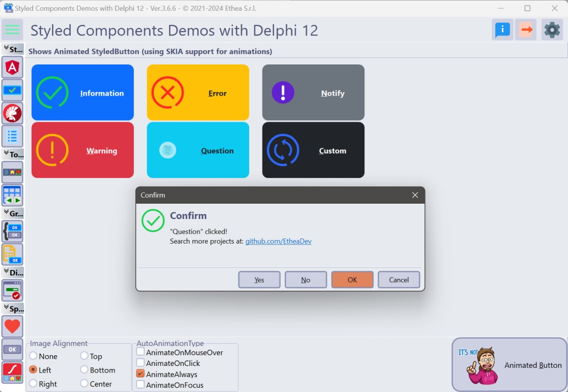
The animated demo is compiled only if the project defines the SKIA conditional symbol: in the context menu of the StyledComponentsDemo project choose Enable SKIA (the symbol is in the Conditional defines of the project options; in the Delphi 13 project it may already be set). With SKIA defined AnimatedButtonsForm and Skia.Vcl.StyledTaskDialogAnimatedUnit are linked (the latter also provides the animated dialogs and the Lottie resources the demo uses: STYLEDTASKLOTTIE_INFORMATION, _WARNING, _ERROR, _QUESTION, _NOTIFY, _CUSTOM). Without the symbol the Animated Buttons item only shows a message that Skia4Delphi is required.
Code examples
1. Create an animated button at run-time
uses
  Vcl.StyledButton, Vcl.StyledAnimatedButton, Vcl.BootstrapButtonStyles;

var
  LButton: TStyledAnimatedButton;
begin
  LButton := TStyledAnimatedButton.Create(Self);
  LButton.Parent := Self;
  LButton.SetBounds(16, 16, 160, 48);
  LButton.Caption := 'Save';
  LButton.StyleFamily := BOOTSTRAP_FAMILY;
  LButton.StyleClass := btn_success;
  LButton.LoadAnimationFromFile('..\Animations\check.json');
end;
2. Load the animation from a resource
//The Lottie file is linked in the executable as RCDATA
//(MYANIM RCDATA "check.json" in a .rc file compiled to .res)
LButton.LoadAnimationFromResource('MYANIM');

//The icons of the animated dialogs are available too when the unit
//Skia.Vcl.StyledTaskDialogAnimatedUnit is in the project (Animations.RES):
//STYLEDTASKLOTTIE_INFORMATION, _WARNING, _ERROR, _QUESTION, _NOTIFY, _CUSTOM, _SHIELD
LButton.LoadAnimationFromResource('STYLEDTASKLOTTIE_INFORMATION');
3. Choose when the animation plays
LButton.AutoAnimationTypes := [AnimateOnMouseOver, AnimateOnClick];
LButton.AnimateOnType := AnimateOnImage;   //hot only over the icon
4. Always animated, looping, reversed
LButton.AnimationLoop := True;
LButton.AnimationInverse := True;
LButton.AutoAnimationTypes := [AnimateAlways];
5. Start / stop the animation by code
if LButton.CanPlayAnimation then
  LButton.StartAnimation(False, False, 0); //ALoop, AInverse, AProgress (0..1)
...
LButton.PauseAnimation;
LButton.ResumeAnimation;
if LButton.AnimationIsRunning then
  LButton.StopAnimation;        //stops on the last frame
6. Fixed size of the animation
LButton.AutoSizeAnimation := False;
LButton.AnimationWidth := 40;
LButton.AnimationHeight := 40;
7. Create with a given style (as the demo does)
LButton := TStyledAnimatedButton.CreateStyled(Self,
  BOOTSTRAP_FAMILY, btn_primary, BOOTSTRAP_NORMAL);
LButton.Parent := Panel1;
LButton.AutoSizeAnimationMargin := 20;
LButton.LoadAnimationFromResource('STYLEDTASKLOTTIE_NOTIFY');
LButton.AutoAnimationTypes := [AnimateOnMouseOver];
Known limits
TStyledAnimatedButtonis a windowed button (TStyledButton): there is no animated version ofTStyledGraphicButtonorTStyledSpeedButton.- Only the inherited, non-animated image of the ImageList is replaced: if
Images/ImageIndexare assigned, the ImageList image is used for the size calculation first (the animation takes its size only when there is no ImageList image).