
TStyledCategoryButtons Demo
Overview
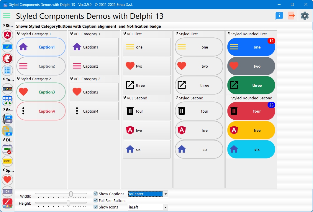
This demo compares TStyledCategoryButtons with the standard VCL TCategoryButtons, showing how to create modern categorized button lists with individual button styling and collapsible categories.
What You'll Learn
- How to create TStyledCategoryButtons with categories
- Adding styled button items to categories
- Comparison with standard TCategoryButtons
- Using notification badges on category items
- Collapsible category groups
- Image and caption alignment options
- Per-category and per-item styling
CategoryButtons Comparison
The demo creates category button controls side-by-side:
Standard TCategoryButtons (Left)
Shows the classic VCL TCategoryButtons for comparison.
TStyledCategoryButtons (Right)
Modern styled category buttons with:
- Individual button styling per item
- Per-category customization
- Notification badge support
- Collapsible categories
- Consistent appearance
Dynamic CategoryButtons Creation
Creating Standard CategoryButtons
procedure TfmStyledCategoryButtons.CreateCategoryButtons;
begin
  FCategoryButtons := TCategoryButtons.Create(Self);
  FCategoryButtons.Parent := Self;
  FCategoryButtons.Align := alLeft;
  FCategoryButtons.ButtonOptions := [boFullSize, boShowCaptions];
  FCategoryButtons.Images := VirtualImageList;
  FCategoryButtons.ButtonWidth := BUTTON_WIDTH;
  FCategoryButtons.ButtonHeight := BUTTON_HEIGHT;
end;
Creating TStyledCategoryButtons
procedure TfmStyledCategoryButtons.CreateStyledCategoryButtons;
begin
  FStyledCategoryButtons := TStyledCategoryButtons.Create(Self);
  FStyledCategoryButtons.Parent := Self;
  FStyledCategoryButtons.Align := alLeft;
  FStyledCategoryButtons.ButtonOptions := [boFullSize, boShowCaptions];
  FStyledCategoryButtons.Images := VirtualImageList;
  FStyledCategoryButtons.ButtonWidth := BUTTON_WIDTH;
  FStyledCategoryButtons.ButtonHeight := BUTTON_HEIGHT;
end;
Creating Categories and Items
Adding Categories
var
  LCategory: TStyledButtonCategory;
begin
  // Create first category
  LCategory := FStyledCategoryButtons.Categories.Add;
  LCategory.Caption := 'Styled Category 1';
end;
Adding Items to Categories
function TfmStyledCategoryButtons.AddStyledButtonToCategoryButtons(
  var ACategory: TStyledButtonCategory;
  const ACaption: string;
  const AImageIndex: Integer;
  const AFamily: TStyledButtonFamily;
  const AClass: TStyledButtonClass;
  const AAppearance: TStyledButtonAppearance): TStyledButtonItem;
begin
  Result := ACategory.Items.Add as TStyledButtonItem;
  Result.Caption := ACaption;
  Result.Hint := Format('Hint of %s button.', [ACaption]);
  Result.ImageIndex := AImageIndex;
  Result.SetButtonStyle(AFamily, AClass, AAppearance);
end;
Complete Example
var
  LCategory: TStyledButtonCategory;
begin
  // Category 1
  LCategory := CategoryButtons.Categories.Add;
  LCategory.Caption := 'File Operations';

  AddStyledButtonToCategoryButtons(LCategory, 'New', 0,
    BOOTSTRAP_FAMILY, btn_primary, BOOTSTRAP_OUTLINE);
  AddStyledButtonToCategoryButtons(LCategory, 'Open', 5,
    BOOTSTRAP_FAMILY, btn_secondary, BOOTSTRAP_OUTLINE);

  // Category 2
  LCategory := CategoryButtons.Categories.Add;
  LCategory.Caption := 'Edit Operations';

  AddStyledButtonToCategoryButtons(LCategory, 'Cut', 8,
    BOOTSTRAP_FAMILY, btn_success, BOOTSTRAP_OUTLINE);
  AddStyledButtonToCategoryButtons(LCategory, 'Paste', 10,
    BOOTSTRAP_FAMILY, btn_danger, BOOTSTRAP_OUTLINE);
end;
Category Features
Collapsible Categories
Click on category header to collapse/expand:
// Collapse a category
CategoryButtons.Categories[0].Collapsed := True;

// Expand a category
CategoryButtons.Categories[0].Collapsed := False;
Category Styling
Each category can have custom appearance:
- Header color
- Border style
- Gradient fill
- Custom font
Button Options
Full Size Mode (boFullSize)
Buttons fill the full width:
CategoryButtons.ButtonOptions := CategoryButtons.ButtonOptions + [boFullSize];Show Captions (boShowCaptions)
Display button captions:
CategoryButtons.ButtonOptions := CategoryButtons.ButtonOptions + [boShowCaptions];Bold Category Captions
Draw the category headers in bold:
CategoryButtons.ButtonOptions := CategoryButtons.ButtonOptions + [boBoldCaptions];Use Plus/Minus Icons
Show +/- icons for expand/collapse:
CategoryButtons.ButtonOptions := CategoryButtons.ButtonOptions + [boUsePlusMinus];Notification Badges
The demo includes notification badges on category items:
procedure TfmStyledCategoryButtons.StyledCategoryButtonsBootstrapGetNotificationBadgeInfo(
  const ACategoryIndex, AButtonItemIndex: Integer;
  var ABadgeContent: string;
  var ASize: TNotificationBadgeSize;
  var APosition: TNotificationBadgePosition;
  var AColor, AFontColor: TColor;
  var AFontStyle: TFontStyles);
begin
  if (ACategoryIndex = 0) and (AButtonItemIndex = 0) then
    ABadgeContent := IntToStr(FNotificationCount + 10)
  else if (ACategoryIndex = 1) and (AButtonItemIndex = 0) then
  begin
    AColor := clBlue;
    ABadgeContent := IntToStr(FNotificationCount + 20);
  end;
end;
Badge Features
- Per-item badges
- Category and item index-based
- Custom colors
- Custom positions
- Numeric or text content
Image and Caption Alignment
Caption Alignment
CategoryButtons.CaptionAlignment := taLeftJustify;   // Left-aligned
CategoryButtons.CaptionAlignment := taCenter;        // Centered
CategoryButtons.CaptionAlignment := taRightJustify;  // Right-aligned
Image Alignment
CategoryButtons.ImageAlignment := iaLeft;    // Image on left
CategoryButtons.ImageAlignment := iaRight;   // Image on right
CategoryButtons.ImageAlignment := iaTop;     // Image on top
CategoryButtons.ImageAlignment := iaBottom;  // Image on bottom
CategoryButtons.ImageAlignment := iaCenter;  // Image centered (no caption)
Interactive Controls
| Control | Function |
|---|---|
| Width Trackbar | Adjust button width |
| Height Trackbar | Adjust button height |
| Show Caption | Toggle caption visibility |
| Full Size | Toggle full-size mode |
| Show Icon | Toggle icon visibility |
| Caption Alignment | Change caption alignment |
| Image Alignment | Change image position |
Button Click Handling
procedure TfmStyledCategoryButtons.CategoryButtonsButtonClicked(
  Sender: TObject;
  const Button: TButtonItem);
begin
  if Assigned(Button) then
    StyledShowMessage(Button.Caption);
end;
Selected Item
Access the currently selected button:
var
  SelectedItem: TButtonItem;
begin
  SelectedItem := CategoryButtons.SelectedItem;
  if Assigned(SelectedItem) then
    ShowMessage(SelectedItem.Caption);
end;
Design-Time Category Buttons
The demo shows category buttons created at design-time:
Classic Style
- Standard VCL appearance
- Collapsible categories
Bootstrap Style
- Modern Bootstrap styling
- Notification badges
- Per-item custom colors
Flat Appearance
Enable flat mode for modern look:
CategoryButtons.Flat := True;Flat mode removes 3D borders and uses flat colors.
Creating CategoryButtons Programmatically
Complete example with multiple categories:
var
  CatButtons: TStyledCategoryButtons;
  Cat: TStyledButtonCategory;
  Item: TStyledButtonItem;
begin
  // Create component
  CatButtons := TStyledCategoryButtons.CreateStyled(Self,
    BOOTSTRAP_FAMILY,
    btn_primary,
    BOOTSTRAP_NORMAL);
  CatButtons.Parent := Self;
  CatButtons.Align := alLeft;
  CatButtons.Images := ImageList1;
  CatButtons.Flat := True;

  // Add first category
  Cat := CatButtons.Categories.Add;
  Cat.Caption := 'Navigation';

  Item := Cat.Items.Add as TStyledButtonItem;
  Item.Caption := 'Home';
  Item.ImageIndex := 0;
  Item.SetButtonStyle(BOOTSTRAP_FAMILY, btn_primary, BOOTSTRAP_NORMAL);

  // Add second category
  Cat := CatButtons.Categories.Add;
  Cat.Caption := 'Tools';
  Cat.Collapsed := True;  // Start collapsed

  Item := Cat.Items.Add as TStyledButtonItem;
  Item.Caption := 'Settings';
  Item.ImageIndex := 1;
  Item.SetButtonStyle(BOOTSTRAP_FAMILY, btn_secondary, BOOTSTRAP_NORMAL);
end;
Key Differences from TCategoryButtons
TStyledCategoryButtons adds:
- Per-Item Styling: Each item can have unique Family/Class/Appearance
- Notification Badges: Built-in badge support per item
- Modern Rendering: Consistent look across Windows versions
- Enhanced Customization: More visual control
- DPI Awareness: Automatic scaling
- Extended Layout: More image/caption positioning options
Use Cases
Application Menus
Create collapsible menu systems:
- File operations category
- Edit operations category
- View options category
- Tools category
Navigation Panels
Organize navigation by topic:
- Main sections as categories
- Sub-pages as items
- Visual hierarchy
Toolboxes
Group related tools:
- Drawing tools category
- Selection tools category
- Editing tools category
Technical Details
Source Location
Demos/source/StyledCategoryButtonsForm.pas
Supported Versions
All Delphi versions (XE6+)
Key Properties
| Property | Description |
|---|---|
Categories | Collection of button categories |
SelectedItem | Currently selected button item |
ButtonOptions | Layout and display options |
ButtonWidth | Button width |
ButtonHeight | Button height |
Images | ImageList for icons |
ImageAlignment | Icon position relative to caption |
CaptionAlignment | Caption text alignment |
Flat | Flat appearance mode |
Key Events
| Event | Description |
|---|---|
OnButtonClicked | Fires when item is clicked |
OnCategoryCollapase | Fires when category collapses (spelled so in the VCL) |
OnGetNotificationBadgeInfo | Provides badge information |
See Also
- TStyledCategoryButtons - Description and examples
- TStyledCategoryButtons Reference - Complete technical documentation
- TStyledButtonGroup Reference - Simple button group
- TStyledButton Reference - Base button component