
TStyledDbNavigator Demo
Overview
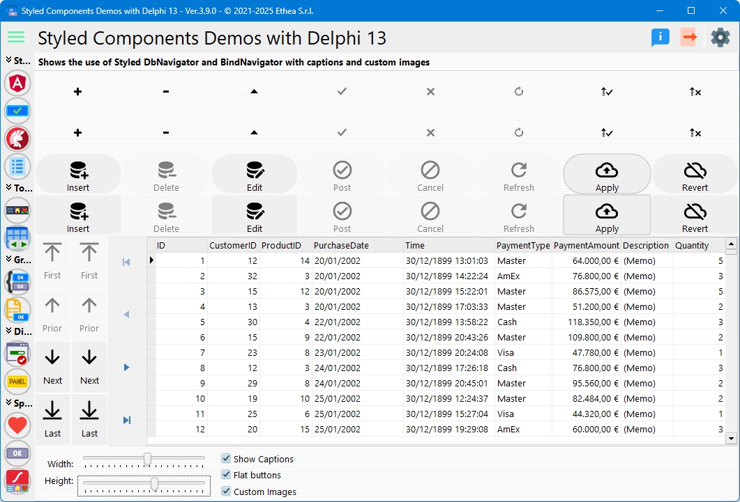
This demo showcases TStyledDbNavigator and TStyledBindNavigator, comparing them with the standard VCL TDBNavigator and TBindNavigator. It demonstrates how to add modern styling to database navigation controls.
What You'll Learn
- How to use TStyledDbNavigator with datasets
- How to use TStyledBindNavigator with LiveBindings
- Comparison with standard navigators
- Configuring navigator appearance
- Custom button images
- Enabling/disabling buttons conditionally
- Horizontal and vertical layouts
Navigator Types
The demo compares three navigator types:
1. TDBNavigator (Standard VCL)
Classic database navigator for comparison.
2. TStyledDbNavigator
Styled version of TDBNavigator:
- Modern appearance
- Customizable styling
- Same functionality as TDBNavigator
- Compatible with all TDataSource datasets
3. TStyledBindNavigator
Styled navigator for LiveBindings:
- Works with TBindSourceDB
- Modern appearance
- LiveBindings integration
Dynamic Navigator Creation
Creating TStyledDbNavigator
procedure TfmStyledDbNavigator.CreateStyledDbNavigator;
begin
  FStyledDbNavigator := TStyledDbNavigator.Create(Self);
  FStyledDbNavigator.Flat := FLAT_BUTTONS;
  FStyledDbNavigator.ShowCaptions := SHOW_CAPTIONS;
  FStyledDbNavigator.Align := DBNAV_ALIGN;
  FStyledDbNavigator.Kind := DBNAV_KIND;  // dbnHorizontal or dbnVertical
  FStyledDbNavigator.Height := DBNAV_HEIGHT;
  FStyledDbNavigator.Width := DBNAV_WIDTH;
  FStyledDbNavigator.VisibleButtons := [nbFirst, nbPrior, nbNext, nbLast];
  FStyledDbNavigator.DataSource := DataSource;
  FStyledDbNavigator.Parent := Self;
end;
Creating TStyledBindNavigator
procedure TfmStyledDbNavigator.CreateStyledBindNavigator;
begin
  FStyledBindNavigator := TStyledBindNavigator.Create(Self);
  FStyledBindNavigator.Flat := FLAT_BUTTONS;
  FStyledBindNavigator.ShowCaptions := SHOW_CAPTIONS;
  FStyledBindNavigator.Align := DBNAV_ALIGN;
  FStyledBindNavigator.Kind := DBNAV_KIND;
  FStyledBindNavigator.VisibleButtons :=
    [TNavigateButton.nbFirst, TNavigateButton.nbPrior,
     TNavigateButton.nbNext, TNavigateButton.nbLast];
  FStyledBindNavigator.DataSource := BindSourceDB;
  FStyledBindNavigator.Parent := Self;
end;
Navigator Buttons
Standard navigator buttons:
| Button | TNavigateBtn | Action |
|---|---|---|
| First | nbFirst | Go to first record |
| Prior | nbPrior | Previous record |
| Next | nbNext | Next record |
| Last | nbLast | Go to last record |
| Insert | nbInsert | Insert new record |
| Delete | nbDelete | Delete current record |
| Edit | nbEdit | Edit current record |
| Post | nbPost | Save changes |
| Cancel | nbCancel | Cancel edits |
| Refresh | nbRefresh | Refresh dataset |
Visible Buttons
Control which buttons appear:
Navigator.VisibleButtons := [nbFirst, nbPrior, nbNext, nbLast];
// Only show navigation buttons, hide edit buttons
Layout Modes
Horizontal Layout (dbnHorizontal)
Navigator.Kind := dbnHorizontal;
Navigator.Align := alTop;
Navigator.Height := 50;
Buttons arranged left-to-right.
Vertical Layout (dbnVertical)
Navigator.Kind := dbnVertical;
Navigator.Align := alLeft;
Navigator.Width := 50;
Buttons stacked top-to-bottom.
Appearance Options
Show Captions
Display text labels on buttons:
Navigator.ShowCaptions := True;Flat Mode
Flat appearance without borders:
Navigator.Flat := True;Button Sizing
Navigator.Width := 60;   // For vertical layout
Navigator.Height := 60;  // For horizontal layout
Custom Images
Replace default button images:
Navigator.Images := VirtualImageList1;The demo includes a checkbox to toggle between default and custom images.
Conditional Button Enabling
The demo shows how to enable/disable buttons based on data:
procedure TfmStyledDbNavigator.StyledDBNavigatorEnableNavBtn(
  const ADbNavigator: TCustomStyledDBNavigator;
  const ABtn: TStyledNavButton;
  var AEnabled: Boolean);
begin
  // Disable Delete button always
  if (ABtn.Index = TNavigateBtn.nbDelete) then
    AEnabled := False;

  // Disable all buttons when Quantity = 3
  if AEnabled and (ClientDataSetQuantity.Value = 3) then
    AEnabled := False;
end;
This event fires for each button, allowing fine-grained control.
Sample Dataset
The demo uses a ClientDataSet with sample data:
- Fields: ID, CustomerID, ProductID, PurchaseDate, Time, PaymentType, PaymentAmount, Description, Quantity
- Display: DBGrid shows all records
- Navigation: Navigators control current record
Interactive Controls
| Control | Function |
|---|---|
| Width Trackbar | Adjust navigator width |
| Height Trackbar | Adjust navigator height |
| Show Captions | Toggle button labels |
| Flat | Toggle flat appearance |
| Custom Images | Switch between default and custom icons |
Comparison Grid
The demo displays navigators in a grid:
┌─────────────────┬─────────────────┐
│  TDBNavigator   │ TStyledDbNav    │
│   (Standard)    │   (Styled)      │
├─────────────────┼─────────────────┤
│  TBindNavigator │ TStyledBindNav  │
│   (Standard)    │   (Styled)      │
└─────────────────┴─────────────────┘
All navigators connect to the same dataset, showing synchronized navigation.
Event Handling
OnClick Event
Fires when user clicks a navigation button:
procedure NavigatorClick(Sender: TObject; Button: TNavigateBtn);
begin
  case Button of
    nbFirst: ShowMessage('First record');
    nbLast: ShowMessage('Last record');
    // ... handle other buttons
  end;
end;
BeforeAction Event
Fires before the action executes. There is no Cancel parameter: call Abort to skip the action:
procedure NavigatorBeforeAction(
  Sender: TObject; Button: TNavigateBtn);
begin
  if (Button = nbDelete) and not Confirm then
    Abort;  // Cancel the delete
end;
For the TStyledBindNavigator the parameter is of type TNavigateButton.
Key Differences from Standard Navigators
TStyledDbNavigator adds:
- Modern Styling: Bootstrap, Angular, or custom styles
- Consistent Appearance: Same look across Windows versions
- Better Customization: Individual button styling
- ShowCaptions Support: Built-in caption display
- DPI Awareness: Automatic scaling
- Extended Events: More control over button behavior
Styling Navigation Buttons
Apply styles to entire navigator:
Navigator.SetDbNavigatorStyle(BOOTSTRAP_FAMILY, btn_primary, BOOTSTRAP_OUTLINE);Or style individual buttons in code, for example Navigator.ButtonItems[nbDelete].StyleClass := btn_danger;.
Technical Details
Source Location
Demos/source/StyledDbNavigatorForm.pas
Supported Versions
All Delphi versions (XE6+)
Required Components
TStyledDbNavigator- For TDataSet navigationTStyledBindNavigator- For LiveBindings navigationTDataSourceorTBindSourceDB- Data connection
Key Properties
| Property | Description |
|---|---|
DataSource | TDataSource or TBindSourceDB link |
Kind | dbnHorizontal or dbnVertical |
VisibleButtons | Set of visible buttons |
ShowCaptions | Display button labels |
Flat | Flat appearance |
Images | Custom button images |
StyleFamily | Button style family |
StyleClass | Button style class |
See Also
- TStyledDbNavigator - Description and examples
- TStyledBindNavigator - Description and examples
- TStyledDbNavigator Reference - Complete DbNavigator documentation
- TStyledBindNavigator Reference - Complete BindNavigator documentation
- TStyledButton Reference - Base button component