
TStyledButton

TStyledButton is the styled replacement of the VCL TButton. It is a windowed control (TCustomControl) with keyboard focus, tab stop, Default/Cancel, & accelerators and ModalResult, drawn with the styles of the library (families, classes, appearances, shapes) instead of the Windows/VCL Styles look.
It is declared in the unit Vcl.StyledButton. Technical reference: TStyledButton-Reference.
The styled buttons are designed to expand the button UI styles beyond the limits of the classic TButton, TBitBtn and TSpeedButton. The family is:
| Component | Description |
|---|---|
| TStyledButton | Windowed button with focus and tab stop: the replacement of TButton (this page) |
 TStyledGraphicButton TStyledGraphicButton | "Pure" graphic button (no focus), also for TControlList |
 TStyledSpeedButton TStyledSpeedButton | Graphic button compatible with TSpeedButton (Layout, Margin, Spacing) |
 TStyledBitBtn TStyledBitBtn | Windowed button compatible with TBitBtn (Kind, Glyph, Layout...) |
When to use it
- Every time you would use a
TButton: dialogs, forms, data entry. You can replace all the buttons of an application at once with the Interposer Unit. - When the button must be reached with the Tab key, be the
Default(Enter) orCancel(Esc) button, close a form withModalResult, or have an&accelerator. - When you need a modern look: rounded or circular buttons, Bootstrap/Angular/Material 3 colors, icons, badges, FAB-like buttons.
- If you do not need the focus, TStyledGraphicButton is lighter.
Differences from TButton
| TButton | TStyledButton |
|---|---|
| Look given by Windows/VCL Styles | Look given by StyleFamily/StyleClass/StyleAppearance, the same with or without VCL Styles (unless AsVCLComponent / StyleName are used) |
| Rectangular | StyleDrawType: btRoundRect, btRounded, btRect, btEllipse, with StyleRadius and StyleRoundedCorners |
| Shadow | StyleShadowSize: a soft shadow below the button (-1 = the one of the style family, 0 = none), see Shadow |
| One image list and image | Images/ImageIndex/ImageName, state images (HotImageIndex, PressedImageIndex, SelectedImageIndex, DisabledImageIndex, StylusHotImageIndex), DisabledImages, ImageAlignment, ImageMargins |
Style: bsPushButton, bsSplitButton, bsCommandLink | Same values, drawn with the styled look; OnDropDownClick for the split button arrow |
ElevationRequired | Same, with the shield drawn by the library |
NotificationBadge, AutoClick/AutoClickDelay, toggle behavior (GroupIndex, AllowAllUp, Down), Kind/Glyph (as TBitBtn) | |
State attributes ButtonStyleNormal, ButtonStylePressed, ButtonStyleSelected, ButtonStyleHot, ButtonStyleDisabled |
Defaults: size 75 x 25, cursor crHandPoint, TabStop = True, DoubleBuffered = True, shape btRoundRect with StyleRadius 6, family Classic / class Windows / appearance Normal.
The style: family, class, appearance
Three elements are enough to configure the look of the button:
- StyleFamily: the main attribute
- StyleClass: a collection of predefined styles inside the family
- StyleAppearance: e.g. Normal or Outline
List of the available StyleFamily (the constants are in Vcl.StandardButtonStyles, Vcl.BootstrapButtonStyles, Vcl.AngularButtonStyles, Vcl.ColorButtonStyles):
- Classic (
DEFAULT_CLASSIC_FAMILY): a collection of styles similar to VCLStyled TButton; the classWindowsis the standard button - Bootstrap (
BOOTSTRAP_FAMILY): styles similar to the Bootstrap buttons (Primary, Secondary, Success, Danger, Warning, Info, Light, Dark; appearances Normal and Outline) - Angular-Light / Angular-Dark (
ANGULAR_LIGHT_FAMILY,ANGULAR_DARK_FAMILY): the Material 2 Angular buttons (appearances Flat, Raised, Basic, Stroked) - Angular-M3-Light / Angular-M3-Dark (
ANGULAR_M3_LIGHT_FAMILY,ANGULAR_M3_DARK_FAMILY): the buttons of the current Angular Material 3 (appearances Text, Elevated, Outlined, Filled, Tonal); see Angular Material 3 families - Basic-Colors (
BASIC_COLOR_FAMILY): styles based on the Delphi "normal" and "System" color constants - SVG-Colors (
SVG_COLOR_FAMILY): styles based on the SVG color names - your own family: see How to build your custom style
The style is not affected by the VCL Styles, so you can have styled buttons also in an application without VCL Styles. The style is resolved lazily (when needed), so changing the three properties in the designer is fast.
ModalResult drives the style
If ModalResult is not mrNone the family chooses the class and the appearance. For example in Bootstrap mrOk is Success, mrYes is Primary, mrNo is Secondary, mrCancel and mrAbort are Danger, mrHelp is Info; each family defines its own mapping (see How to build your custom style).
Design time and Component Editor
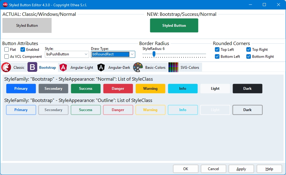
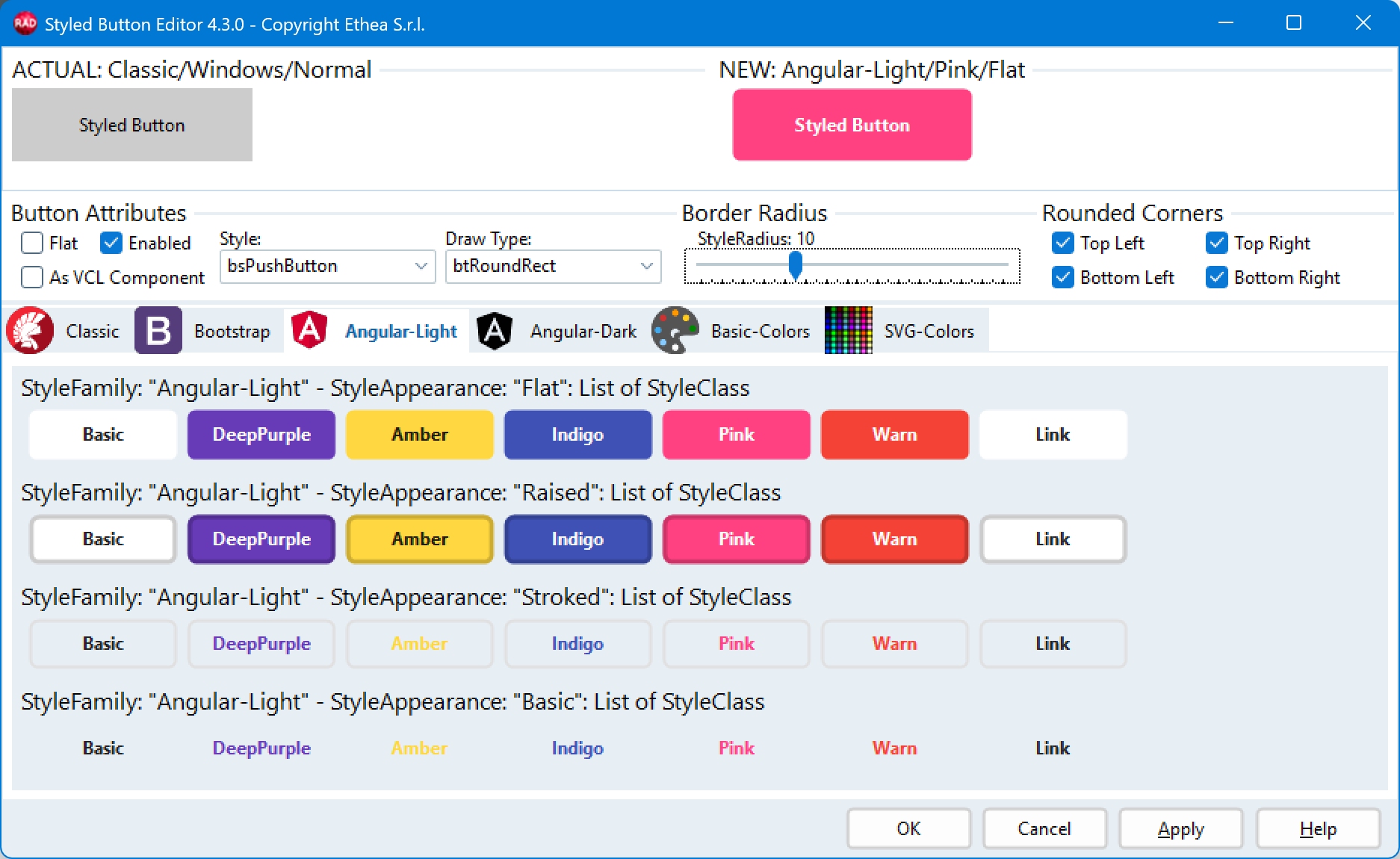
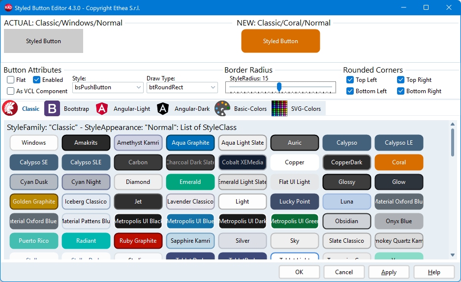
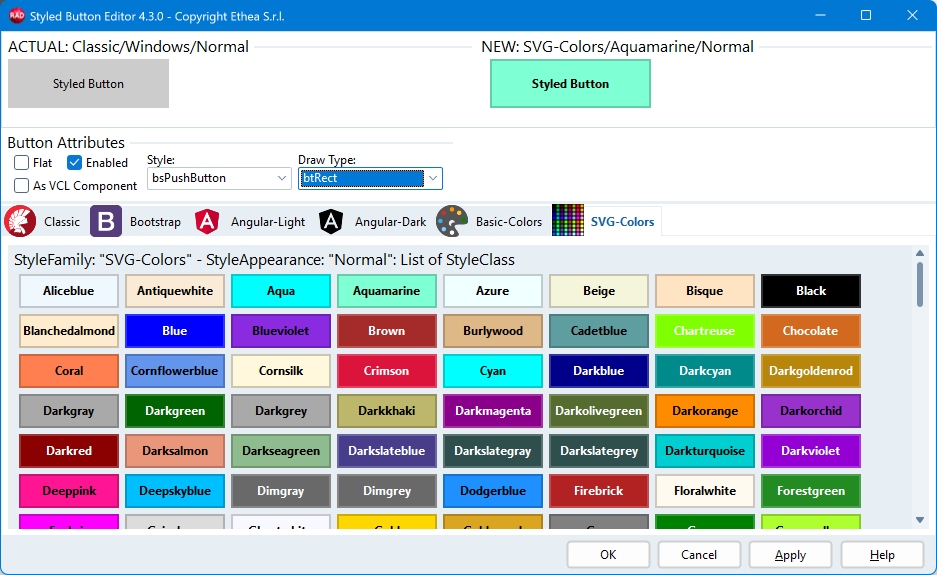
Drop the component from the Styled Components palette page. Right-click it and choose Styled Button Editor... (the same verb is at the bottom of the Object Inspector) to select the three values with a click and see a preview. See Component Editor for the details.
The Component Editor with the "Bootstrap" family: the appearances are Normal and Outline
The Component Editor with the "Angular" family: the appearances are Flat, Raised, Basic, Stroked
The Component Editor with the "Classic" family
The Component Editor with the "SVG-Colors" family
Examples
1. A button created at runtime
uses
  Vcl.StyledButton, Vcl.BootstrapButtonStyles;

var
  LButton: TStyledButton;
begin
  LButton := TStyledButton.CreateStyled(Self,
    BOOTSTRAP_FAMILY, btn_primary, BOOTSTRAP_NORMAL);
  LButton.Parent := Self;
  LButton.Caption := '&Save';
  LButton.Default := True;      //activated by the Enter key
  LButton.StyleDrawType := btRounded;
  LButton.OnClick := SaveButtonClick;
end;
2. Dialog buttons with ModalResult
//ModalResult closes the form and chooses the style (Bootstrap: Success / Danger)
BtnOK.ModalResult := mrOk;
BtnOK.Default := True;
BtnCancel.ModalResult := mrCancel;
BtnCancel.Cancel := True;
3. Split button
Btn.Caption := 'Save';
Btn.Style := bsSplitButton;
Btn.DropDownMenu := SaveOptionsMenu; //shown by the arrow, under the button
Btn.OnClick := SaveClick;            //click on the main part

//Optional: handle the arrow click yourself. It replaces the automatic menu
//(call Btn.ShowDropDownMenu if you still want to show it):
//Btn.OnDropDownClick := DropDownClick;
4. Command link
Btn.Style := bsCommandLink;
Btn.Caption := 'Continue';
Btn.CommandLinkHint := 'Proceed to the next step';
Btn.Images := ImageList1;
Btn.ImageIndex := 0;
5. Icon, FAB and notification badge
//Round "FAB" button with an icon, no caption
Btn.StyleDrawType := btEllipse;
Btn.ShowCaption := False;
Btn.Width := 48;
Btn.Height := 48;
Btn.Images := ImageList1;
Btn.ImageIndex := 2;
Btn.ImageAlignment := iaCenter;

//Counter on the top right corner
Btn.NotificationBadge.NotificationCount := 3;
6. AutoClick and elevation
//OnClick is fired automatically after 5 seconds
Btn.AutoClickDelay := 5000;
Btn.AutoClick := True;

//UAC shield for an operation that needs the administrator rights
BtnSettings.ElevationRequired := True;
See AutoClick / AutoClickDelay and Notification Badge.
7. Change the style, or follow the VCL Style
//Family, class and appearance at once (an empty value keeps the current one)
Btn.SetButtonStyle(ANGULAR_M3_LIGHT_FAMILY, btn_Basic, FilledAttr);

//As the standard VCL button of the active VCL Style
Btn.AsVCLComponent := True;
//Delphi 10.4+: as the standard VCL button of a given VCL Style
//Btn.StyleName := 'Ruby Graphite';

//Copy the style of a button to another one
Btn.AssignStyleTo(OtherBtn);
8. Default style for the whole application
//In the .dpr, after Application.Initialize.
//It is shared by TStyledButton and TStyledBitBtn.
uses
  Vcl.StyledButton, Vcl.ButtonStylesAttributes, Vcl.BootstrapButtonStyles;

begin
  Application.Initialize;
  TStyledButton.RegisterDefaultRenderingStyle(btRounded);
  //or with family, class and appearance
  TStyledButton.RegisterDefaultRenderingStyle(btRoundRect,
    BOOTSTRAP_FAMILY, btn_primary, BOOTSTRAP_NORMAL);
  Application.CreateForm(TMainForm, MainForm);
  Application.Run;
end.
To replace the standard TButton of an existing application without changing the forms, add Vcl.StyledComponentsHooks to the uses: see Interposer Unit (Vcl.StyledComponentsHooks). For the message dialogs see Interposer Unit (Vcl.StyledMessagesHooks).
Shadow (StyleShadowSize)
StyleShadowSize is a property of the component, like StyleRadius, StyleDrawType and StyleRoundedCorners: it gives the button a soft shadow below its face, as the Elevated button of Angular Material has.
-1(default): the shadow of the style family. Only theElevated(2 pixels, 3 on hover) andFab(3 and 4 pixels) appearances of the Angular-M3 families have one: the other families have none.0: no shadow, even if the family has one.- greater than zero: that shadow, in pixels at 100% scale (it follows the DPI), the same in every state and in any family.
The shadow is seen only below the button and it is drawn inside the area of the control: the face is shorter by the size of the shadow, the top and the sides are unchanged. Give the button a few pixels more height than you want for the face. The value is saved in the form file only when it is different from -1.
StyledButton1.StyleFamily := BOOTSTRAP_FAMILY;
StyledButton1.StyleShadowSize := 3;   // a shadow on a family that has none
StyledButton1.StyleShadowSize := 0;   // no shadow on an Angular-M3 Elevated button
The shadow that the style family provides is also available, read only, in ButtonStyleNormal.ShadowSize, ButtonStyleHot.ShadowSize... (a public property of TStyledButtonAttributes, not saved: it is the default that StyleShadowSize = -1 uses).
Demos
In the folder Demos\Delphi<version>\ build StyledComponentsDemo (see Main Demo) to try the buttons:
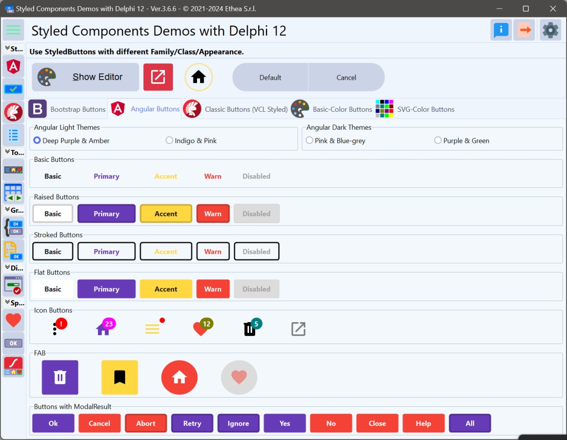
- Family, Class & Appearance Demo and Styled Buttons Examples
- Styled Buttons with VCL Styles Demo (push button, split button, command link)
- AutoClick Demo, Rounded Corners Demo, Button Group Demo

In the demo you can test many different ways to obtain Styled Button, Icon, FAB...
See also
- TStyledButton-Reference: all the properties, methods and events
- TStyledGraphicButton, TStyledSpeedButton, TStyledBitBtn
- Styled Buttons Examples
- Component Editor, Angular Material 3 families, How to build your custom style