
Description of TStyledTaskDialog
TStyledTaskDialog is a "TaskDialog" component (a descendant of the VCL TTaskDialog) that shows its dialog in a VCL form with styled buttons, custom captions and icons. Using a special form you can show a fully customizable dialog. Using Skia4Delphi you can also use animated images into dialog (see TStyledAnimatedTaskDialog)!
| Component | Description |
|---|---|
 | TStyledTaskDialog replaces TTaskDialog, MessageDlg, TaskMessageDlg and ShowMessage with dialogs drawn by the library: the buttons use the same StyleFamily system of all the other components, so the dialogs are always consistent with the rest of the application, with or without VCL Styles. |
Units: Vcl.StyledTaskDialog.pas (component and global routines), Vcl.StyledTaskDialogFormUnit.pas (base form), Vcl.StyledTaskDialogStdUnit.pas (standard form), Skia.Vcl.StyledTaskDialogAnimatedUnit.pas (animated form, optional).
When to use it
- You want message dialogs with the look of your application (Bootstrap, Angular, Classic...), instead of the native Windows ones.
- You need what the native TaskDialog offers (command links, radio buttons, verification checkbox, expandable text, footer, progress bar, hyperlinks) also with VCL Styles, on every Delphi version supported by the library (the native
TTaskDialogis not available in older Windows and is not styled). - You need features that the native dialogs do not have: AutoClick (countdown on the default button), ButtonsWidth/ButtonsHeight, button shape and radius, alpha blending, hiding the system close button, a dialog font of your own, custom dialog forms, animated icons.
- You want to restyle all the dialogs of an existing application without changing the calls: add the Vcl.StyledMessagesHooks interposer unit.
How it differs from the VCL TTaskDialog
- Same properties, events and
ExecuteofTTaskDialog(Title,Text,CommonButtons,Buttons,RadioButtons,Flags,ExpandedText,FooterText,ProgressBar...), plus the styled ones:DialogButtonsFamily,DialogButtonsDrawType,DialogButtonsRadius,DialogButtonsRoundedCorners,ButtonsWidth,ButtonsHeight,AutoClick,AutoClickDelay,UseCommandLinks,UseTitleInMessageDlg,AlphaBlendValue,MainIconSize,HideSystemCloseButton,Position,UseAnimations,UseAnimationLoop,UseAnimationInverseand theOnDialogShowevent. See the Reference. MainIconaccepts alsotdiQuestion(a question-mark icon that the native dialog does not have).- Pressing Ctrl+C (or Ctrl+Ins) copies the dialog content to the clipboard in the native TaskDialog layout, like the Windows system dialogs (see Copy to Clipboard).
- If no styled form is registered (
UseStyledDialogForm(False)),Executefalls back to the native TaskDialog.
Design-time
The component is on the Styled Components palette page. Double-click it (or use the context menu) to open the Test Dialog... verb of the Component Editor, which executes the dialog in the IDE. MainIcon and FooterIcon have a property editor with the list None / Warning / Error / Information / Shield / Question, and DialogButtonsFamily has the same family list of the other styled components.
How the style of the dialog buttons is chosen
The only choice you make for the buttons of a dialog is the StyleFamily (the "StyledButton set"), passed to InitializeStyledTaskDialogs, to TStyledTaskDialog.RegisterDefaultRenderingStyle or assigned to DialogButtonsFamily. The StyleClass and the StyleAppearance of every button are not taken from you: the family derives them from the ModalResult of the button (for example in the Bootstrap family Ok is Success, No is Danger, Cancel is Warning), so that the buttons of a dialog are always recognizable.
This means that:
TStyledButton.RegisterDefaultRenderingStyle(..., 'Classic', 'Windows Modern', 'Normal')sets the style of theTStyledButtoncomponents you create, but does not choose the class of the dialog buttons: the dialog uses only the family.- With the Classic family the buttons are "As VCL": they follow the active VCL Style of the application (or of the form, through
StyleName). To get "Windows Modern" buttons in a dialog, activate the "Windows Modern" VCL Style. - To have a set of dialog buttons with colours of your own, create a custom family with
Vcl.TemplateButtonStyles.pas(see How to build your custom style) and pass its name as the dialog family: inGetStyleByModalResultof your family you decide the class of everyModalResult. The familiesAngular-M3-LightandAngular-M3-Dark(Angular M3 families) can be used as dialog families too.
Position, monitor and owner form
The dialog opens centered on the monitor of the form that launched it (or over that form if tfPositionRelativeToWindow is in Flags); if you call it from a form without a window it uses the active form, then the main form. The launching form is only a reference for the position: the dialog does not depend on it, so the form can be destroyed while the dialog is modal without any problem. Details in the Reference.
Code examples
1. Global configuration (project file)
uses
  Vcl.StyledButton, Vcl.ButtonStylesAttributes, Vcl.BootstrapButtonStyles,
  Vcl.StyledTaskDialog;

begin
  Application.Initialize;
  //default shape and family of the buttons of every TStyledTaskDialog
  TStyledTaskDialog.RegisterDefaultRenderingStyle(btRounded, BOOTSTRAP_FAMILY);
  //dialog font, button family, command links off, auto-click off
  InitializeStyledTaskDialogs(True, Screen.MessageFont, False, BOOTSTRAP_FAMILY);
  Application.CreateForm(TMainForm, MainForm);
  Application.Run;
end.
2. Styled replacements of the standard routines
StyledShowMessage('File saved successfully!');

if StyledMessageDlg('Delete the selected file?', mtConfirmation,
  [mbYes, mbNo], 0, mbNo) = mrYes then
  DeleteSelectedFile;

StyledTaskMessageDlg('Connection error',
  'Unable to connect to the server.', mtError, [mbOK], 0);
3. Component: confirmation dialog
var
  Dlg: TStyledTaskDialog;
begin
  Dlg := TStyledTaskDialog.Create(Self);
  try
    Dlg.Title := 'Confirm Delete';
    Dlg.Text := 'Are you sure you want to delete this file?';
    Dlg.MainIcon := tdiWarning;
    Dlg.CommonButtons := [tcbYes, tcbNo];
    Dlg.DefaultButton := tcbNo;
    Dlg.DialogButtonsFamily := BOOTSTRAP_FAMILY;
    if Dlg.Execute and (Dlg.ModalResult = mrYes) then
      DeleteFile(FileName);
  finally
    Dlg.Free;
  end;
end;
4. Custom buttons as command links
Dlg.CommonButtons := [];
with Dlg.Buttons.Add as TTaskDialogButtonItem do
begin
  Caption := 'Save and continue';
  CommandLinkHint := 'Save the document and go on';
  ModalResult := 100;
  Default := True;
end;
with Dlg.Buttons.Add as TTaskDialogButtonItem do
begin
  Caption := 'Discard changes';
  CommandLinkHint := 'Lose the modifications';
  ModalResult := 101;
end;
Dlg.UseCommandLinks := True;
if Dlg.Execute then
  case Dlg.ModalResult of
    100: SaveAndContinue;
    101: DiscardChanges;
  end;
5. Auto-close dialog (countdown on the default button)
Dlg.Text := 'This dialog will close automatically in 5 seconds.';
Dlg.CommonButtons := [tcbOk];
Dlg.AutoClickDelay := 5000;
Dlg.AutoClick := True;
Dlg.Execute;

//or, with the routine
DoStyledTaskMessageDlg('Operation complete', 'Closing in 5 seconds...',
  mtInformation, [mbOK], 0, 5000);
See the AutoClick guide.
6. Verification checkbox, expandable text and footer
Dlg.Text := 'An error occurred while processing your request.';
Dlg.ExpandedText := 'Technical details:' + sLineBreak + E.Message;
Dlg.ExpandButtonCaption := 'Show details';
Dlg.FooterText := 'See the log for more information';
Dlg.FooterIcon := tdiInformation;
Dlg.VerificationText := 'Don''t show this message again';
Dlg.Execute;
if tfVerificationFlagChecked in Dlg.Flags then
  SaveSetting('ShowErrorDetails', False);
7. Customizing the open dialog
procedure TMainForm.StyledTaskDialogDialogShow(const AForm: TForm);
begin
  //e.g. change the button of the dialog being shown
  StyledTaskDialog.FindDialogButton(mrOk).StyleDrawType := btRounded;
end;
OnDialogShow receives the dialog form; FindDialogButton returns the styled button with that ModalResult.
8. Animated dialog (Skia4Delphi)
//the unit Skia.Vcl.StyledTaskDialogAnimatedUnit must be in the project uses
Dlg.UseAnimations := True;
Dlg.UseAnimationLoop := True;
Dlg.MainIcon := tdiInformation;
Dlg.Execute;
Demos
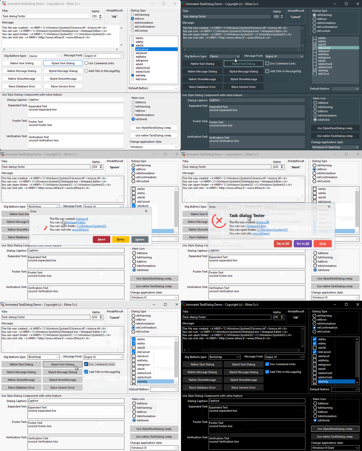
Demos\StyledComponentsDemo (form StyledDialogDemoForm.pas, see the TStyledTaskDialog Demo) is useful to test every format / buttons and type of dialogs, with different "StyledButton sets" (Classic, Angular, Bootstrap), and shows how to use StyledTaskDialog with custom icons using ImageList.
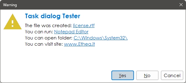
Confirmation Dialog with custom font and English buttons
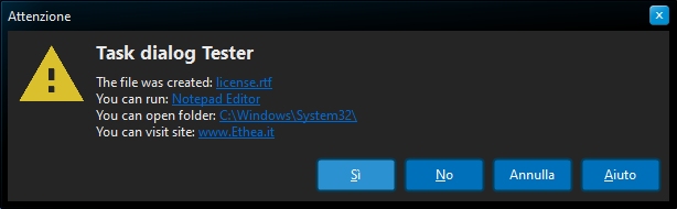
Warning Dialog with italians Buttons
A simple way to activate button captions is to change StyledComponents.inc file and activate {$Define ItaMessages} (or {$Define FraMessages})
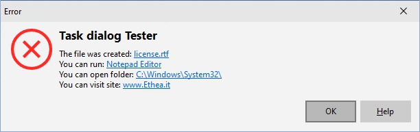
The StyledTaskDialog is VCL-Styles enabled! You can also hide the system close button (HideSystemCloseButton) or change its size using the OnDialogShow Event-handler.
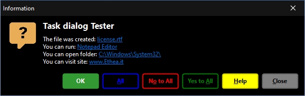
Error Dialog
Custom Dialog
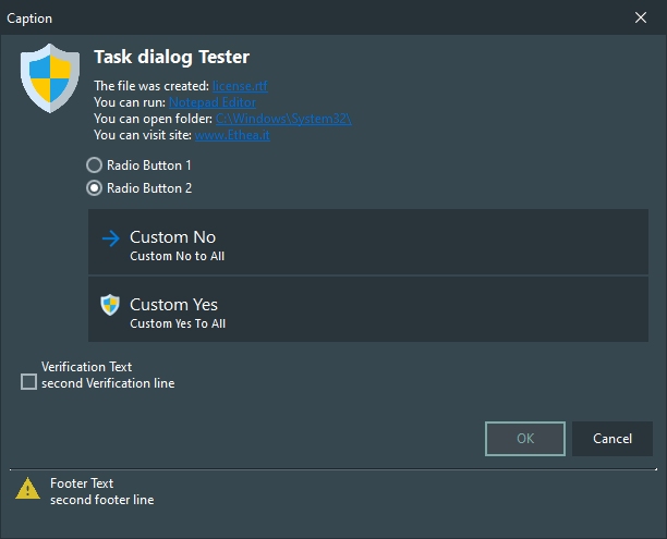
Shield Dialog with footer
Animated dialogs
If you have Skia4Delphi, you can also try the animated dialogs in the same demo, with nice animations. See TStyledAnimatedTaskDialog.
See Also
- TStyledTaskDialog Reference - Properties, methods, events and routines
- TStyledTaskDialog Demo
- TStyledAnimatedTaskDialog - Animated dialogs
- Vcl.StyledMessagesHooks - Interposer for MessageDlg and ShowMessage
- AutoClick Guide
- Component Editor
- TStyledButton - The buttons used in the dialogs