
Component Editor
The Styled Button Editor and the Styled Panel Editor are the design-time dialogs used to choose the style of a component with a click, instead of typing StyleFamily, StyleClass and StyleAppearance in the Object Inspector. They are the same dialog: it shows buttons when you edit a button and panels when you edit a TStyledPanel.
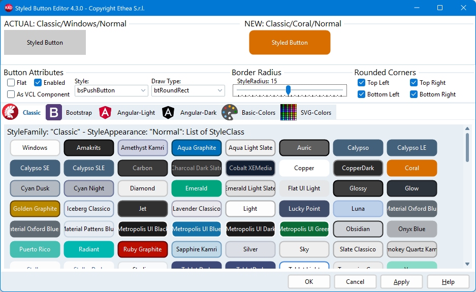
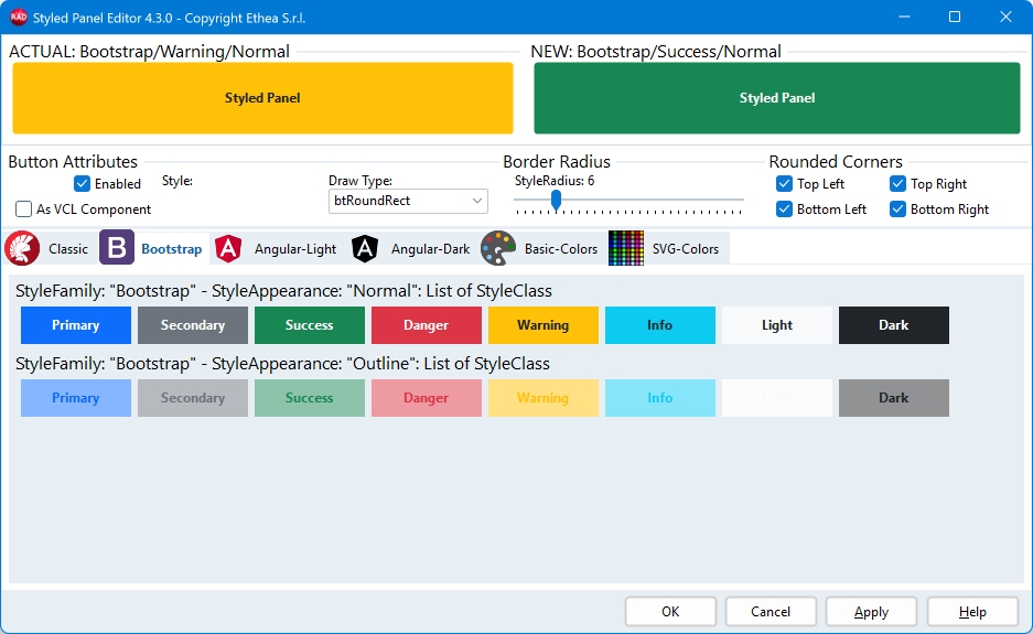
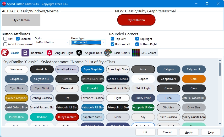
The editor of a button (family "Classic") and the editor of a TStyledPanel:
How to open it
Select the component in the Form Designer, then right-click it and choose Styled Button Editor... (or Styled Panel Editor... for a TStyledPanel). The same verb is available at the bottom of the Object Inspector.
It is available for TStyledGraphicButton, TStyledSpeedButton, TStyledButton, TStyledBitBtn, TStyledToolButton and TStyledPanel.
The dialog
ACTUAL and NEW
At the top of the dialog two copies of your component are shown:
- ACTUAL: the component as it is now, with its current
Family/Class/Appearance. - NEW: the component as it will be when you confirm. It changes every time you click a style or change an attribute, so you can see the result before applying it.
The captions show the three values of each one, for example NEW: Bootstrap/Success/Normal.
The style pages
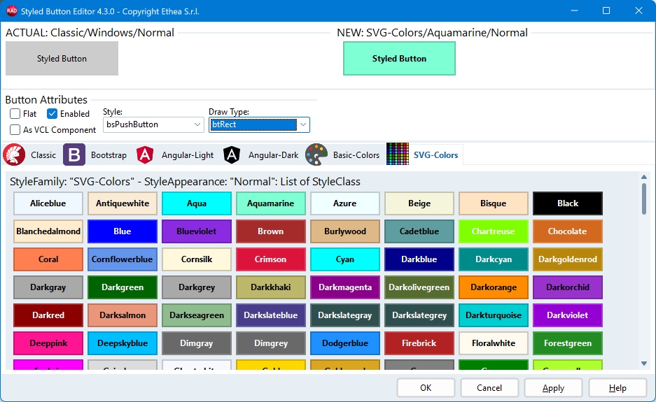
Below there is one tab for every StyleFamily registered in your project (Classic, Bootstrap, Angular-Light, Angular-Dark, Basic-Colors, SVG-Colors and any custom family you added with your own style unit).
- The dialog opens on the page of the family the component is using.
- Every page contains one group for each StyleAppearance of the family (Normal, Outline, Flat, Raised, Basic, Stroked...), and each group lists all the StyleClass values of the family.
- For a button component every item is a button drawn with that style. For a
TStyledPanelevery item is a panel, drawn with the colours a panel has in that style, and the mouse cursor over it is a hand to tell you that it can be clicked. - Click an item to copy its Family, Class and Appearance (and its shape) to the NEW component. Pause the mouse over an item to see its three values in the hint.
Pages are built when you open them for the first time, so the dialog opens quickly even if a family has hundreds of classes (SVG-Colors has 148).
Attributes
| Control | Meaning |
|---|---|
| Draw Type | Shape of the component: btRect, btRounded, btRoundRect, btEllipse... The previews of the current page are redrawn with the chosen shape. |
| Style | Only for buttons: bsPushButton, bsSplitButton or bsCommandLink. |
| Enabled | Shows the NEW component enabled or disabled, to check the disabled colours. |
| Flat | Only for buttons: the Flat property. |
| As VCL Component | See below. |
| Rounded Corners | Which corners are rounded (top left, top right, bottom left, bottom right), for the rounded shapes. |
| Border Radius | Radius of the corners, for the btRoundRect shape. |
Changing the shape, the corners or the radius redraws the previews of the page you are looking at, so you choose the style knowing how it will look.
As VCL Component
As VCL Component is the way to ask the component to look like the standard VCL control in the active VCL Style of the application (or of the form, with StyleName): the same colours, and for panels the same square corners of a TPanel.
- It exists only in the Classic family: checking it moves the dialog to the Classic page.
- The Windows item of the Classic page is the "As VCL" one. Clicking it checks the box again; clicking any other style unchecks it, because that style has its own colours.
- A Classic component that is not "As VCL" but uses the name of a VCL style as its class draws the colours that its kind of component has in that style: a button of Ruby Graphite is red, a panel of Ruby Graphite is dark grey, like a
TPanelin that style.
Buttons of the dialog
| Button | Action |
|---|---|
| OK | Applies the NEW style to the component and closes the dialog. |
| Apply | Applies the NEW style to the component and keeps the dialog open, to try another one. |
| Cancel | Closes the dialog without changing the component. |
| Help | Opens this page. |
The size and the position of the dialog are remembered while the IDE stays open.
Examples
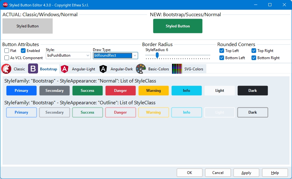
The Component Editor, with selected Family "Bootstrap" and StyleRadius 18: Style Appearance can be Normal or Outline
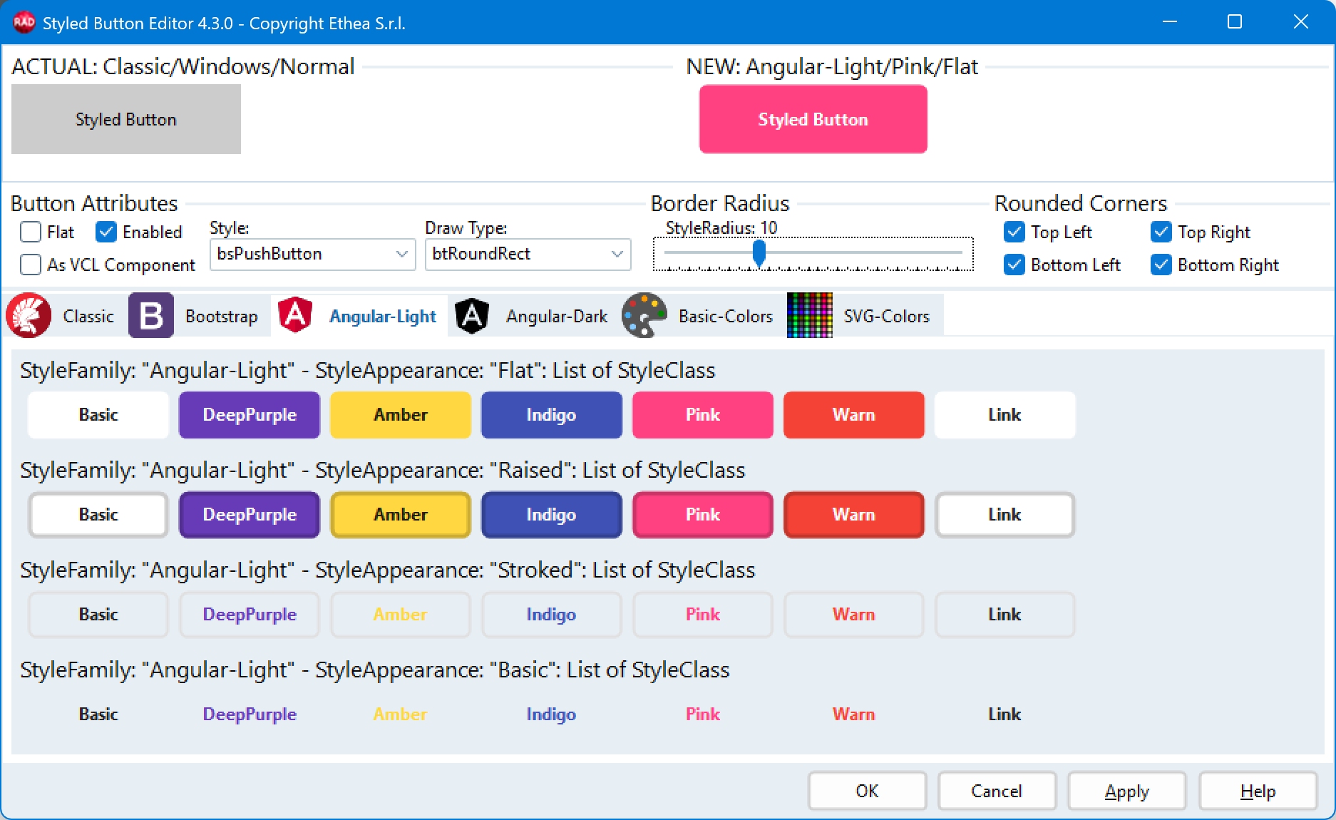
The Component Editor, with selected Family "Angular Light": Style Appearance can be Flat, Raised, Basic, Stroked
The Component Editor, with selected Family "Classic": Style Appearance can be Normal or Outline
The Component Editor, with selected Family "Basic-Colors", and Rounded StyleDrawType: Style Appearance can be Normal and Outline
The Component Editor, with selected Family "SVG-Colors": Style Appearance can be Normal or Outline
The Component Editor of a TStyledPanel: the previews are panels, drawn with the colours a panel has in each style
Notes for panels
- For a panel the
StyleDrawTypealso drivesParentBackground: the rounded shapes (btRounded,btRoundRect,btEllipse) make the panel transparent outside the shape. If you want an opaque panel with a rounded shape, checkParentBackgroundin the Object Inspector after closing the editor. - The colour of a panel comes from the chosen style; if you need your own colour, set
Color(or thePanelStyleNormalattributes) after choosing the style.
See also
- TStyledButton and TStyledPanel reference
- How to build your custom style: a family you register appears as a new tab of the editor.