Themes
Kittox ships with a built-in theme system that controls the global look-and-feel of an application (colors, fonts, icons, light/dark mode). Everything is configured from a single Theme: node in Config.yaml.
Overview
The Theme node has the mode as its value (Light, Dark or Auto) and optional sub-nodes for fine-grained customization:
Theme: Auto
  Primary-Color: SteelBlue
  Font-Family: Segoe UI
  Font-Size: 13px
  IconStyle: outlined
  IconSize: Medium
If the Theme node is not specified at all, Kittox uses Auto with the default palette, system font and filled icons at Medium size.
| Sub-node | Default | Description |
|---|---|---|
| (value) | Auto | Theme mode: Light, Dark, or Auto (follows the OS preference via prefers-color-scheme) |
Primary-Color | (none) | Base accent color — any CSS color name or #rrggbb value. Drives the toolbar, status bar and accent palette via CSS color-mix() |
Font-Family | system UI stack | Font family used by the whole application |
Font-Size | 13px | Base font size (any CSS size unit) |
IconStyle | filled | Material Design Icon style: filled, outlined, round, sharp, two-tone |
IconSize | Medium | Default icon size: Small (1em), Medium (1.4em), Large (1.8em) |
Theme mode
The value of the Theme node selects the base palette:
| Mode | Behavior |
|---|---|
Light | Forces the light palette. Rendered as <html data-theme="light"> |
Dark | Forces the dark palette. Rendered as <html data-theme="dark"> |
Auto | No data-theme attribute is emitted; CSS @media (prefers-color-scheme: dark) decides at runtime based on the user's OS setting |
# Always light
Theme: Light

# Always dark
Theme: Dark

# Follow the OS (default)
Theme: Auto
TIP
Auto is the recommended default — it respects each user's OS/browser preference and switches dynamically when the user toggles dark mode without reloading the page.
Primary-Color
Setting Primary-Color generates a full chrome and accent palette from a single color. Internally, Kittox uses CSS color-mix() to derive:
- toolbar and panel header background (
--kx-chrome) - darker variant for status bar and hover states (
--kx-chrome-dark) - lighter variants for splitters and group headers (
--kx-chrome-light,--kx-chrome-mid) - accent color for focus rings, selected rows, active buttons (
--kx-accent,--kx-accent-bg,--kx-accent-ring) - chrome text color — automatically chosen between light and dark based on the perceived luminance (ITU-R BT.601) of the primary color
Both theme-name values (FireBrick, SteelBlue, Green…) and hex values (#2c3e50) are supported.
# Ethea red
Theme: Light
  Primary-Color: FireBrick

# Corporate blue, dark mode
Theme: Dark
  Primary-Color: "#1e3a8a"

# Auto mode with a neutral accent
Theme: Auto
  Primary-Color: Teal
TIP
In Light mode the page text colors are also derived from Primary-Color (dark shades), giving a cohesive monochromatic look. In Dark mode only the chrome/accent overrides apply — page text stays on the default dark palette to preserve readability.
Font-Family and Font-Size
Font-Family and Font-Size override the CSS variables --kx-font and --kx-font-size on :root. They affect the whole application — forms, grids, toolbars, menus.
Theme: Light
  Font-Family: Inter
Font-Size: 14pxTheme: Auto
Font-Family: Comic Sans MS
Font-Size: 12pxWhen omitted, Kittox uses the platform's native UI font stack: -apple-system, BlinkMacSystemFont, "Segoe UI", Roboto, "Helvetica Neue", Arial, sans-serif.
IconStyle
Kittox icons are Material Design Icons rendered via CSS mask-image. IconStyle picks one of the five Material variants — available for every icon:
| Value | Description |
|---|---|
filled (default) | Solid/filled glyphs |
outlined | Outline-only glyphs, thinner look |
round | Rounded corner variant |
sharp | Angular, geometric variant |
two-tone | Two-tone glyphs with primary and secondary shades |
Theme: Light
  IconStyle: outlined
Because icons use CSS mask-image, their color follows the surrounding text color and automatically adapts to the active theme — no per-theme icon sets needed.
See Labels and Icons for the complete icon name map and per-view overrides.
IconSize
Sets the default icon size throughout the application:
| Value | Size |
|---|---|
Small | 1em |
Medium (default) | 1.4em |
Large | 1.8em |
Theme: Light
  IconSize: Small
Individual icons can still override the default with the CSS classes kx-icon-sm, kx-icon-md, kx-icon-lg.
Real-world examples
HelloKitto — branded red + custom font
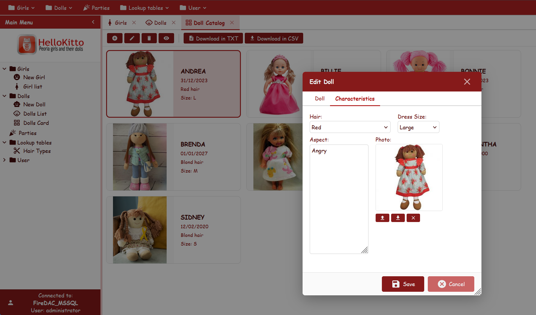
From Examples/HelloKitto/Home/Metadata/Config.yaml:
Theme: Light
  Primary-Color: FireBrick
  Font-Family: Comic Sans MS
  Font-Size: 12px
  IconStyle: filled
Produces a playful, strongly-branded UI with red chrome/accent and a casual font.
KEmployee — minimalist outlined light
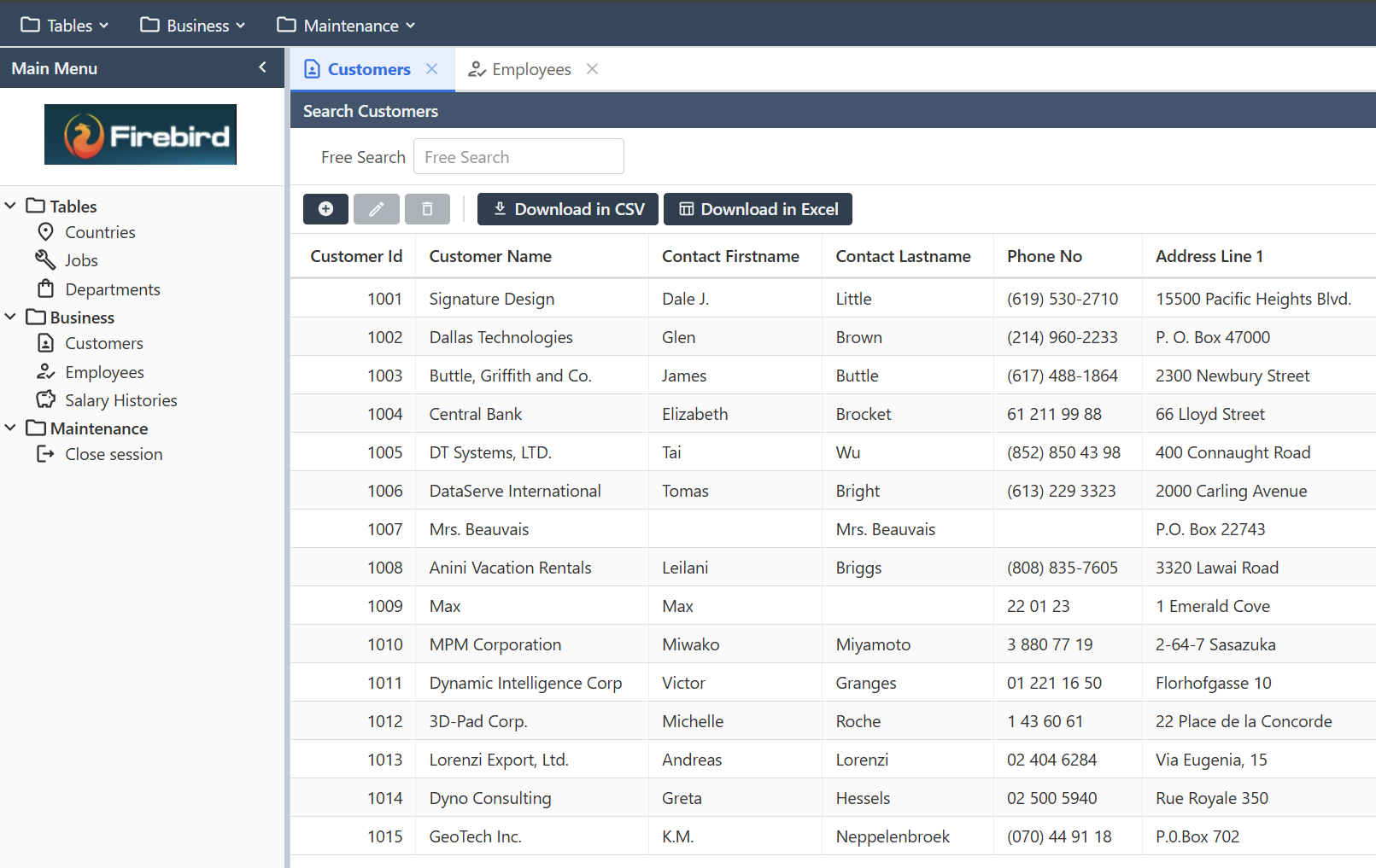
From Examples/KEmployee/Home/Metadata/Config.yaml:
Theme: Light
  IconStyle: outlined
Defaults for everything else — clean corporate look.
TasKitto — dark mode with small two-tone icons
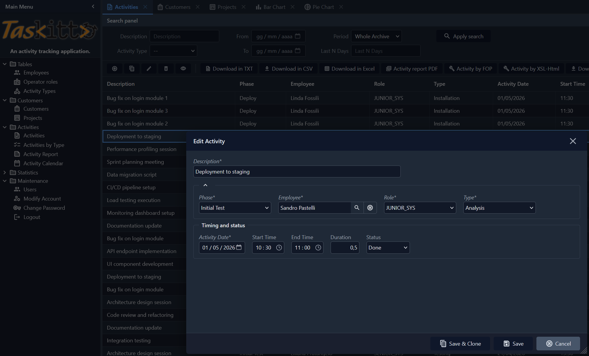
From Examples/TasKitto/Home/Metadata/Config.yaml:
Theme: Dark
  Font-Size: 12px
  IconStyle: two-tone
  IconSize: medium
A compact dark UI; two-tone icons provide gentle color cues against the dark chrome.
CSS custom properties
Every theme value is applied through a CSS variable on :root (light / auto) or [data-theme="dark"] (dark). The most relevant ones:
| Variable | Role |
|---|---|
--kx-font, --kx-font-size | Base font family and size |
--kx-bg | Page background |
--kx-surface, --kx-surface-alt | Panel and card surfaces |
--kx-text, --kx-text-secondary, --kx-text-muted | Primary text tones |
--kx-chrome, --kx-chrome-dark, --kx-chrome-hover, --kx-chrome-mid, --kx-chrome-light | Toolbar / header palette |
--kx-chrome-text, --kx-chrome-btn-hover | Text and button hover on chrome |
--kx-accent, --kx-accent-bg, --kx-accent-ring | Focus rings, selected rows, active buttons |
--kx-status-bg, --kx-status-text, --kx-status-border | Status bar |
--kx-input-bg, --kx-input-border | Form input fields |
--kx-border, --kx-border-light | Separators and rules |
--kx-error, --kx-error-surface, --kx-error-border | Validation / danger colors |
--kx-overlay, --kx-shadow | Modal overlay and drop shadows |
The complete list lives in Home/Resources/css/kittox.css. To override individual variables (without re-declaring the whole theme), see CSS Theming — it covers application.css, the custom-stylesheet file that is picked up automatically by every Kittox application.
See also
- Config File — full reference of the
Config.yamltop-level nodes - CSS Theming — customizing individual CSS rules in
application.css - Labels and Icons — Material Design icon name map and per-view overrides
- KIDE Config Editor — edit
Config.yamlvisually in KIDEx