ChartPanel (Kittox Enterprise only)
The ChartPanel is a data panel controller that renders interactive charts using Chart.js. It displays a ViewTable's records as a chart with an optional data grid sidebar.
The ChartPanel is typically used as a CenterController inside a List controller, which provides filtering capability and a grid sidebar. The chart refreshes automatically when filters change.
The available chart types are: Bar, Line, Pie, and Doughnut. Bar and Line are cartesian charts (with X and Y axes), while Pie and Doughnut display slices proportional to data values.
Cartesian charts (Bar, Line)
Cartesian charts map a category field to one axis and a numeric field to the other. The chart type is determined by the Series/Series/Type value.
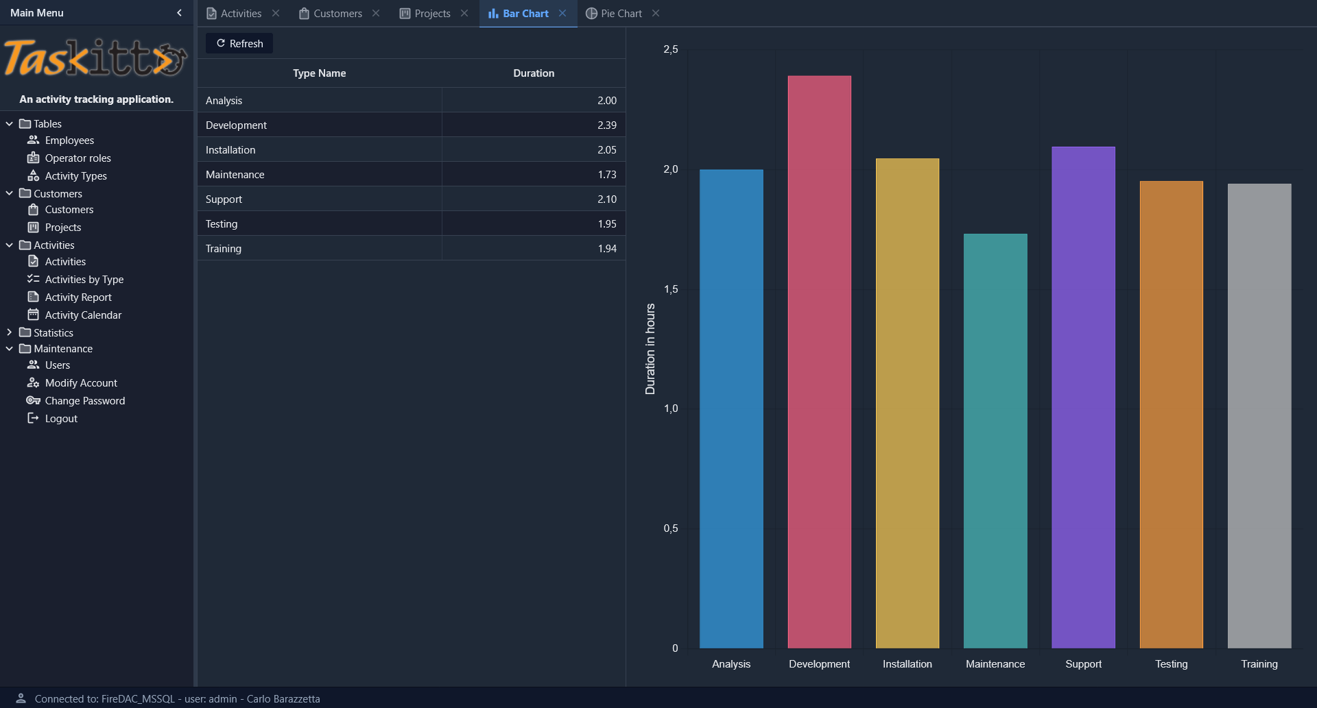
Bar chart example
Controller: List
  CenterController: ChartPanel
    Chart:
      Type: Cartesian
      Axes:
        Axis:
          Position: Left
          Title: _(Duration in hours)
        Axis:
          Type: Category
          Position: Bottom
      Series:
        Series:
          Type: Bar
          XField: TYPE_NAME
          YField: DURATION
          Highlight:
            StrokeStyle: black
            FillStyle: gold
          Label:
            Field: DURATION
            Display: insideEnd
  WestController: GridPanel
    Width: 500

MainTable:
  IsReadOnly: True
  Model: ACTIVITY_BY_TYPE
The WestController: GridPanel places a data grid to the left of the chart, showing the same data in tabular form. You can also use EastController: GridPanel to place the grid to the right. A draggable splitter between the grid and the chart allows the user to resize both areas interactively.
Series configuration
Each Series node under Chart/Series defines a data series:
| Property | Description |
|---|---|
Type | Chart type: Bar or Line |
XField | Field name for the X axis (category labels) |
YField | Field name for the Y axis (numeric values) |
Title | Display name for the series (shown in legend and tooltips) |
Highlight/StrokeStyle | Stroke color when hovering a bar (e.g., black) |
Highlight/FillStyle | Fill color when hovering a bar (e.g., gold) |
Label/Field | Field name whose value is displayed as a label on each bar |
Label/Display | Label position: insideEnd, insideStart, outside |
Axes configuration
Axes are defined under Chart/Axes as Axis subnodes:
| Property | Description |
|---|---|
Position | Axis position: Left, Right, Bottom, Top |
Title | Axis title (localizable with _()) |
Type | Axis type: Category for labels (default for X), numeric for values |
Polar charts (Pie, Doughnut)
Polar charts display data as slices of a circle. The chart type is Polar, and the series type determines the specific rendering.
Pie chart example
Controller: List
  EastController: GridPanel
    Width: 400
  CenterController: ChartPanel
    Chart:
      Type: Polar
      Theme: Muted
      Sprites:
        Sprite:
          X: 20
          Y: 35
          Text: _(Activities By Type)
          FontSize: 22
      Series:
        Series:
          Type: Pie3D
          AngleField: DURATION
          Label:
            Field: TYPE_NAME
            CalloutLine:
              Length: 60
              Width: 2
          Highlight:
            Margin: 40
          Title: _(Duration)
          Thickness: 50
          Distortion: 60
          Bevel: 20
          Donut: 50
      Legend:
        Docked: left
        Padding: 10
        Toggleable: True
      InnerPadding: 20
      InsetPadding: 50

MainTable:
  IsReadOnly: True
  Model: ACTIVITY_BY_TYPE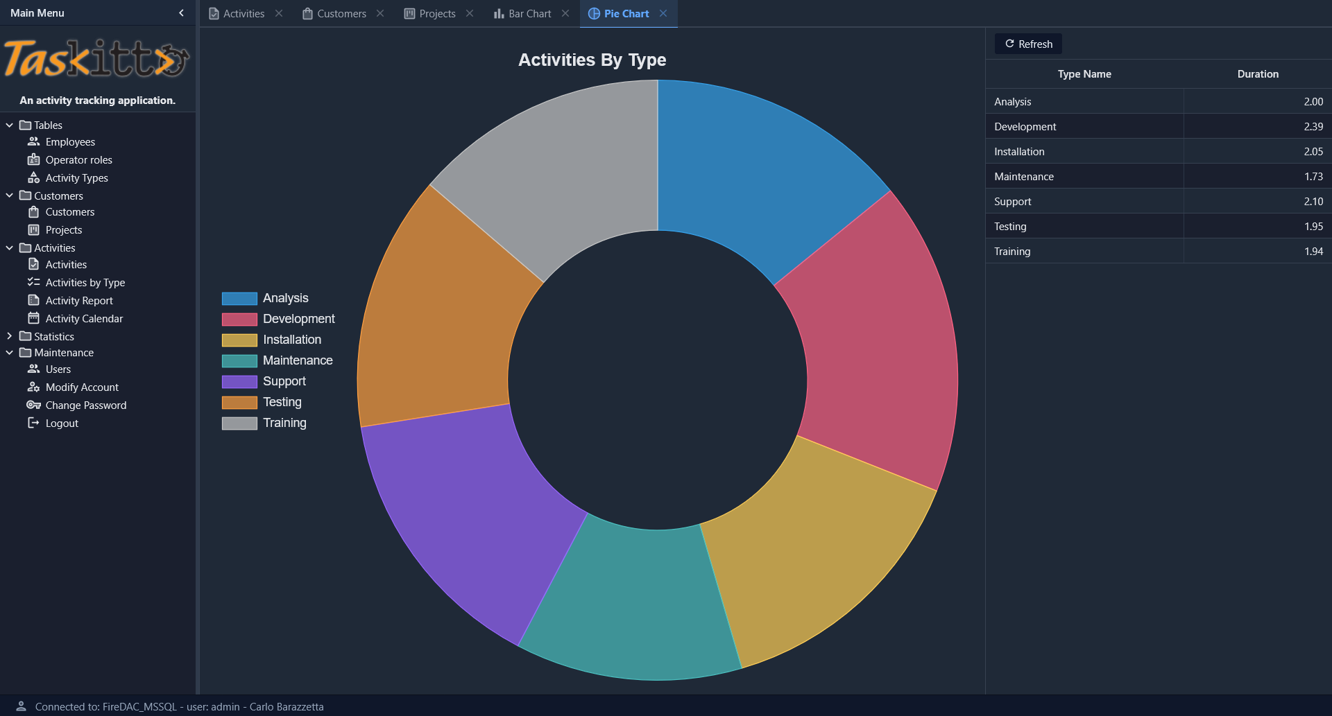
Pie/Doughnut series properties
| Property | Description |
|---|---|
Type | Pie, Pie3D |
AngleField | Field name whose values determine slice sizes |
Label/Field | Field name for slice labels |
Label/CalloutLine/Length | Length of the callout line connecting the label to the slice |
Label/CalloutLine/Width | Width of the callout line |
Title | Series title (displayed in tooltips) |
Donut | If > 0, renders as a doughnut chart with the specified hole size |
Thickness | Thickness of the 3D effect (Pie3D only) |
Distortion | Perspective distortion amount (Pie3D only) |
Bevel | Bevel size of the 3D effect (Pie3D only) |
Highlight/Margin | Expansion margin when hovering a slice |
Chart options
General options defined directly under the Chart node:
| Property | Default | Description |
|---|---|---|
Type | Chart type: Cartesian or Polar | |
Theme | Color theme for the chart (e.g., Muted) | |
InnerPadding | 0 | Padding between the chart area and the series |
InsetPadding | 0 | Padding between the chart container and the chart area |
Chart title
Use the Sprites/Sprite node to set a chart title:
Chart:
  Sprites:
    Sprite:
      Text: _(My Chart Title)
      FontSize: 22
      X: 20
Y: 35| Property | Description |
|---|---|
Text | Title text (localizable with _()) |
FontSize | Font size in pixels |
X | Horizontal position offset |
Y | Vertical position offset |
If X and Y are omitted, the title is rendered centered above the chart area.
Legend
Configure the legend under Chart/Legend:
| Property | Default | Description |
|---|---|---|
Docked | top | Legend position: top, bottom, left, right |
Padding | 0 | Padding around the legend area |
Toggleable | False | If True, clicking a legend item toggles the visibility of the corresponding data series |
If no Legend node is defined, the legend is hidden for cartesian charts and shown at the top for polar charts.
Grid sidebar
A common pattern is to display both the chart and a data grid. Use WestController or EastController to place a GridPanel alongside the chart:
Controller: List
  CenterController: ChartPanel
    Chart:
      # ...chart config...
  WestController: GridPanel
    Width: 500
The grid and chart share the same data source and both respond to filter changes.
Automatic colors
Chart.js colors are automatically assigned from a built-in palette of 12 colors. Each data point (or series) receives a distinct color in a cyclic pattern. No manual color configuration is required.