TilePanel
The TilePanel is a menu controller that displays navigation items as colored tiles in a grid layout. It is an alternative to the TreePanel for building application menus, commonly used for mobile-friendly home pages.
Overview
The TilePanel reads menu items from a tree view definition (same YAML format as TreePanel) and renders them as clickable tiles with icons and labels. Tiles are organized in sections (from tree folders) and rows.
Controller: TilePanel
  ColorSet: Blue
  TileWidth: 120
  TileHeight: 80
  ShowImage: True
  Border: True
  TreeView: USER_TreeMenu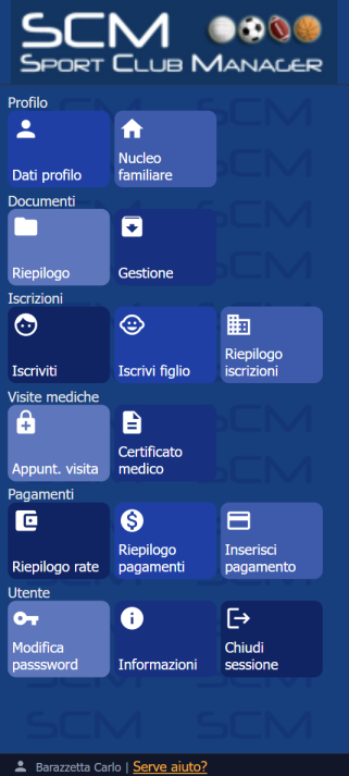
Configuration
| Property | Type | Default | Description |
|---|---|---|---|
TreeView | String | MainMenu | Name of the tree view YAML that defines the menu structure |
TileWidth | String | 140px | Width of each tile (CSS value) |
TileHeight | String | 60px | Height of each tile (CSS value) |
ColorSet | String | Color palette for tiles: Blue, Green, Red, Orange, Purple, Gray | |
ShowImage | Boolean | False | Show icons on tiles |
ShowImage/Position | String | Icon position: empty = top-left (default), Center = centered | |
Border | Boolean | False | Show panel border |
BorderColor | String | Border color for individual tiles (CSS color value) |
Color sets
The ColorSet property assigns colors from a predefined palette. Each tile in the menu gets the next color in the set, cycling through automatically.
Available color sets: Blue, Green, Red, Orange, Purple, Gray.
If no ColorSet is specified, all tiles use a default neutral color.
View opening behavior
When a tile is clicked, the TilePanel delegates to kxApp.openView() — the same function used by TreePanel. The behavior depends on the context:
- Desktop (central TabPanel exists): the view opens in a new tab
- Mobile (no central TabPanel): the view is appended to the body as a dialog overlay, forced fullscreen by the
body.kx-mobileCSS class
Modal views (Wizard, standalone Form, IsModal: True) and non-DataViews (Logout, ChangePassword) always open as dialog overlays appended to the body, regardless of desktop or mobile context.
Mobile usage
The TilePanel is commonly used as the home view on mobile devices. In Config.yaml:
HomeTinyView: %Auth:PROFILEID%_HomeTilesOn mobile, the TilePanel renders only the tile grid — no embedded tab header is shown. All views opened from tiles appear as fullscreen overlays.
See How to customize for mobile for details on mobile home view selection.
Example
This example from the SCM (Sport Club Manager) application shows a mobile home page with a logo header, a TilePanel menu, and a status bar footer:
# USER_HomeTiles.yaml
DisplayLabel: _(%Config:AppTitle%)
Controller: BorderPanel

  NorthView:
    Controller: HtmlPanel
      Height: 100
      Html: <center><img src="%IMAGE(%Config:LogoSocietaSportiva%)%" height=100></center>

  CenterView:
    Controller: TilePanel
      ColorSet: Blue
      Border: True
      TileHeight: 80
      TileWidth: 110
      ShowImage: True
      TreeView: %Auth:PROFILEID%_TreeMenu

  SouthView:
    Controller: StatusBar
      Text: %Auth:User_FullName%
    ImageName: user

MobileSettings:
  Content:
    Width: 480
    User-scalable: 0
  ContentLandscape:
    Width: 1000
    User-scalable: 0
The TreeView property uses the %Auth:PROFILEID% macro to load a profile-specific menu (e.g. USER_TreeMenu or ADMIN_TreeMenu). The MobileSettings node configures the viewport meta tag for mobile devices.
See also
- TreePanel — tree-based menu controller
- Panel — common panel properties
- How to customize for mobile — mobile home view configuration