Form Controller
Displays a single record of a data view. It is usually called by a List controller when the user selects a record to view or edit, or creates a new record, but it can be used in stand-alone manner in special cases, such as insert-only forms, or editing data in single-record tables.
Fields and editors
The form controller renders a form panel with an editor for each field in the (main) view table; it can also show tabs or buttons for detail datasets. In read-write mode, it also features confirm and cancel buttons, whereas in read-only mode it has a close button only.
As mentioned above, each view table field generates an editor. The type of editor depends on the field's data type. For example, a date field features a popup date picker, a Boolean field a checkbox, a Reference field a combo box, a Currency field a text input with currency symbol formatting, and so on. Editor types are pluggable, so new editor types can be developed in Delphi.
Editor rendering is centralised in TKXEditorFactory (Kitto.Html.Editors.pas), which is shared by both the Form controller and the List controller's filter panel. This ensures that the same field types produce consistent HTML elements and CSS classes regardless of context.
Editors are laid out vertically in the (scrollable) form panel, unless a layout definition is provided.
Field types reference
The following table shows how each data type is rendered in the form, including the HTML element, CSS classes, and default behavior.
| Data type | HTML element | CSS class | Default behavior |
|---|---|---|---|
String | <input type="text"> | .kx-input-text | Single-line text input. maxlength set from field Size. |
String (password) | <input type="password"> | .kx-input-password | Masked input (dots/bullets). Activated by IsPassword: True on the model field. |
String (large) | <textarea> | .kx-input-memo | Multi-line text area. Activated when Size div 2 >= 200 (same threshold as Kitto1). Height controlled by Lines (default: 5). Resizable vertically. |
Memo | <textarea> | .kx-input-memo | Multi-line text area. Height controlled by Lines (default: 5). Resizable vertically. |
HTMLMemo | <textarea> → SunEditor | .kx-html-editor | Rich-text WYSIWYG editor. Toolbar configurable via HTMLEditor node. See HTMLMemo editor. |
Integer | <input type="number"> | .kx-input-integer | Right-aligned. Native spin buttons hidden by default. Set UseSpeedButtons: True on the field to show them (adds .kx-spin-buttons). |
Currency | <input type="text" inputmode="decimal"> | .kx-input-currency | Right-aligned. Currency symbol and decimal formatting from UserFormats. See Currency fields. |
Decimal / Float | <input type="text" inputmode="decimal"> | .kx-input-decimal | Right-aligned. Uses inputmode="decimal" for mobile numeric keyboard. |
Boolean | <input type="checkbox"> | .kx-input-checkbox | Auto-sized (no width constraint). |
Date | <input type="date"> | .kx-input-date | Native browser date picker. Width includes space for the picker icon. |
Time | <input type="time"> | .kx-input-time | Native browser time picker. Width includes space for the picker icon. |
DateTime | <input type="date"> + <input type="time"> | .kx-input-date + .kx-input-time | Two side-by-side inputs (date and time), each with its own picker icon. |
Reference (small) | <select> | .kx-input-select | Drop-down combo box with all lookup values. Also used for fields with AllowedValues. |
Reference (large) | text + lookup button | .kx-form-lookup-display | Read-only text field with a magnifying glass button that opens a lookup dialog. Activated by IsLarge: True on the referenced model. |
FileReference | custom upload widget | — | Upload button with file name display and optional preview. |
Blob (picture) | custom picture editor | — | Thumbnail preview with upload/change/clear buttons. Activated by IsPicture: True. |
CSS customization
Every field type has a dedicated CSS class (listed in the table above) that can be overridden in your application's application.css to customize the default appearance. All classes inherit from the base .kx-form-input class, which defines the common look (border, padding, font, background).
For example, to left-align integer fields instead of the default right alignment:
.kx-input-integer {
  text-align: left;
}
To change the background of currency fields:
.kx-input-currency {
  background-color: #fffde7;
}
To add a custom border to date fields:
.kx-input-date {
  border-color: #1976d2;
}
The .kx-spin-buttons modifier class controls the visibility of native spin buttons on integer fields. It is added automatically when the model field has UseSpeedButtons: True:
# Model field definition
Anno: Integer
  UseSpeedButtons: True
Read-only and disabled fields
Read-only fields (set via IsReadOnly: True on the model or view field, or when the form is in View mode) receive the standard disabled styling:
.kx-form-input:disabled— applies to all disabled form inputs (muted text, alternate background, default cursor)..kx-form-readonly .kx-form-input— applies the same styling when the entire form is in read-only mode.- SunEditor editors in read-only mode have
contenteditable="false"andopacity: 0.6for a visually consistent muted appearance.
Layouts
Layouts are yaml files stored under Metadata\Views\Layouts, and by default they are searched for using a naming convention. A layout called <ViewName>_Form.yaml is automatically used by the Form controller to render a view. You can also explicitly specify a layout (useful for sharing layouts among similar views) in the Controller/Form/Layout parameter. A layout allows you to tweak:
- Which fields are visible and in what order.
- How fields are laid out in rows and groups.
- Field labels and widths.
Fields in a layout can be put inside containers. First-level objects (fields or containers) are laid out vertically by default.
Currently available containers include:
FieldSet: surrounds fields with a border that may have a caption and a collapse/expand button. Options:Title: Sets the caption displayed in the fieldset legend.LabelWidth: Sets the width in pixels for the labels (in case they are aligned to the left or right, as opposed to the top).Collapsible: Displays a collapse/expand button (default:False).Collapsed: Displays the box initially collapsed (default:False, only meaningful whenCollapsibleisTrue).
Row: Lays out fields in a row instead of vertically.Spacer: Inserts vertical space (8px) between fields or containers.
Some options are common to all containers:
ColumnWidth: Sets the relative width (a decimal value from 0 to 1) in case the object is contained in aRowcontainer. Use this option to fine-tune the relative widths of objects in a container.CharWidth: Sets the object width in characters.Width: Sets the object width in pixels.
A container can contain fields or other containers (for example,it is common for a FieldSet to contain Rows).
There are options you can set globally, as first-level nodes in the layout yaml file:
MemoWidth: Default width in characters for memo fields (default: 60).MaxFieldWidth: Sets a constraint for maximum field width in characters (default: 60).MinFieldWidth: Sets a constraint for minimum field width in characters (default: 5).RequiredLabelTemplate: A template string to format labels for required fields. May contain HTML code (default:<b>{label}*</b>, which means display the field's label in boldface and then a*character).MsgTarget: Indicates where the validation messages are displayed:Title: As field title (usually displayed as a pop-up hint by the web browser, default).Under: As text under each field.
LabelWidth: Sets the width in pixels for the labels (in case they are aligned to the left or right, as opposed to the top). Labels are rendered to the left of the fields, in a column that isLabelWidthpixels wide.LabelAlign: Sets where the labels are aligned into the left column of the fields:Right: This is the default setting when no layout is used.Top: Each label is on top of the corresponding field, andLabelWidthis ignored. This is the default setting when a layout is used.Left: LikeRightbut labels are left-aligned.
LabelSeparator: A string appended to the labels (default: ": ").LabelPad: The distance in pixels between the labels (only forLeftandRightalignments) and the fields (default: 5).
All fields support these options:
CharWidth: Sets the field width in characters.DisplayLabel: Sets the field caption.Width: Sets the field width in pixels.
Some options are supported by specific kinds of fields:
Lines: Number of lines to display for memo fields (default: 5, unlessEditLinesis specified on the field).Resizable: Set this to True to make a combo box's drop-down list resizable by the user.
Everything you don't set at the layout level, is looked for at the view field or model level and synthsized if needed.
Finally, you can use a PageBreak node to cause the creation of a new page in the tab control that hosts the layout. All subsequent nodes are then created on the new page. Supply the page title as the node's value. The first page (before any PageBreak) gets its title from the model's DisplayLabel or defaults to "General".
When the form also has detail tables, the detail grids appear as additional tabs after the layout pages, creating a unified tab bar.
Layout example
Here is an example of form layout:
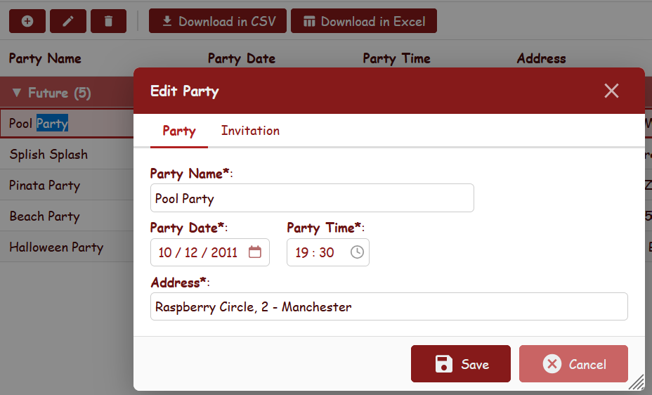
# layout Hellokitto parties_Form.yaml
Field: Party_Name
Row:
  Field: Party_Date
  Field: Party_Time
Field: Address
  CharWidth: 60
This example displays the fields in three rows, and sets a custom width for the Address field.
Another example:
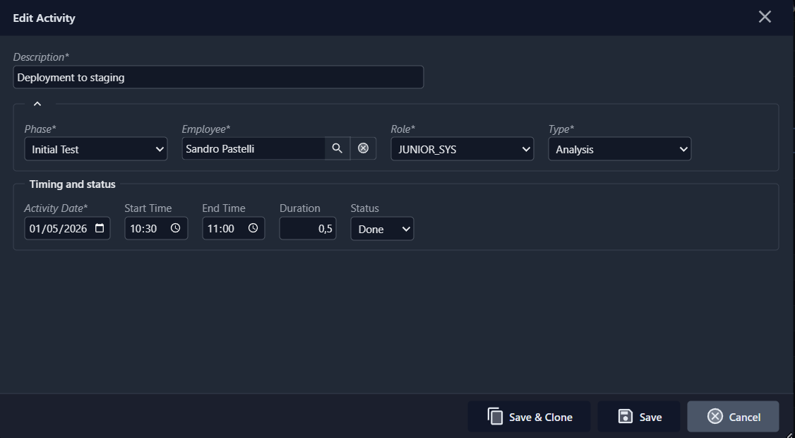
# Taskitto layout ActivityInput_Form.yaml
Field: DESCRIPTION
  CharWidth: 70
FieldSet:
  Collapsible: True
  Row:
    Field: PHASE
    Field: EMPLOYEE
    Field: ROLE
    Field: TYPE
FieldSet:
  Title: Timing and status
  Row:
    Field: ACTIVITY_DATE
    Field: START_TIME
    Field: END_TIME
    Field: DURATION
    Field: STATUS
Here we have two field sets (rendered as bordered boxes containing the field editors). The first is collapsible, the second has a titled legend "Timing and status".
Currency fields
Fields with the Currency data type are rendered as text inputs with special formatting behavior:
- The configured currency symbol (from UserFormats) is displayed inside the input field, followed by the formatted value (e.g.
€ 1200,50). - The decimal separator and decimal places follow the application's
UserFormatsconfiguration. - The field is right-aligned.
- When the user focuses the field for editing, the currency symbol is temporarily removed so only the number is editable.
- When the user leaves the field, the value is re-formatted with the correct number of decimal places and the currency symbol is restored.
No configuration is needed on individual fields — the formatting is automatic based on the data type and the UserFormats/Currency, UserFormats/Decimal settings in Config.yaml.
Field width calculation
Field widths are calculated in CSS ch units based on the field's Size attribute (or CharWidth from the layout). The width is multiplied by the Char_Width_Factor setting (see Scale factors below). Additional padding is added for special field types such as date pickers and combo boxes.
Scale factors
Kittox provides two configurable scale factors in Config.yaml under Defaults/Layout to control the size of form fields and editors:
Defaults:
  Layout:
    Char_Width_Factor: 0.85
Char_Height_Factor: 0.8| Parameter | Default | Description |
|---|---|---|
Char_Width_Factor | 1.0 | Multiplier for field widths (in CSS ch units). Values < 1.0 produce narrower fields. |
Char_Height_Factor | 1.0 | Multiplier for editor heights (HTMLMemo). Applied as rows × 16 × factor to compute the total editor height in pixels. Values < 1.0 produce shorter editors. |
The framework defaults are 1.0 (modern, spacious layout). Applications ported from earlier Kittox versions can use values like 0.85 / 0.8 to reproduce a more compact layout.
HTMLMemo editor
Fields with the HTMLMemo data type are rendered as rich-text editors using SunEditor, an open-source WYSIWYG editor.
The editor provides a configurable toolbar with formatting, font, color, alignment, list, and link controls. The toolbar can be customized per field via the HTMLEditor node in the model or view definition:
# Model field definition
NoteIscrizione: HTMLMemo
  Lines: 20
  HTMLEditor:
    EnableFont: True
    EnableFontSize: True
    EnableFormat: True
    EnableColors: True
    EnableAlignments: True
    EnableLinks: True
    EnableLists: True
EnableSourceEdit: True| Option | Default | Toolbar group |
|---|---|---|
EnableFont | True | Font family selector |
EnableFontSize | True | Font size selector |
EnableFormat | True | Bold, italic, underline, strikethrough |
EnableColors | True | Font color, highlight color |
EnableAlignments | True | Text alignment (left, center, right, justify) |
EnableLinks | True | Insert/edit hyperlink |
EnableLists | True | Bulleted and numbered lists |
EnableSourceEdit | True | View/edit HTML source code |
All options default to True. Set any to False to remove the corresponding toolbar group. When the field is read-only, the toolbar is hidden entirely.
The editor height is determined by the Lines attribute (default: 5) and the Char_Height_Factor setting. The formula is:
totalHeight = rows × 16 × Char_Height_Factor
editorHeight = max(totalHeight - 65, 50) px
The 65px subtracted accounts for the SunEditor toolbar (~40px) and status bar (~25px).
Password fields
Fields with IsPassword: True in the model definition are automatically rendered as <input type="password">, displaying dots/bullets instead of the actual value:
# Model definition
PASSWORD_HASH: String(60) not null
  DisplayLabel: Password
  IsPassword: True
No configuration is needed on the view or form — the masking is automatic based on the model field's IsPassword property.
Master/Detail (Detail Tables)
Kittox supports master/detail relationships, allowing a form to display the master record and its related detail records in a single, integrated interface. Detail tables are defined at two levels:
- Model level: A
DetailReferencesnode in the master model declares the "has many" relationship (see Models and RelationshipOneToMany). - View level: A
DetailTablesnode underMainTablein the view defines how and which detail tables are displayed.
Prerequisites: model configuration
Before using detail tables in a view, you need a proper master/detail relationship defined in your models. The master model declares DetailReferences, and the detail model has a Reference field pointing back to the master:
# Master model: PROJECT.yaml
ModelName: PROJECT
Fields:
  PROJECT_ID: String(32) not null primary key
    IsVisible: False
    DefaultValue: %COMPACT_GUID%
  PROJECT_NAME: String(40) not null
  CUSTOMER: Reference(CUSTOMER) not null
    Fields:
      CUSTOMER_ID:
  STATUS: String(12)
    AllowedValues:
      Offered: Offered
      Open: Open
      Stopped: Stopped
      Terminated: Terminated
DetailReferences:
PHASE: PHASE# Detail model: PHASE.yaml
ModelName: PHASE
Fields:
PHASE_ID: String(32) not null primary key
IsVisible: False
DefaultValue: %COMPACT_GUID%
PHASE_NAME: String(40) not null
PROJECT: Reference(PROJECT) not null
Fields:
PROJECT_ID:
START_DATE: Date
END_DATE: Date
STATUS: String(12)
AllowedValues:
Started: Started
Finished: Finished
Invoiced: Invoiced
Killed: Killed
Waiting: WaitingThe Reference(PROJECT) field in PHASE is the foreign key that links each phase to its parent project. Kittox uses this reference to automatically build the FK filter when loading detail records.
How detail tabs work
When you open a master record for editing (or viewing), any DetailTables defined in the view are rendered as additional tabs in the form dialog. The tab bar merges form field pages (created by PageBreak nodes in the layout) with detail grid tabs. For example, a Project form with a PHASE detail table shows tabs like:
[Project | Phases]
If the form layout also has a PageBreak:
[Project | Details | Phases]
Detail tabs are lazy-loaded: the grid content is fetched from the server only when the user clicks on the tab for the first time. This avoids unnecessary database queries when the user only edits the master record fields.
Detail tabs are available in both edit and add mode. In add mode, the detail store starts empty and the user can add detail records before saving the master.
YAML configuration
Detail tables are defined under the MainTable/DetailTables node in the view:
# View: Projects.yaml (from TasKitto)
Type: Data
Controller: List

MainTable:
  Model: PROJECT
  DetailTables:
    Table:
      Model: PHASE
      Controller:
        Form:
          Layout: Phases_Form
The Table node contains:
| Node | Description |
|---|---|
Model | The detail model name. Must have a Reference field pointing back to the master model. |
ViewName | Optional. References an existing view definition for the detail grid. |
Fields | Optional. Controls which fields appear and their properties in the detail grid. |
Controller | Optional. Controller settings for the detail grid (CRUD permissions, Form layout, ToolViews). |
Auto-built vs. explicit views
When you specify only Model: PHASE, Kittox auto-builds a list view from the model definition, creating a standard grid with all visible fields, toolbar, and CRUD buttons.
For full control over columns, filters, sorting, and toolbar, reference an existing view:
  DetailTables:
    Table:
      ViewName: Phases
Controlling detail grid columns
Without using ViewName, you can still control which columns appear in the detail grid and customize their properties using the Fields node:
# View: Customers.yaml (from KEmployee)
MainTable:
  Model: Customer
  DetailTables:
    Table:
      Model: Sales
      Fields:
        CustNoRef:
          Fields:
            CustNo:
          IsVisible: False
        PoNumber:
          IsVisible: False
        OrderStatus:
        OrderDate:
        ShipDate:
        DateNeeded:
        Paid:
        QtyOrdered:
        TotalValue:
        Discount:
        ItemType:
        Aged:
        SalesRepRef:
In this example, the FK field (CustNoRef) and PoNumber are hidden, while the remaining fields are listed in display order. You can set IsVisible: False on any field, or override DisplayLabel, DisplayWidth, and other view-level properties.
Custom form layout for detail records
You can specify a custom layout for the form dialog that opens when editing a detail record:
  DetailTables:
    Table:
      Model: PHASE
      Controller:
        Form:
          Layout: Phases_Form
The layout file (Phases_Form.yaml under Metadata/Views/Layouts/) controls the detail form arrangement:
# Phases_Form.yaml
Row:
  Field: PROJECT
    CharWidth: 40
Field: PHASE_NAME
Row:
  Field: START_DATE
  Field: END_DATE
  Field: STATUS
ToolViews in detail grids
Detail tables can have their own ToolViews for custom toolbar buttons, such as export tools:
# View: Parties.yaml (from HelloKitto)
MainTable:
  Model: Party
  DetailTables:
    Table:
      Model: Invitation
      Fields:
        Invitation_Id:
        Party:
          IsVisible: False
        Invitee:
        Accepted:
      Controller:
        ToolViews:
          DownloadCSV:
            DisplayLabel: _(Download in CSV)
            ImageName: download
            Controller: ExportCSVTool
              RequireSelection: False
Display styles
The DetailTables/Controller/Style node controls how detail tables are displayed. The available values are:
| Style | Description |
|---|---|
Tabs | Detail grids appear as additional tabs in the form dialog, merged with form field pages. This is the default style. |
Bottom | The form is split vertically: master record fields on top, detail grids in a tabbed panel below. Both master and details are visible simultaneously. Use Height to set the detail panel height in pixels. |
Example with Bottom style (from HelloKitto):
MainTable:
  Model: Party
  DetailTables:
    Controller:
      Style: Bottom
        Height: 250
    Table:
      Model: Invitation
Example with Tabs style (from KEmployee):
MainTable:
  Model: Customer
  DetailTables:
    Controller:
      Style: Tabs
    Table:
      Model: Sales
TIP
The Bottom style is particularly useful when you want the user to see the master record fields and detail records at the same time, without switching between tabs. The Tabs style is better suited for forms with many fields or multiple detail tables, as it uses the available space more efficiently.
Nested details (sub-details)
Detail tables can themselves have detail tables, creating multi-level master/detail hierarchies:
# View: Customers.yaml (from TasKitto)
MainTable:
  Model: CUSTOMER
  DetailTables:
    Table:
      Model: PROJECT
      DetailTables:
        Table:
          Model: PHASE
          Controller:
            Form:
              Layout: Phases_Form
      Controller:
        PreventAdding: False
        PreventDeleting: False
        AllowDuplicating: True
In this example, when editing a Customer, the form shows a PROJECT detail tab. When editing a Project from that tab, its form shows a PHASE detail tab. This creates a navigation chain: Customer → Project → Phase.
FK field behavior
When a detail record is opened (add, edit, or view), the foreign key field that links to the master record is automatically handled:
- Read-only: The FK reference field (e.g., PROJECT in a PHASE record) is rendered as disabled in all modes, preventing the user from changing the master link.
- Pre-filled on Add: When adding a new detail record, the FK field is automatically set to the current master record's key value.
Detail toolbar
The detail grid has its own CRUD toolbar with Add, Edit, Delete buttons, independent from the master form's toolbar. The toolbar respects these controller settings:
| Setting | Default | Description |
|---|---|---|
PreventAdding | False | Hides the Add button. |
PreventEditing | False | Hides the Edit button. |
PreventDeleting | False | Hides the Delete button. |
AllowDuplicating | False | Shows a Duplicate button that clones the selected record. |
Double-click
Double-clicking a row in the detail grid opens the record form, following the same logic as the main grid:
- If editing is allowed, double-click opens the form in edit mode.
- Otherwise, if viewing is allowed, double-click opens in view mode.
After saving or deleting a detail record, the detail grid is automatically refreshed to reflect the changes.
Transactional master-detail save
All changes to master and detail records are saved in a single database transaction. The workflow is:
- Edit master fields → click Save → changes are cached in memory (no DB write yet). The form switches to View mode and the Save All button appears.
- Edit detail records (add, edit, delete) → changes are tracked in memory with state flags (New, Modified, Deleted).
- Click Save All → the master record and all pending detail changes are persisted to the database in one transaction:
- New detail records →
INSERT - Modified detail records →
UPDATE(only changed fields) - Deleted detail records →
DELETE - Master record →
UPDATE
- New detail records →
- If any step fails, the entire transaction is rolled back.
The Cancel button discards all pending changes (master and detail) without touching the database.
TIP
The server-side store is kept in the user's session for the entire editing lifecycle. This enables lazy blob loading, incremental editing, and transactional save. The store is automatically released on save, cancel, tab close, or session timeout.
Complete example
This example from TasKitto shows a Projects view with filters, ToolViews, an EditController, and a PHASE detail table with a custom form layout:
# View: Projects.yaml
Type: Data
Controller: List
  Filters:
    DisplayLabel: _(Project Filter)
    Connector: and
    Items:
      FreeSearch: Name
        ExpressionTemplate: >
          upper({Q}PROJECT_NAME) like upper('%{value}%')
      DynaList: Customer
        CommandText: |
          select '' CUSTOMER_ID, '(All)' CUSTOMER_NAME
          union all
          select distinct CUSTOMER_ID, CUSTOMER_NAME
          from CUSTOMER order by 2
        ExpressionTemplate: CUSTOMER.CUSTOMER_ID = '{value}'

MainTable:
  Model: PROJECT
  EditController:
    Width: 800
    Height: 500
    LabelAlign: left
  DetailTables:
    Table:
      Model: PHASE
      Controller:
        Form:
          Layout: Phases_Form
Standalone forms
The Form controller can be used as a standalone view (not opened from a List grid). This is useful for editing single-record data such as the current user's profile.
# View definition (e.g. UserForm.yaml)
Type: Data
Controller: Form
  Operation: Edit

MainTable:
  Model: KITTO_USERS
  DefaultFilter: "{Q}USER_NAME = '%Auth:USER_NAME%'"
When Controller: Form is detected with an Operation of Edit or View, the framework loads the record matching the DefaultFilter expression (which supports macro expansion, including %Auth:...% macros for the current user). The form opens as a dialog overlay (IsModal: True by default for forms) with Save and Cancel buttons. A Close button appears if AllowClose is True (the default). On mobile, the dialog is automatically maximized to fill the screen. See Panel properties for details on IsModal, Maximized, and AllowClose.
Supported operations
| Operation | Behavior |
|---|---|
Edit | Loads an existing record via DefaultFilter, allows editing |
View | Loads an existing record via DefaultFilter, read-only mode |
Add | Opens an empty form for inserting a new record |