Description of Styled Buttons (TStyledGraphicButton and TStyledButton)
TStyledGraphicButton, TStyledButton are designed to expand Button UI styles to break the limits of classic TButton, TBitBtn and TSpeedButton provided in Delphi.
List of Styled Button Components:
| Component | Description |
|---|---|
 | TStyledGraphicButton is a "pure" Graphic Button with Styles (eg. Classic, Bootstrap, Angular, Basic-Color, SVG-Color) with support of ImageList, Action and full configuration of five states: Normal, Pressed, Selected, Hot and Disabled. You can use it also into a TVirtualList component. |
 | TStyledButton is classic "button control" with Styles (eg. Classic, Bootstrap, Angular, Basic-Color, SVG-Color) with support of ImageList, Action and full configuration of five states: Normal, Pressed, Selected, Hot and Disabled, plus Focus and TabStop support. You can easily replace all of your TButton components. |
 | TStyledSpeedButton derives from TStyledGraphicButton, and introduce Layout, Margin and Spacing properties, to control Drawing (Icon and Caption) as a standard TSpeedButton. You can also use Glyph and NumGlyphs. |
 | TStyledBitBtn derives from TStyledButton, and introduce Layout, Margin and Spacing properties, to control Drawing (Icon and Caption) as a standard TBitBtn. You can also use Glyph and NumGlyphs. |
The Button Styles defined are not affected by VCLStyles and are also visibile on a "non styled" Windows application, so you can have more than a single Button styled also using VCLStyles. You can build rectangular or rounded or ellipsis/circle button as you prefer.
You can build Rectangular, Rounded or RoundRect or Ellipsis/Circle button as you prefer.
using only three elements you can setup your Button in a very simple way:
- StyleFamily: the main attribute for Styled Button
- StyleClass: a collection of predefined button style
- Style Appearance: eg.Normal or Outline
Component editor for TStyledGraphicButton and StyledButton:
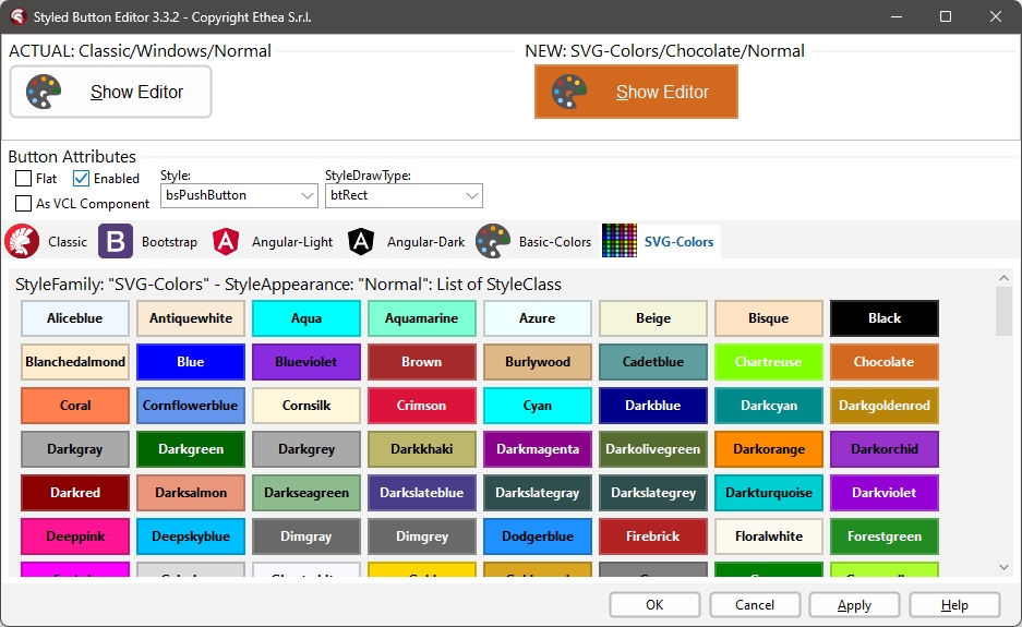
To simplify use of the Styled Buttons, there is a useful "Component Editor" to select three values that defines Button Style:
List of available StyleFamily
- Classic: a collection of Styles similar to VCLStyled TButton
- Bootstrap: a collection of Styles similar to Bootstrap buttons
- Angular-Light: a collection of styles similar to Angular buttons
- Angular-Dark: a collection of styles similar to Angular buttons
- Basic-Color: a collection of styles based to Delphi "normal" and "System" Color collection
- SVG-Color: a collection of styles based to Delphi "AlphaColors" Color collection
Control the default rendering styles for any Styled Buttons
It's possible to redefine at global application level the default Drawing styles for any Components, adding some line in your project file. For Example:
Add those units in uses of dpr:
  Vcl.StyledButton,
  Vcl.ButtonStylesAttributes,
Add those lines after Application.Initialize in dpr code:
TStyledButton.RegisterDefaultRenderingStyle(btRounded);You can also use a Family/Class/Appearance of any type, for example:
TStyledButton.RegisterDefaultRenderingStyle(btRoundRect, BOOTSTRAP_FAMILY, btn_primary, BOOTSTRAP_NORMAL);You can also use Interposer Unit (Vcl.StyledComponentsHooks.pas) to easily change all Buttons of your application.
Component editor for TStyledGraphicButton and StyledButton
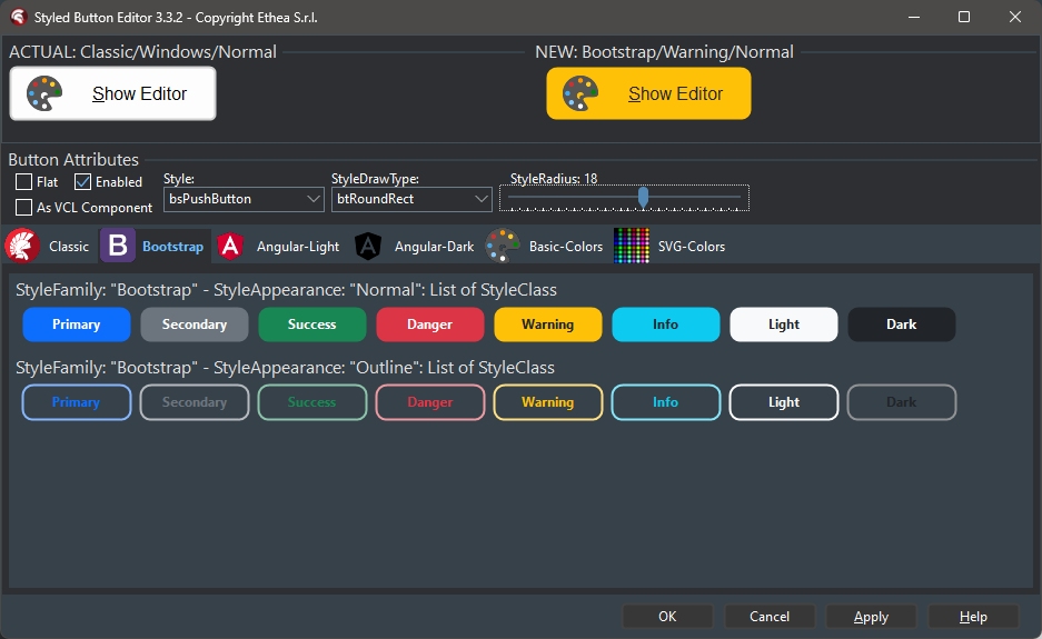
In this picture the Component Editor to select "Boostrap" styles: Style Appearance are Normal and Outline
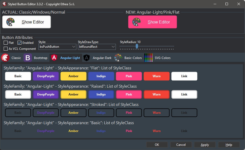
In this picture, the Component Editor to select "AngularUI" styles: Style Appearance are Flat, Raised, Basic, Stroked
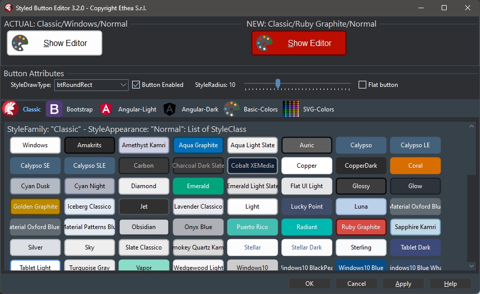
In this picture, the Component Editor to select "Classic" styles: Style Appearance are Normal and Outline
In this picture, the Component Editor to select "SVG-Color" styles: Style Appearance are Normal and Outline
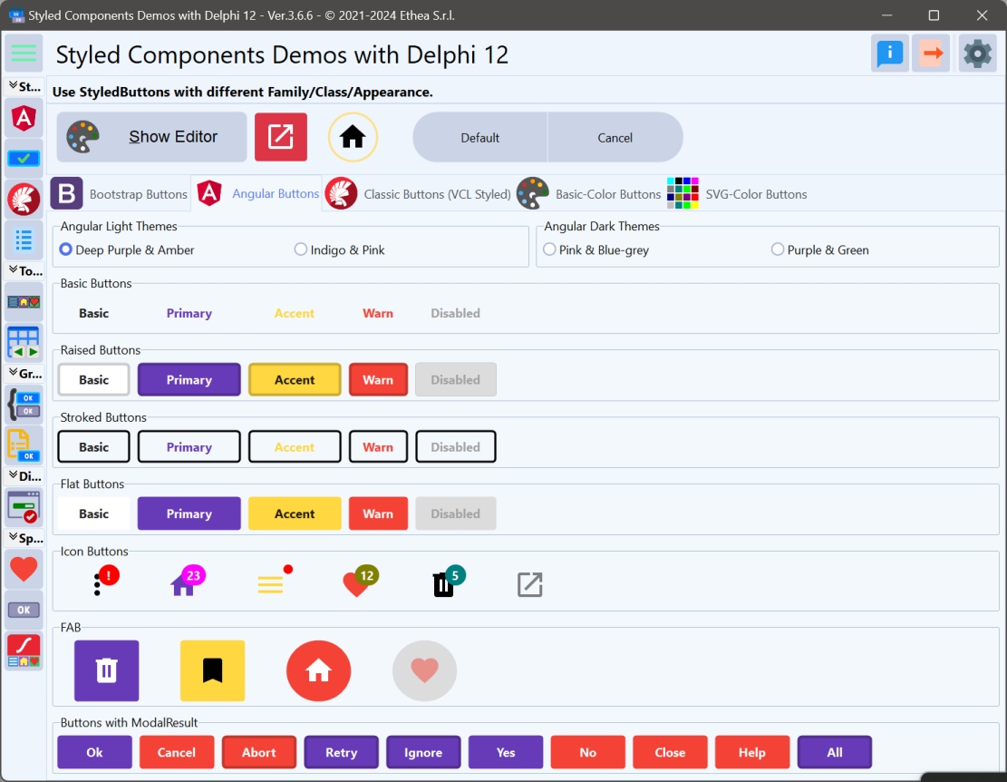
Demo: Buttons
In the Folder Demos\DelphiVersion\ you can Build StyledComponentsDemo to see how it works.

In the demo you can test many different ways to obtain Styled Button, Icon, FAB...
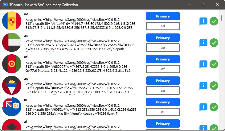
Demo: StyledButton In ControlList
You can see how to use StyledGraphicButton into a ControlList (only for D10.4+)