TStyledTaskDialog Demo
Overview
This comprehensive demo showcases the TStyledTaskDialog component, demonstrating how to create modern, styled message dialogs and task dialogs with custom buttons, hyperlinks, command links, and auto-click features.

What You'll Learn
- Using TStyledTaskDialog vs. standard TTaskDialog
- Creating styled message dialogs
- Adding custom buttons and command links
- Implementing hyperlinks in messages
- Using auto-click (countdown) dialogs
- Verification checkboxes
- Expanded text sections
- Footer text
- Custom button widths and alpha blending
Dialog Types
The demo includes multiple ways to show dialogs:
1. Native Dialogs (Standard VCL)
- Native MessageDlg: Delphi's standard message dialog
- Native TaskDialog: Delphi's task dialog (Windows Vista+)
- Native ShowMessage: Simple message box
2. Styled Dialogs
- StyledMessageDlg: Styled replacement for MessageDlg
- StyledTaskDialog: Full-featured styled task dialog
- StyledShowMessage: Simple styled message
Message Dialog Functions
Simple Messages
// Standard
ShowMessage('Hello World');

// Styled
StyledShowMessage('Hello World');
Message Dialogs with Buttons
// Standard MessageDlg
if MessageDlg('Delete this item?', mtConfirmation,
  [mbYes, mbNo], 0) = mrYes then
  DeleteItem;

// Styled MessageDlg
if StyledMessageDlg('Delete this item?', mtConfirmation,
  [mbYes, mbNo], 0) = mrYes then
  DeleteItem;
Task Dialogs with Title
// Standard TaskDialog
TaskMessageDlg('Confirm Delete',
  'Are you sure you want to delete this item?',
  mtConfirmation, [mbYes, mbNo], 0);

// Styled TaskDialog
StyledTaskMessageDlg('Confirm Delete',
  'Are you sure you want to delete this item?',
  mtConfirmation, [mbYes, mbNo], 0);
Dialog Types (TMsgDlgType)
The demo shows all message types:
| Type | Icon | Use Case |
|---|---|---|
mtWarning | Warning | Caution messages |
mtError | Error | Error notifications |
mtInformation | Info | Informational messages |
mtConfirmation | Question | Confirmation questions |
mtCustom | None | Custom dialogs |
Standard Buttons
Available button combinations:
// Single button
[mbOK]

// Yes/No
[mbYes, mbNo]

// Yes/No/Cancel
[mbYes, mbNo, mbCancel]

// OK/Cancel
[mbOK, mbCancel]

// Abort/Retry/Ignore
[mbAbort, mbRetry, mbIgnore]

// All buttons
[mbYes, mbNo, mbOK, mbCancel, mbAbort, mbRetry, mbIgnore, mbAll, mbHelp]
Default Button
Specify which button is default (Enter key):
StyledMessageDlg('Save changes?', mtConfirmation,
  [mbYes, mbNo, mbCancel], 0, mbYes);  // Yes is default
Hyperlinks in Messages
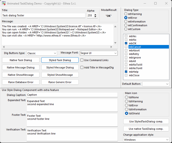
Add clickable links to dialog messages:
LMessage :=
  'The file was created: ' +
  StringToHRef('C:\Windows\System32\license.rtf', 'license.rtf') + sLineBreak +
  'You can run: ' +
  StringToHRef('C:\Windows\System32\Notepad.exe', 'Notepad Editor') + sLineBreak +
  'You can open folder: ' +
  StringToHRef('C:\Windows\System32\') + sLineBreak +
  'You can visit site: ' +
  StringToHRef('http://www.ethea.it', 'www.Ethea.it');

StyledTaskMessageDlg('File Operations', LMessage,
  mtInformation, [mbOK], 0);
Hyperlink Types
- File paths: Opens the file
- Executables: Runs the program
- Folders: Opens in Explorer
- URLs: Opens in default browser
Using TStyledTaskDialog Component
For advanced features, use the component directly:
var
  Dialog: TStyledTaskDialog;
begin
  Dialog := TStyledTaskDialog.Create(Self);
  try
    Dialog.Caption := 'Application';
    Dialog.Title := 'Confirm Action';
    Dialog.Text := 'Do you want to proceed?';
    Dialog.CommonButtons := [tcbYes, tcbNo];
    Dialog.DefaultButton := tcbYes;

    // Execute dialog
    if Dialog.Execute then
    begin
      if Dialog.ModalResult = mrYes then
        PerformAction;
    end;
  finally
    Dialog.Free;
  end;
end;
Custom Buttons
Add custom buttons with command links:
Dialog.CommonButtons := []; // Clear common buttons

// Add custom button with command link
with Dialog.Buttons.Add as TTaskDialogButtonItem do
begin
  Caption := 'Retry';
  CommandLinkHint := 'Retry the operation...';
  ModalResult := mrRetry;
  Default := True;
end;

with Dialog.Buttons.Add as TTaskDialogButtonItem do
begin
  Caption := 'Cancel';
  CommandLinkHint := 'Cancel and return...';
  ModalResult := mrCancel;
end;

// Enable command links
Dialog.Flags := Dialog.Flags + [tfUseCommandLinks];
Auto-Click Feature
Dialogs can auto-close after a delay:
// Auto-click after 5 seconds
StyledTaskDialog.AutoClickDelay := 5000;
StyledTaskDialog.AutoClick := True;

// Or use the function parameter
StyledTaskMessageDlg('Auto-closing dialog',
  'This will close in 5 seconds',
  mtInformation, [mbOK], 0, mbOK,
  5000);  // 5000ms = 5 seconds
The button background color is drawn progressively for each second of AutoClickDelay duration.
Expanded Text
Add collapsible detail text:
Dialog.ExpandedText :=
  'Technical Details:' + sLineBreak +
  'Error Code: 0x80004005' + sLineBreak +
  'Module: DataAccess.dll' + sLineBreak +
  'Function: Connect';
Dialog.ExpandButtonCaption := 'Show Details';
Footer Text
Add footer information:
Dialog.FooterText := 'For more information, visit www.example.com';
Dialog.FooterIcon := tdiInformation;
Verification Checkbox
Add a "Don't show again" option:
Dialog.VerificationText := 'Don''t show this message again';
Dialog.Flags := Dialog.Flags + [tfVerificationFlagChecked];

// Check if user checked it
if Dialog.Execute then
begin
  if tfVerificationFlagChecked in Dialog.Flags then
    SaveSetting('DontShowAgain', True);
end;
Custom Button Width
Adjust button width:
StyledTaskDialog.ButtonsWidth := 120; // 120 pixelsAlpha Blending
Set dialog transparency:
StyledTaskDialog.AlphaBlend := True;
StyledTaskDialog.AlphaBlendValue := 240;  // 0-255 (255 = opaque)
Style Families
Choose button style family for the dialog:
InitializeStyledTaskDialogs('Bootstrap');
// Now all styled dialogs use Bootstrap buttons

InitializeStyledTaskDialogs('Angular-Light');
// Now all styled dialogs use Angular buttons
Initialization
Initialize dialog defaults in your application startup:
begin
  Application.Initialize;

  // Initialize StyledTaskDialogs with Bootstrap buttons
  InitializeStyledTaskDialogs(
    True,                    // Use title in MessageDlg
    Screen.MessageFont,      // Font to use
    False,                   // Use command links
    'Bootstrap',             // Button family
    255,                     // Alpha blend (255 = opaque)
    120,                     // Button width
    32,                      // Button height
    -1);                     // Auto-click delay (-1 = disabled)

  Application.CreateForm(TMainForm, MainForm);
  Application.Run;
end;
Error Handling
Show errors with styled dialogs:
procedure TForm.ShowError(Sender: TObject; E: Exception);
var
  LTitle: string;
begin
  LTitle := GetErrorClassNameDesc(E.ClassName,
    E is EAccessViolation);

  StyledTaskMessageDlg(LTitle, E.Message,
    mtError, [mbOK], E.HelpContext);
end;

// In FormCreate:
Application.OnException := ShowError;
Demo Features
The demo form includes:
Controls
- Dialog Type: Choose message type
- Buttons: Select which buttons to show
- Default Button: Choose default button
- Title: Set dialog title
- Message: Set dialog message text
- Caption: Set dialog window caption
- Expanded Text: Collapsible details
- Footer Text: Footer information
- Verification Text: Checkbox text
- Main Icon: Dialog icon type
Options
- Use Command Links: Enable command link buttons
- Use Title in MessageDlg: Show title in simple dialogs
- Auto Click: Enable countdown auto-close
- Auto Click Delay: Countdown duration
Test Buttons
- Native ShowMessage: Standard Windows message
- Styled ShowMessage: Styled message
- Native MessageDlg: Standard message dialog
- Styled MessageDlg: Styled message dialog
- Native TaskDialog: Standard task dialog
- Styled TaskDialog: Styled task dialog
- Use DialogComp (Native): Standard TTaskDialog component
- Use DialogComp (Styled): TStyledTaskDialog component
Advanced Examples
Progress Dialog
Dialog.Title := 'Processing...';
Dialog.Text := 'Please wait while processing';
Dialog.CommonButtons := [tcbCancel];
Dialog.Flags := Dialog.Flags + [tfShowProgressBar];
Dialog.Execute;
Radio Button Dialog
with Dialog.RadioButtons.Add do
begin
  Caption := 'Option 1';
  Enabled := True;
end;

with Dialog.RadioButtons.Add do
begin
  Caption := 'Option 2';
  Enabled := True;
end;

if Dialog.Execute then
  ShowMessage('Selected: ' + Dialog.RadioButton.Caption);
Animated Dialogs (with Skia4Delphi)
If Skia4Delphi is installed:
{$IFDEF SKIA}
StyledTaskDialog.UseAnimations := True;
{$ENDIF}
This enables Lottie animations in dialogs.
Technical Details
Source Location
Demos/source/StyledDialogDemoForm.pas
Dialog Units
Vcl.StyledTaskDialog.pas- Main dialog componentVcl.StyledTaskDialogFormUnit.pas- Dialog form baseSkia.Vcl.StyledTaskDialogAnimatedUnit.pas- Animated version (optional)
Supported Versions
All Delphi versions (XE6+)
Key Functions
| Function | Description |
|---|---|
StyledShowMessage() | Simple message |
StyledMessageDlg() | Message with buttons |
StyledTaskMessageDlg() | Task dialog with title |
InitializeStyledTaskDialogs() | Set default options |
See Also
- TStyledTaskDialog Reference - Complete technical documentation
- TStyledButton Reference - Dialog buttons