Description of Styled Toolbar (and StyledToolButton)
StyledToolbar is a Toolbar that uses StyledToolButton, with full customizable of every button style and full control over the size of the buttons, also when Captions are visible.
| Component | Description |
|---|---|
 | TStyledToolbar is a Toolbar that uses StyledToolButton, with full customizable of every button style and full control over the size of the buttons, also when Captions are visible. The width and height of the StyledToolButtons inside, do not depends on Caption size, as in classic TToolBar. |
TStyledToolbar is designed to use TStyledToolButtons inside, to show a Toolbar like a classic TToolbar but with the same Style attributes that can be assigned to Styled Graphic Buttons.
You can build Rectangular, Rounded or RoundRect or Ellipsis/Circle button as you prefer.
using only three elements you can setup your Button in a very simple way:
- StyleFamily: the main attribute for Styled Button
- StyleClass: a collection of predefined button style
- Style Appearance: eg.Normal or Outline
Component editor for TStyledToolbar:
To simplify use of the Styled Toolbar, there is a useful "Component Editor" to select three values that defines Button Style:
List of available StyleFamily
- Classic: a collection of Styles similar to VCLStyled TButton
- Bootstrap: a collection of Styles similar to Bootstrap buttons
- Angular-Light: a collection of styles similar to Angular buttons
- Angular-Dark: a collection of styles similar to Angular buttons
- Basic-Color: a collection of styles based to Delphi "normal" and "System" Color collection
- SVG-Color: a collection of styles based to Delphi "AlphaColors" Color collection
Control the default rendering styles for any Styled Buttons
It's possible to redefine at global application level the default Drawing styles for any Components, adding some line in your project file. For Example:
Add those units in uses of dpr:
  Vcl.StyledToolbar,
  Vcl.ButtonStylesAttributes,
Add those lines after Application.Initialize in dpr code:
TStyledToolbar.RegisterDefaultRenderingStyle(btRounded);You can also use a Family/Class/Appearance of any type, for example:
TStyledToolbar.RegisterDefaultRenderingStyle(btRoundRect, BOOTSTRAP_FAMILY, btn_primary, BOOTSTRAP_NORMAL);You can also use Interposer Unit (Vcl.StyledComponentsHooks.pas) to easily change all Buttons of your application.
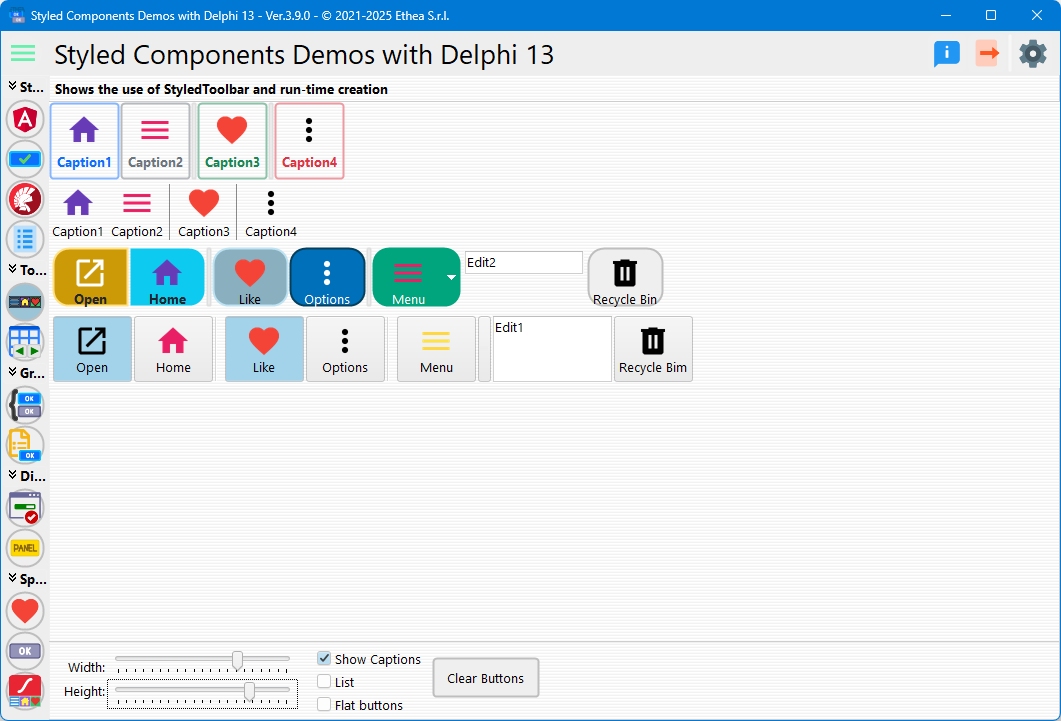
Demo
In the Folder Demos\DelphiVersion\ you can Build StyledComponentsDemo to see how it works. In the StyledComponents demo, you can see how to use this component, compared to the classic Delphi TToolBar.
The major differece is based on the control of the "size" of buttons when "ShowCaptions" is True: in standard Toolbar, the dimension is defined by the larger caption.
In the StyledToolbar the dimension is always defined by "ButtonWidth" property.
In this picture, the Toolbar Demo compares the StyledToolbar and the classic Toolbar