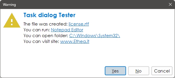
TStyledTaskDialog is a special "TaskDialog" component with custom Button Captions and Icons. Using a special Form you can show a full customizable Dialog. Using Skia4Delphi you can also use animated images into dialog!
Description of TStyledTaskDialog
TStyledTaskDialog is designed to expand message/task dialog functionalities, fully customizable and also animation.
You can test Styled Dialogs with different "StyledButton set" (Classic, Angular, Bootstrap).
Also, you can use a custom form (inherited from "TStyledTaskDialogForm") to show your complete custom Dialog.
Demos\StyledTaskDlgDemo and Demos\AnimatedTaskDialogDemo
A simple demo to show how to use StyledTaskDialog with custom icons using ImageList.
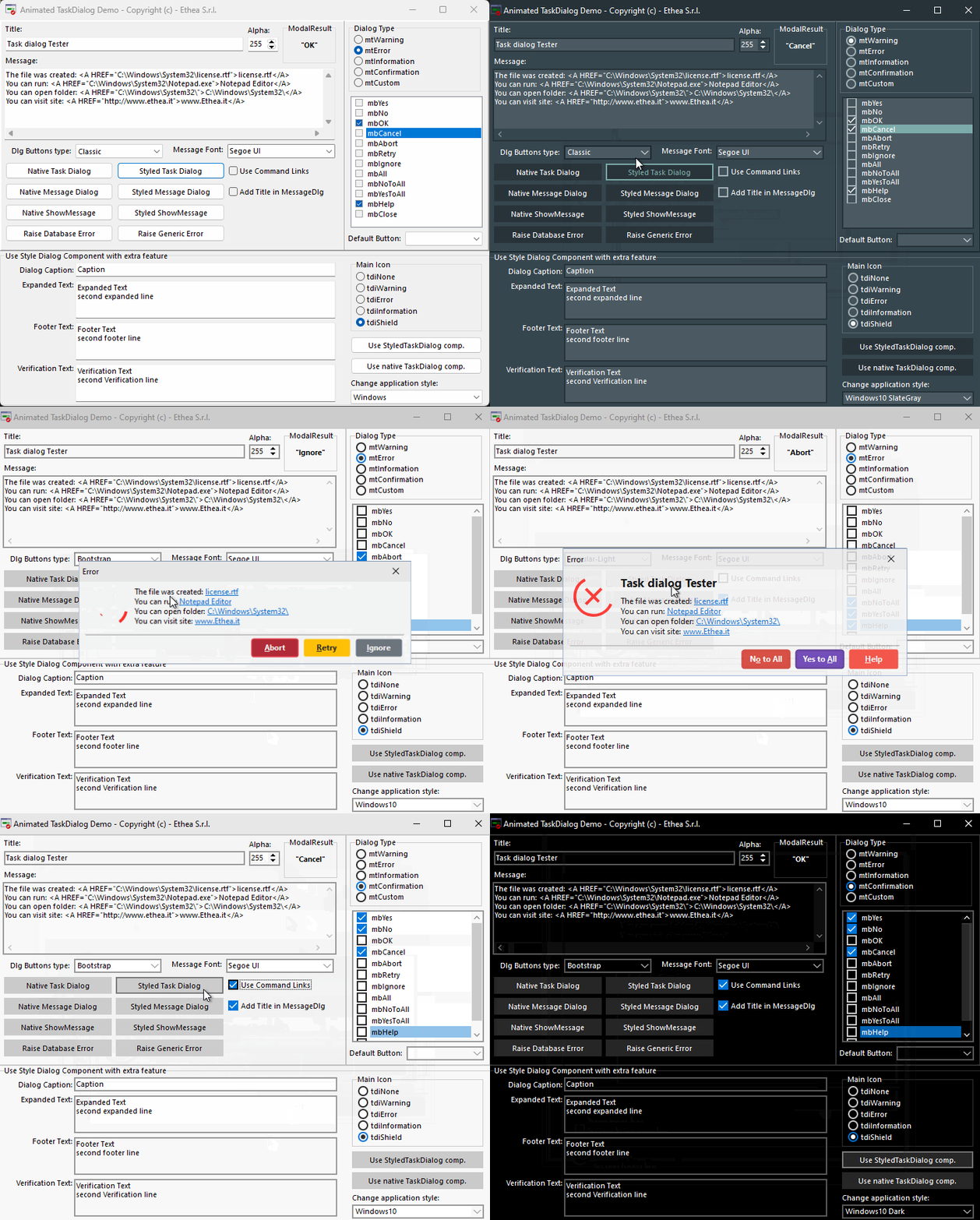
The main form is useful to test every format / buttons and type of dialogs.
Confirmation Dialog with custom font and English buttons

Warning Dialog with italians Buttons
A simple way to activate button captions is to change StyledComponents.inc file and activate {$Define ItaMessages}

The StyledTaskDialog is VCL-Styles enabled! You can also hide the system close button or change it's size using the OnDialogShow Event-handler.
Error Dialog

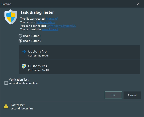
Custom Dialog

Shield Dialog with footer

Description of AnimatedStyledTaskDialog
If you have Skia4Delphi, you can also try the AnimatedTaskDialogDemo, with nice animations:

