StyledComponents Demo - Main Form
Overview
The StyledComponentsDemo is a unified demonstration application that showcases all the features and capabilities of the StyledComponents library. The demo uses a modern navigation interface with a main menu that allows you to explore different examples.
Main Form Structure
The MainDemoForm serves as the central hub for the entire demo application. It features:
1. Collapsible Menu (TStyledCategoryButtons)
The left panel contains a TStyledCategoryButtons component that acts as the main navigation menu:
- Collapsed Mode: Shows only icons (48px width)
- Expanded Mode: Shows icons and captions (300px width)
- Click the menu button to toggle between modes
The menu is organized into categories:
- Basic Features: Core button demonstrations
- Containers: Toolbar, panels, and container components
- Data-Aware: Database navigators
- Advanced: Special features and configurations
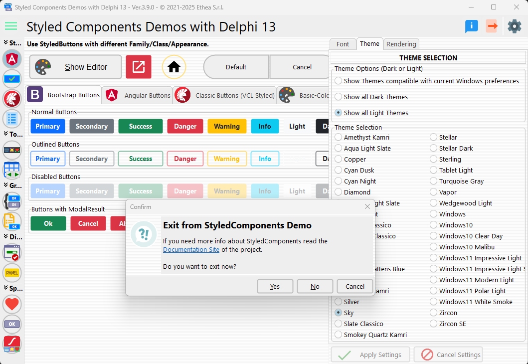
2. Settings Panel
The right panel provides global settings for the demo:
Font Settings
- Font Family: Choose from available system fonts
- Font Size: Adjust the display font size
Theme Settings
- Theme Selection: Choose between Light/Dark themes or follow Windows theme
- Style Selection: Pick from available VCL Styles
Rendering Options
- Rounded Buttons: Toggle rounded corners for buttons
- Rounded Toolbars: Toggle rounded corners for toolbar buttons
- Rounded Menus: Toggle rounded corners for menu items
Display Mode
- Embedded Forms: Show demos inside the main window
- Separate Forms: Open demos in separate modal windows
3. Work Area
The central area displays the selected demo form:
- In Embedded Mode: The form loads inside the main window's client area
- In Separate Mode: The form opens as a modal dialog
Navigation Flow
MainDemoForm (TfrmMain)
  ├─ LeftPanel: TStyledCategoryButtons (Menu)
  ├─ RightPanel: Settings Panel
  └─ WorkClientPanel: Demo Display Area
How to Navigate
- Open Menu: Click the hamburger icon (☰) at the top-left
- Select Demo: Click on any menu item to load the corresponding demo
- Close Menu: Menu auto-collapses when a demo is selected (in embedded mode)
- Adjust Settings: Click the settings icon to open the settings panel
Key Features
Dynamic Form Loading
The main form uses the acExampleExecute method to dynamically load demo forms based on the selected action:
procedure TfrmMain.acExampleExecute(Sender: TObject);
begin
  if FActiveAction = acFamilyClassAppearance then
    ActiveViewClass := TfmStyledButtons
  else if FActiveAction = acStyledBitBtn then
    ActiveViewClass := TfmBitBtn
  // ... other demos
end;
Embedded vs. Separate Display
Forms can be displayed in two modes:
- Embedded: Form becomes a child of
WorkClientPanelwithBorderStyle := bsNone - Separate: Form opens with
ShowModalas a centered dialog
Settings Persistence
All settings (fonts, themes, rendering options) are saved to an INI file in the user's AppData folder and restored on next launch.
DPI Awareness
The demo is fully DPI-aware and adapts to different screen resolutions and scaling factors (from Delphi 10.3+).
Available Demos
The following demo forms are available from the main menu:
| Demo | Description | Form Class |
|---|---|---|
| Family/Class/Appearance | Explore different button families and styles | TfmStyledButtons |
| TStyledBitBtn | Compare with standard TBitBtn | TfmBitBtn |
| AutoClick | Automatic button click feature | TfmAutoClick |
| VCL Styles | Compare buttons with VCL Styles | TfmStyledButtonVCLStyles |
| Control List | ControlList with styled buttons (Delphi 11+) | TfmControlList |
| TStyledToolbar | Toolbar component comparison | TfmStyledToolbar |
| TStyledDbNavigator | Database navigator comparison | TfmStyledDbNavigator |
| TStyledButtonGroup | Button group comparison | TfmStyledButtonGroup |
| TStyledCategoryButtons | Category buttons comparison | TfmStyledCategoryButtons |
| TStyledTaskDialog | Task dialog demonstrations | TfmStyledTaskDialog |
| Rounded Corners | Corner radius options | TfmRoundedCorners |
| TStyledPanel | Styled panel component | TfmStyledPanel |
| Animated Buttons | Skia-powered animations (with Skia4Delphi) | TfmAnimatedButtons |
First Launch
On first launch, the demo shows a Welcome Screen that explains:
- The purpose of the demo
- Available features
- Testing recommendations (especially for HighDPI scenarios)
Technical Details
Source Location
- Main Form:
Demos/source/MainDemoForm.pas - Demo Forms:
Demos/source/[FormName].pas - Resources:
Demos/source/DResources.pas(Delphi 10.3+)
Supported Delphi Versions
- Delphi XE6 through Delphi 13 (current version)
- Some features require specific versions (noted in demo descriptions)
Project Files
Demos/Delphi{Version}/StyledComponentsDemo.dproj- Separate project for each Delphi version
See Also
- Home - StyledComponents overview
- Components Reference - Technical documentation