Rounded Corners and StyleDrawType Demo
Overview
This demo showcases the StyleDrawType property and rounded corner options available across all StyledComponents, demonstrating how to create buttons, toolbars, button groups, and category buttons with different shapes and corner radius values.
What You'll Learn
- Different StyleDrawType values (Rounded, RoundRect, Rect, Ellipse)
- How to set corner radius
- Applying styles to toolbars
- Applying styles to button groups
- Applying styles to category buttons
- FAB (Floating Action Button) circular buttons
- Icon-only buttons
StyleDrawType Values
btRounded (Fully Rounded)
Perfect circles or pill shapes:
Button.StyleDrawType := btRounded;- Square buttons: Becomes circular
- Rectangular buttons: Becomes pill-shaped
- Use case: FAB buttons, modern UI, icon buttons
btRoundRect (Rounded Corners)
Rectangles with rounded corners:
Button.StyleDrawType := btRoundRect;
Button.StyleRadius := 8; // Corner radius in pixels- Adjustable radius: Use StyleRadius property
- Default radius: 6 pixels
- Use case: Modern cards, soft UI elements
btRect (Rectangle)
Perfect rectangles with sharp corners:
Button.StyleDrawType := btRect;- No rounding: Sharp 90° corners
- Use case: Classic interfaces, strict grids
btEllipse (Circle)
Perfect circles regardless of dimensions:
Button.StyleDrawType := btEllipse;- Forces circular shape: Ignores width/height ratio
- Use case: FAB buttons, icon buttons, badges
Corner Radius (StyleRadius)
For btRoundRect type, control the corner radius:
Button.StyleDrawType := btRoundRect;
Button.StyleRadius := 4;   // Subtle rounding
Button.StyleRadius := 8;   // Medium rounding
Button.StyleRadius := 16;  // Heavy rounding
Button.StyleRadius := 32;  // Very rounded
Large radius values approach btRounded appearance.
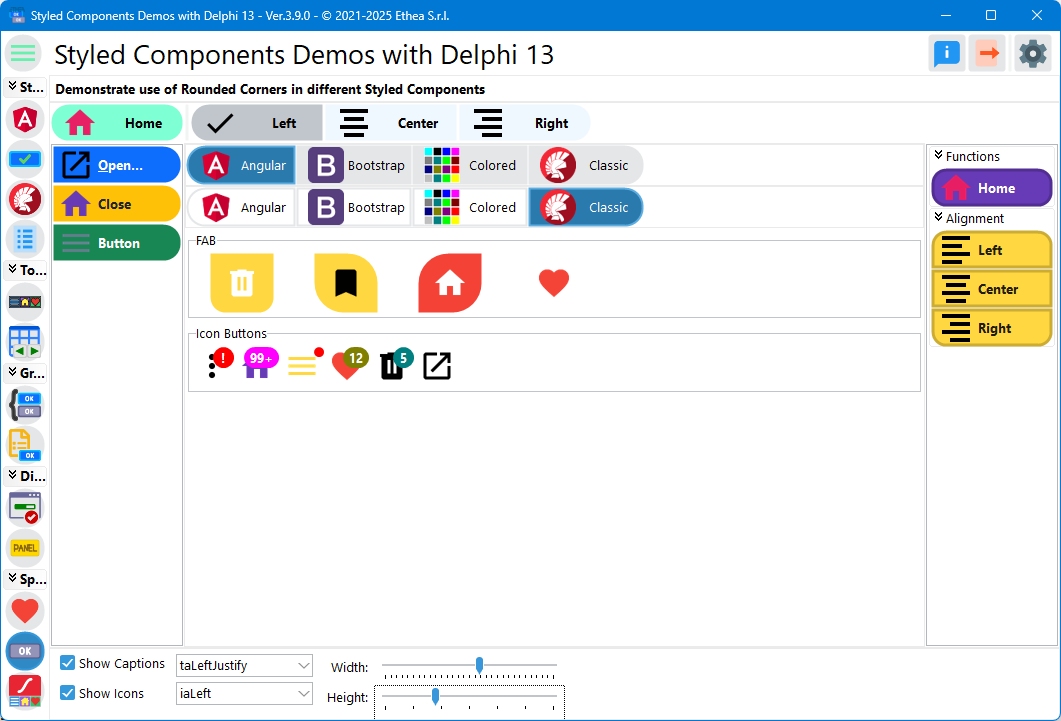
Demo Layout
The demo displays styled components in a grid:
Top Section: Regular Buttons (TStyledButton)
Four buttons showing different families:
- Angular: Material Design button
- Bootstrap: Web-style button
- Colored: Color-based button
- Classic: Windows-style button
Middle Section: Graphic Buttons (TStyledGraphicButton)
Same four buttons in graphic (non-windowed) variant.
FAB Section: Floating Action Buttons
Circular icon buttons (Material Design):
- Home icon
- Bookmark icon
- Trash icon
- Heart icon (disabled)
Icon Buttons Section
Square icon-only buttons:
- Various icons
- No captions
- Compact layout
Bottom Section: Containers
- TStyledToolbar: Toolbar with styled buttons
- TStyledButtonGroup: Button group
- TStyledCategoryButtons: Categorized buttons
Interactive Controls
The demo includes controls to modify appearance:
| Control | Function |
|---|---|
| Width Trackbar | Adjust button/container width |
| Height Trackbar | Adjust button/container height |
| Show Caption | Toggle caption visibility |
| Show Icon | Toggle icon visibility |
| Caption Alignment | Left, Center, Right |
| Image Alignment | Left, Right, Top, Bottom, Center |
Changes apply to all components simultaneously.
FAB (Floating Action Buttons)
Material Design circular action buttons:
FABButton := TStyledButton.CreateStyled(Self,
  ANGULAR_LIGHT_FAMILY,
  btn_PrimaryDeepPurple,
  FlatAttr);
FABButton.StyleDrawType := btEllipse;  // Force circular
FABButton.Width := 56;   // Material Design standard size
FABButton.Height := 56;
FABButton.Images := ImageList;
FABButton.ImageIndex := 0;
FABButton.ImageAlignment := iaCenter;  // Center icon
FABButton.ShowCaption := False;  // No caption
FAB Sizes
Material Design defines standard FAB sizes:
- Default FAB: 56x56 pixels
- Mini FAB: 40x40 pixels
- Extended FAB: 48+ height, variable width (with caption)
Icon Buttons
Square buttons with only icons:
IconButton := TStyledButton.CreateStyled(Self,
  ANGULAR_LIGHT_FAMILY,
  btn_PrimaryDeepPurple,
  BasicAttr);
IconButton.StyleDrawType := btRoundRect;
IconButton.StyleRadius := 4;
IconButton.Width := 40;
IconButton.Height := 40;
IconButton.Images := ImageList;
IconButton.ImageIndex := 1;
IconButton.ImageAlignment := iaCenter;
IconButton.ShowCaption := False;
Applying to Toolbars
Set default style for all toolbar buttons:
// At design-time or globally
TStyledToolbar.RegisterDefaultRenderingStyle(btRounded);

// At runtime for specific toolbar
Toolbar.StyleDrawType := btRounded;
Individual toolbar buttons can override:
ToolButton.StyleDrawType := btRoundRect;
ToolButton.StyleRadius := 6;
Applying to Button Groups
Set style for button group items:
ButtonGroup.StyleDrawType := btRounded;

// Individual items can override
ButtonGroup.Items[0].StyleDrawType := btRoundRect;
Applying to Category Buttons
Set style for category button items:
CategoryButtons.StyleDrawType := btRounded;

// Items inherit from parent
// Or set per category/item
Global Default Registration
Set application-wide defaults:
// In project source or main form OnCreate
TStyledButton.RegisterDefaultRenderingStyle(btRounded);
TStyledToolbar.RegisterDefaultRenderingStyle(btRounded);
TStyledButtonGroup.RegisterDefaultRenderingStyle(btRounded);
TStyledCategoryButtons.RegisterDefaultRenderingStyle(btRounded);
All new components will use these defaults.
Combining with Style Families
StyleDrawType works with all families:
// Bootstrap rounded
Button.StyleFamily := BOOTSTRAP_FAMILY;
Button.StyleClass := btn_primary;
Button.StyleDrawType := btRounded;

// Angular Material with RoundRect
Button.StyleFamily := ANGULAR_LIGHT_FAMILY;
Button.StyleClass := btn_PrimaryDeepPurple;
Button.StyleDrawType := btRoundRect;
Button.StyleRadius := 4;  // Material Design uses 4px

// Classic with sharp corners
Button.StyleFamily := DEFAULT_CLASSIC_FAMILY;
Button.StyleDrawType := btRect;
Responsive Sizing
The demo demonstrates how components resize:
- Width trackbar: Changes button/container width
- Height trackbar: Changes button/container height
- DPI-aware: Automatic scaling on high-DPI displays
All shapes maintain proper proportions when resized.
Caption and Image Positioning
Combine StyleDrawType with alignment:
// Pill-shaped button with left icon
Button.StyleDrawType := btRounded;
Button.ImageAlignment := iaLeft;
Button.Caption := 'Save';

// Circular icon button
Button.StyleDrawType := btEllipse;
Button.ImageAlignment := iaCenter;
Button.ShowCaption := False;

// Rounded card with top image
Button.StyleDrawType := btRoundRect;
Button.StyleRadius := 12;
Button.ImageAlignment := iaTop;
Button.Caption := 'Card Title';
Technical Details
Source Location
Demos/source/RoundedCornersForm.pas
Supported Versions
All Delphi versions (XE6+)
Key Properties
| Property | Type | Description |
|---|---|---|
StyleDrawType | TStyledButtonDrawType | Button/container shape |
StyleRadius | Integer | Corner radius for btRoundRect |
ImageAlignment | TImageAlignment | Icon position |
ShowCaption | Boolean | Display caption |
StyleDrawType Enum
type
  TStyledButtonDrawType = (
    btRounded,    // Fully rounded (circle/pill)
    btRoundRect,  // Rounded rectangle
    btRect,       // Sharp rectangle
    btEllipse     // Force circle
  );
Best Practices
1. Consistency
Use the same StyleDrawType for related components:
// All buttons rounded
Button1.StyleDrawType := btRounded;
Button2.StyleDrawType := btRounded;
Button3.StyleDrawType := btRounded;
2. Context-Appropriate Shapes
- btRect: Traditional desktop apps
- btRoundRect: Modern desktop apps, cards
- btRounded: Modern mobile-like UI
- btEllipse: FAB buttons, avatar buttons
3. Radius Values
Common radius values:
- 2-4px: Subtle, professional
- 6-8px: Balanced, modern
- 12-16px: Prominent, friendly
- 20+px: Very soft, approaching btRounded
4. Icon Buttons
For icon-only buttons:
Button.ShowCaption := False;
Button.ImageAlignment := iaCenter;
Button.Width := Button.Height;  // Square or circular
Platform Considerations
Windows
All StyleDrawType values render correctly.
High DPI
- Corner radius scales with DPI
- Icons scale automatically (with ImageList)
- Proportions maintained
VCL Styles
StyledComponents render independently of VCL Styles, so StyleDrawType always works.
See Also
- TStyledButton Reference - Button documentation
- TStyledToolbar Reference - Toolbar documentation
- TStyledButtonGroup Reference - ButtonGroup documentation