Delphi VCL StyledComponents




Components similar to Delphi VCL Buttons, Panels, Toolbar, DbNavigator, BindNavigator, ButtonGroup and CategoryButtons with Custom Graphic Styles, and an advanced, full-customizable TaskDialog, also with animations!
Actual official version: 4.6.2
Setup for Installation of Components
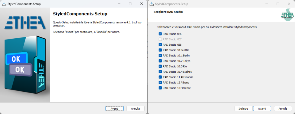
An easy "Installer" read-to-use is located in the Release area: Download the Installer.
The Installer automatically detect your Delphi versions, installa sources, build and installa packages and add source paths.
Installation with DPM (Delphi Package Manager)
The library is also published on delphi.dev as the package EtheaDev.StyledComponents (Delphi XE6 to 13, Win32 and Win64): you can install it with DPM, the Delphi Package Manager, as an alternative to the Setup. From the IDE, right click on your project in the Project Manager and choose Manage DPM Packages, or from the command line:
dpm install EtheaDev.StyledComponents <path of your project>.dprojDPM downloads the package, builds it for the Delphi version and the platforms of your project and adds it to the project.
Documentation
Follow the Project Site to known how to use those components to modernize your Delphi VCL using those components.
A brief description
StyledComponents is a set of VCL components for Delphi (32 and 64 bit) that allow you to overcome the limits imposed by standard VCL components, maintaining 100% compatibility of the properties.
You can easily use them, as a replacement for the standard ones, as well as to provide new features.
The main limitations of the buttons and components of the VCL are the shape and color, defined by the operating system.
With StyledComponents you can overcome these limits in a simple way. You can:
- Control the shape of the button, the width of its border and the shadow below it
- Control button and border color (without limits) for every button state.
- Use "families" of predefined styles as in the WEB environment (e.g. Angular, Angular Material 3 or Bootstrap)
- Adapt to the colors of the VCL styles, keeping the shape of the button consistent
- The appearance is identical in “Windows” mode or by applying VCL styles to the application
Last, but not least, with StyledTaskDialog you can control appearance of your Message Dialogs in any aspect. Using Skia4Delphi you can also add animated Icons to your messages.
…all available from the Delphi XE6 version (which allows the use of GDI+, used for button drawing).
The most important properties
using only few properties you can setup your Button in a very simple way.
Color attributes:
With three values, you can select predefined ready styles for button color, border and font color:
- StyleFamily: the "Family" of a Style (eg. Classic, Bootstrap, Angular, Angular-M3, Basic-Colors or SVG-Colors)
- StyleClass: a collection of predefined button style of the selected Family
- Style Appearance: eg.Normal or Outline
Shape attributes:
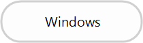
- StyleDrawType
btRoundRect (default) | btRect | btRounded | btEllipse |
|---|---|---|---|
 |  |  |  |
- StyleRoundedCorners: used for RoundRect and Rounded DrawType
- StyleRadius: used for btRoundRect DrawType
Border and shadow attributes:
- StyleBorderWidth: the width of the border, the same in every state of the button and on any family (
-1= the border of the chosen style,0= no border, greater than zero = that width in pixels, scaled with the DPI) - StyleShadowSize: a soft shadow below the button, drawn inside the area of the control (
-1= the shadow of the chosen style,0= no shadow, greater than zero = that shadow in every state and on any family)
Like the other style properties, both are available on all the buttons, on the toolbar, the navigators, the button group and the category buttons (which give them to their buttons and items), and the default border width of the new components can be set with RegisterDefaultRenderingStyle. The shadow is also available on TStyledPanel.
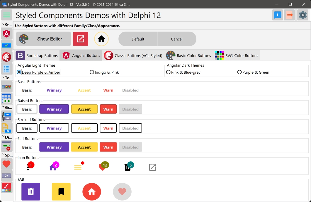
In this picture you can see the StyledComponentsDemo application with some examples:
Special Properties:
StyledComponents offers more options then standard components, such as:
- Down, AllowUp and GroupIndex to use them in "group"
- Caption alignment (left, centered, right)
- Presence of Captions (with alignment) and customizable icons via ImageList in TStyledDBNavigator and TStyledBindNavigator
- Ability to change icon position and caption alignment in TStyledButtonGroup and TStyledCategoryButtons
- Different appearance for buttons Items of TStyledToolbar, TStyledButtonGroup and TStyledCategoryButtons
- Notification Badge for all StyledButtons
- A Component Editor (right click on the component, "Styled Button Editor...") to choose Family, Class and Appearance with a preview of every style, and to set the shape, the border and the shadow
- AutoClick event (after a Delayed time)
- Animated icons using, TStyledAnimatedButton
…finally, a component for Dialogs is available, completely customizable, which uses custom images or animations and StyledButtons within it, to be 100% consistent with the rest of the application.
Notice: by default the cursor for all Styled Buttons is crHandPoint.
List of available Components:
| Component | Description |
|---|---|
 | TStyledGraphicButton is a "pure" Graphic Button with Styles (eg. Classic, Bootstrap, Angular, Angular-M3, Basic-Color, SVG-Color) with support of ImageList, Action and full configuration of five states: Normal, Pressed, Selected, Hot and Disabled. You can use it also into a TVirtualList component. |
 | TStyledButton is classic "button control" with Styles (eg. Classic, Bootstrap, Angular, Angular-M3, Basic-Color, SVG-Color) with support of ImageList, Action and full configuration of five states: Normal, Pressed, Selected, Hot and Disabled, plus Focus and TabStop support. You can easily replace all of your TButton components. |
 | TStyledToolbar is a Toolbar that uses StyledToolButton, with full customizable of every button style and full control over the size of the buttons, also when Captions are visible. The width and height of the StyledToolButtons inside, do not depends on Caption size, as in classic TToolBar. |
 | TStyledDbNavigator is a special "DbNavigator" component, with Styles (eg. Classic, Bootstrap, Angular, Angular-M3, Basic-Color, SVG-Color), plus Button captions and better "move" icons in vertical mode. |
 | TStyledBindNavigator is a special "BindNavigator" component, with Styles (eg. Classic, Bootstrap, Angular, Angular-M3, Basic-Color, SVG-Color), plus Button captions and better "move" icons in vertical mode. |
 | TStyledButtonGroup is a special "ButtonGroup" component with Styles (eg. Classic, Bootstrap, Angular, Angular-M3, Basic-Color, SVG-Color) plus ImagePosition, CaptionAlignment and Flat properties, for adding more controls to the appearance of Buttons. |
 | TStyledCategoryButtons is a special "CategoryButtons" component with Styles (eg. Classic, Bootstrap, Angular, Angular-M3, Basic-Color, SVG-Color) plus ImagePosition, CaptionAlignment and Flat properties, for adding more controls to the appearance of Buttons. |
 | TStyledTaskDialog is a special "TaskDialog" component (to replace MessageDlg and TaskDlg) with custom Button Captions and Icons. Using a special Form you can show a full customizable Dialog. Using Skia4Delpghi you can show animated dialogs! |
 | TStyledPanel a styled container control based on TCustomPanel with support for Styles (eg. Classic, Bootstrap, Angular, Angular-M3, Basic-Color, SVG-Color). It provides full control over background rendering with customizable shape (Rounded, RoundRect, Rect, Ellipse), colors and borders for Normal and Disabled states. Features include Caption alignment, customizable margins, and the ability to switch between styled and VCL rendering. |
For "backward compatibily", you can also use those components.
| Component | Description |
|---|---|
 | TStyledSpeedButton derives from TStyledGraphicButton, and introduce Layout, Margin and Spacing properties, to control Drawing (Icon and Caption) as a standard TSpeedButton. You can also use Glyph and NumGlyphs. |
 | TStyledBitBtn derives from TStyledButton, and introduce Layout, Margin and Spacing properties, to control Drawing (Icon and Caption) as a standard TBitBtn. You can also use Glyph and NumGlyphs. |
Those components uses some properties to Draw Icon and Caption in a different way:
- A Glyph and NumGlyphs for the Icon of the button (not reccomended, because doesn't scale)
- The position of the caption, using ButtonLayout instead and Margin (instead of ImageAlignment and ImageMargins)
- The space between the Icon and the Caption, defined by spacing.
TStyledAnimatedButton Component (using Skia4Delphi):
| Component | Description |
|---|---|
 | TStyledAnimatedButton is Styled Button with with "animated icon" using a Skia TSkAnimatedImage component inside. You can select the events that starts the animation, like: AnimateOnMouseOver, AnimateOnClick, AnimateAlways, AnimateOnFocus. |
Description of Styled Buttons
TStyledGraphicButton, TStyledButton, TStyledBitBtn and TStyledSpeedButton are designed to expand Button UI styles to break the limits of classic VCL Button components.
The Button Styles defined are not affected by VCLStyles and are also visibile on a "non styled" Windows application, so you can have more than a single Button styled also using VCLStyles.
You can build Rectangular, Rounded or RoundRect or Ellipsis/Circle button as you prefer.
using only three elements you can setup your Button in a very simple way:
- StyleFamily: the main attribute for Styled Button
- StyleClass: a collection of predefined button style
- Style Appearance: eg.Normal or Outline
Component editor for Styled Buttons and Styled Panels:
To simplify use of the Styled Buttons and Panels, there is a useful "Component Editor" (right-click the component in the Form Designer) to select with a click the three values that define the Style. All the details, with the screenshots of every family, are in the Component Editor page.
List of available StyleFamily
- Classic: a collection of Styles similar to VCLStyled TButton
- Bootstrap: a collection of Styles similar to Bootstrap buttons
- Angular-Light: a collection of styles similar to the Material 2 Angular buttons (Flat, Raised, Basic, Stroked), light theme
- Angular-Dark: the same Material 2 styles, dark theme
- Angular-M3-Light: the buttons of the current Angular Material 3 (Text, Elevated, Outlined, Filled, Tonal), light colour scheme, as in the Angular Material button page
- Angular-M3-Dark: the same Angular Material 3 buttons, dark colour scheme
- Basic-Color: a collection of styles based to Delphi "normal" and "System" Color collection
- SVG-Color: a collection of styles based to Delphi "AlphaColors" Color collection
Control the default rendering styles for any Styled Buttons, Toolbars and DbNavigator
It's possible to redefine at global application level the default Drawing styles for any Components, adding some line in your project file. For Example:
Add those units in uses of dpr:
  Vcl.StyledButton,
  Vcl.ButtonStylesAttributes,
  Vcl.StyledDbNavigator,
  Vcl.StyledToolbar,
Add those lines after Application.Initialize in dpr code:
  TStyledButton.RegisterDefaultRenderingStyle(btRounded);
  TStyledDbNavigator.RegisterDefaultRenderingStyle(btRounded);
  TStyledToolbar.RegisterDefaultRenderingStyle(btRect);
You can also use a Family/Class/Appearance of any type, for example:
TStyledButton.RegisterDefaultRenderingStyle(btRoundRect, BOOTSTRAP_FAMILY, btn_primary, BOOTSTRAP_NORMAL);You can also use Interposer Unit (Vcl.StyledComponentsHooks.pas) to easily change all Buttons of your application.
Template unit to create your custom Family Styles
With the unit "Vcl.TemplateButtonStyles.pas" you can create your own Family of Button Styles, as explained here
Special Features
Styled Components has special features compared to classic VCL Controls.
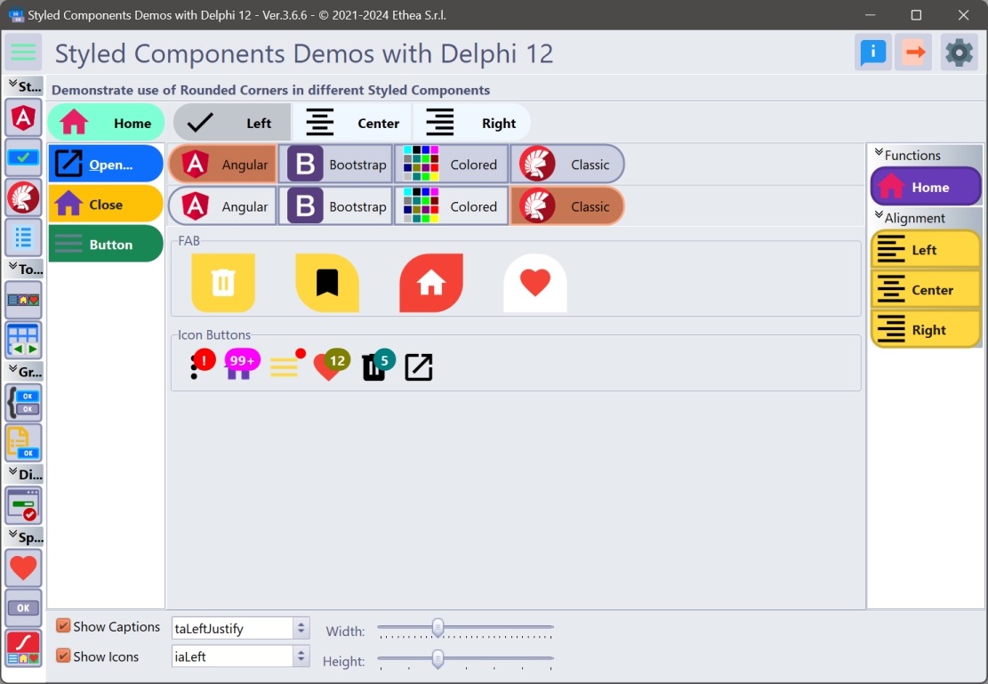
RoundedCorners options
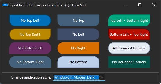
You can define RoundedCorners property, to enable/disable Rounding drawing, as showed in this example:
Notification Badge for buttons
All styled Buttons can show NotificationBadge above them, with custom label/color and shape.

Read Notification Badge guide to explorer how it works...
AutoClick/AutoClickDelay for buttons
You can activate the AutoClick flag to invoke the Click event of the StyledButton, after a AutoClickDelay time, as showed in the AutoClick Demo:
Also the StyledTaskdialog can use this function to AutoClick and close the Dialog.
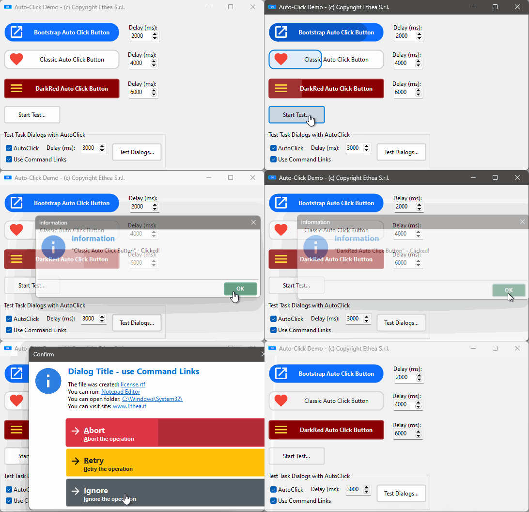
Read AutoClick/Delay guide to explorer how it works...
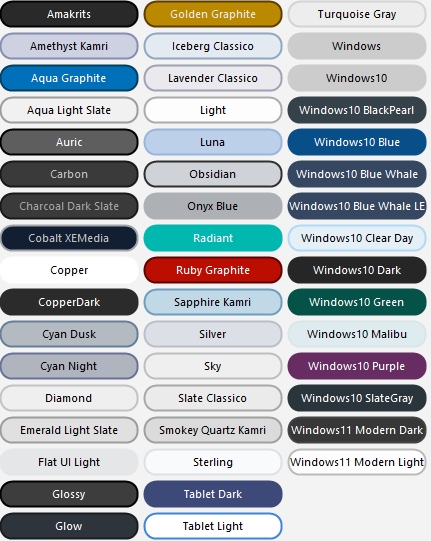
Rounded Button Style
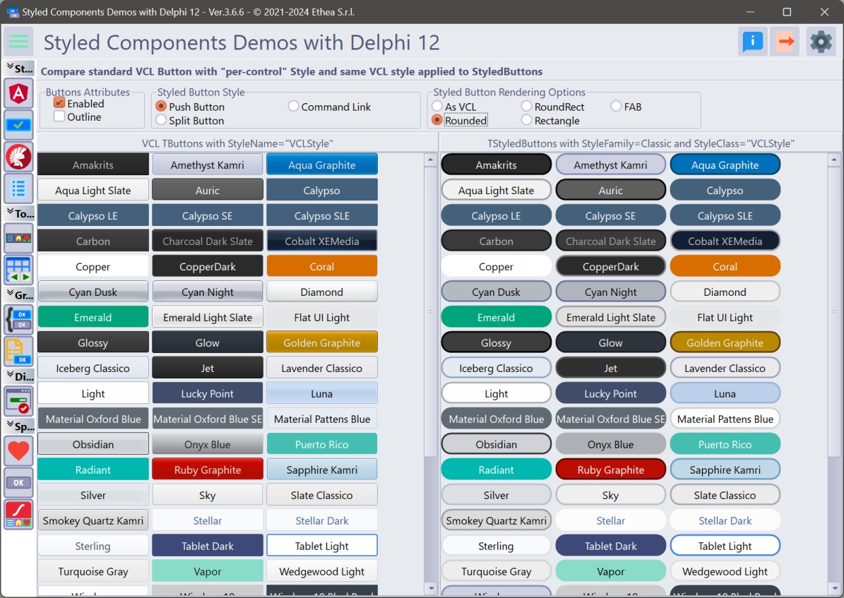
_In this picture an example of "full-rounded" buttons applyed to all "VCL-Styled" buttons: a feature not available in VCL Styled buttons.
Use the "StyledComponentsDemos" to see all the components in action!
In the Demos folder you can find subfolders for every Delphi version that contains the project:
StyledComponentsDemo.dproj
The demo is organized to launch different Forms "embedded" into the main form client area or outside.
Demos\StyledButtonsDemo\Delphi10_4+\StyledButtonsVCLStyled.dpr
Using standard VCL Buttons you can apply different colors only from Delphi 10.4, using "per-control" option, but you cannot control other aspect of Buttons.
With StyledComponents you can have Buttons with the active VCL-Style also in previous versions of Delphi, and you can control all the aspect of the button, like Rounded shape, as you can test in the Demo.
The same demo, compiled with an old Delphi version (like XE6) show that you have this feature available!
Enabling Skia4Delphi to see the Animated Buttons Demo in action
If you have Skia4Delphi installed, you must install also the Packages contained into Vcl.StyledAnimatedComponents.groupproj.
Then you must "Enable SKIA" in the "context-menu" of StyledComponentsDemo project, so you can see the StyledAnimated Buttons in action.
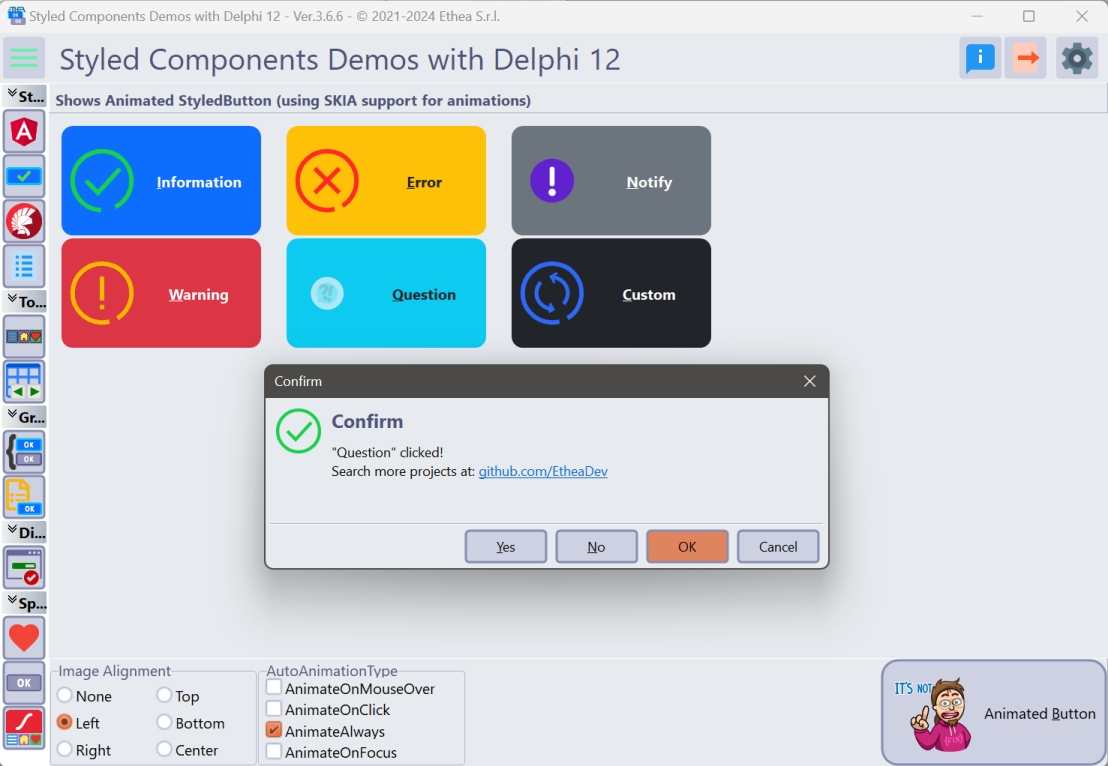
Notice that this feature is not available in Delphi XE6.
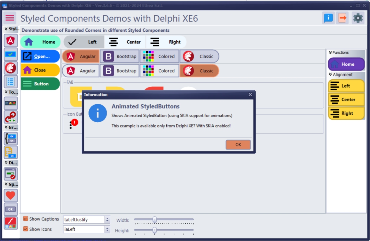
RoundedCorners Demo
A simple way to show StyledRoundedCorners options applied to many Styled Components.
Description of StyledToolBar
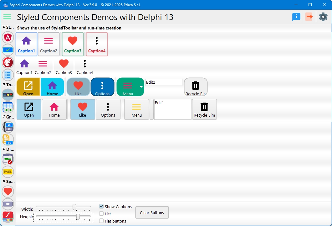
TStyledToolbar (and TStyledToolButtons) shows a Toolbar like a classic TToolbar but with the same Style attributes that can be assigned to Styled Graphic Buttons.
In the StyledToolbar demo, you can see how to use this component, compared to the classic Delphi TToolBar.
The major differece is based on the control of the "size" of buttons when "ShowCaptions" is True: in standard Toolbar, the dimension is defined by the larger caption. In the StyledToolbar the dimension is always defined by "ButtonWidth" property.
In this picture, the Toolbar Demo compares the StyledToolbar and the classic Toolbar
Description of StyledDbNavigator and StyledBindNavigator
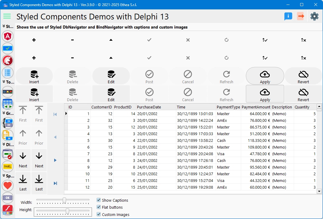
TStyledDbNavigator (with TStyledNavButton buttons) shows a Navigator like a classic TDbNavigator but with the same Style attributes that can be assigned to Styled Graphic Buttons.
TStyledBindNavigator (with TStyledNavButton buttons) shows a Navigator like a classic TBindNavigator but with the same Style attributes that can be assigned to Styled Graphic Buttons.
In the TStyledDbNavigator demo, you can see how to use those components, compared to the classic Delphi TDbNavigator and TBindNavigator.
In this picture, the StyledDbNavigator and StyledBindNavigator with a custom imagelist for images and Captions visible
The major differences are:
- the possibility to set and show Captions on the StyledDbNavigator.
- The "Icons" with up/down directions when the navigator is displayed in vertical position.
- The icons are more readable (like the "Edit" one) and customized form VCL Styled in light and dark mode.
- It's possible to use a Custom Imagelist, to show other images on the buttons.
Description of StyledButtonGroup and StyledCategoryButtons
TStyledButtonGroup and TStyledCategoryButtons shows a list of buttons with flow or full-size layout, like a classic TButtonGroup or TCategoryButtons. You can define StylesFamily/StyleClass/StyleAppearance for every buttons at component level or change the Style on a single "Button" Item.
TStyledButtonGroup inherits from TButtonGroup, so you can continue to use it as the VCL component as showed in the Demo:
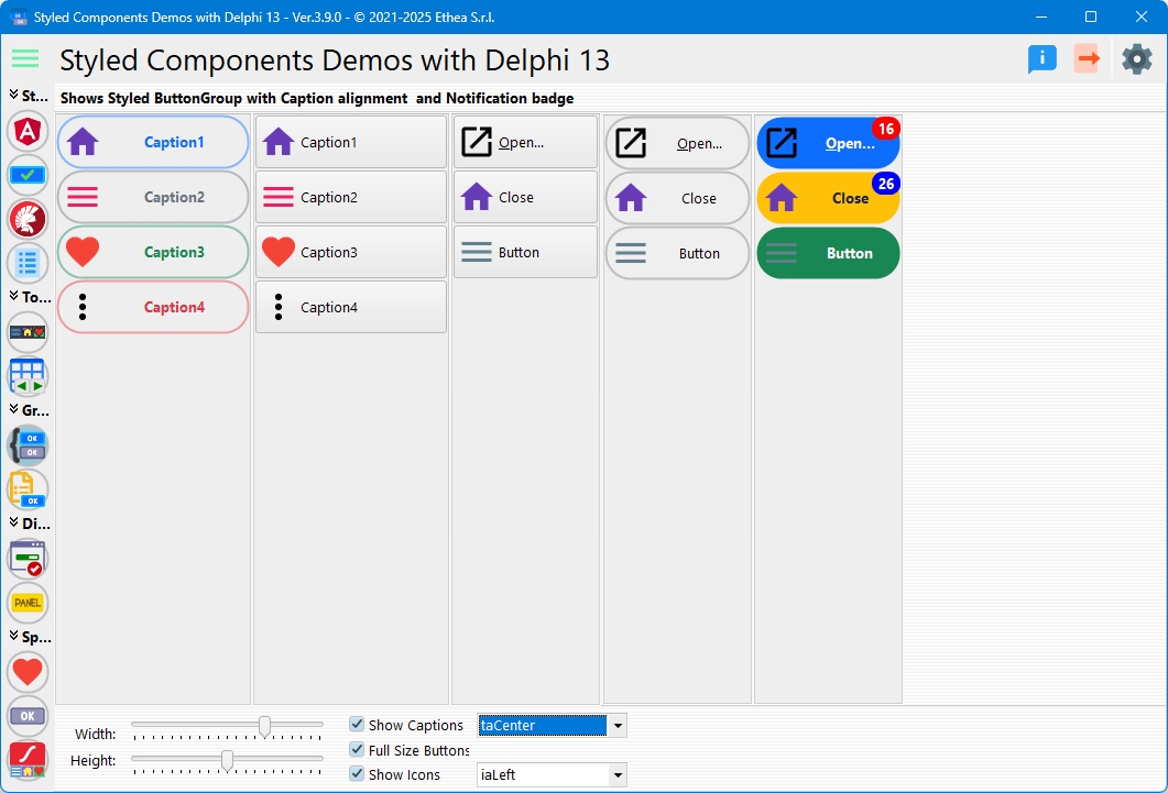
TStyledCategoryButtons inherits from TCategoryButtons, so you can continue to use it as the VCL component as showed in the Demo:
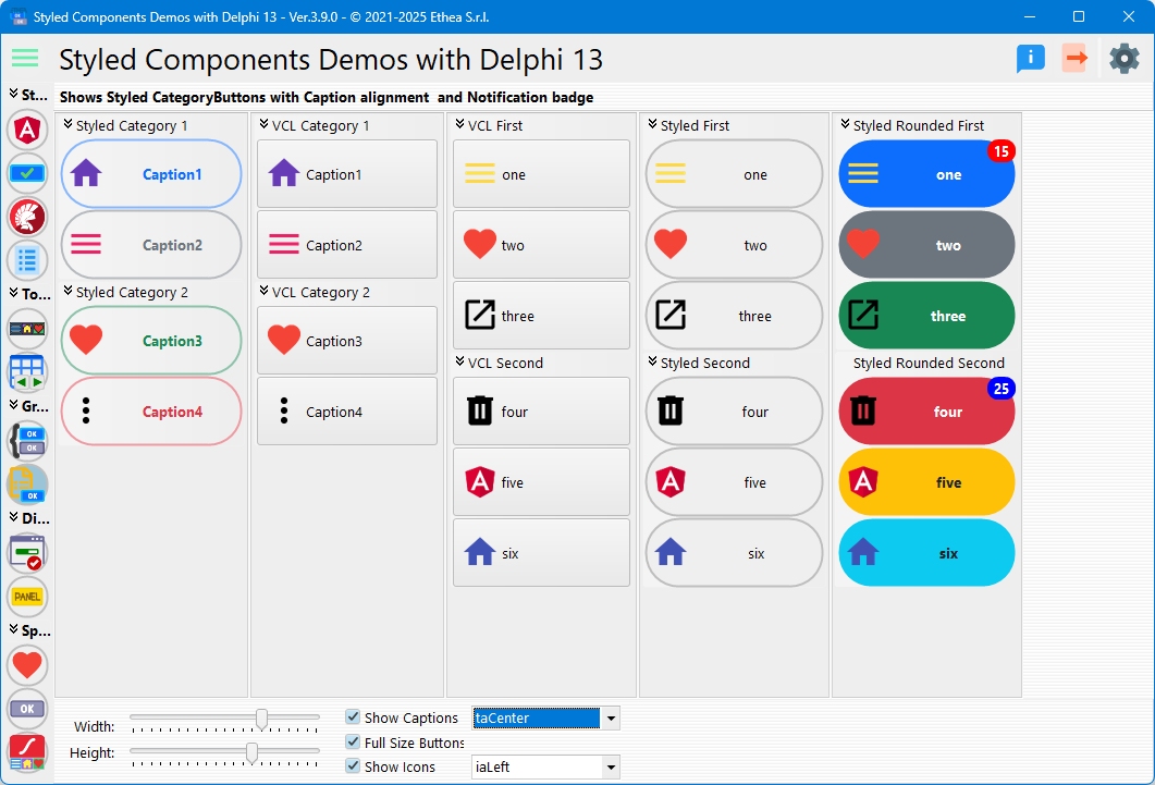
The major differences are:
- You can define a custom style for every buttons in the "Group" or "Categories"
- You can use a custom style for each button.
- You can specify Flat buttons.
- The Buttons caption can be aligned also at center or right.
- The Buttons icons can be aligned left, top, bottom, right, center.
- Additional Spacing and ImageMargins to control exact position of the Buttons icon and the Caption.
Description of StyledTaskDialog
TStyledTaskDialog is designed to expand message/task dialog functionalities, fully customizable and also animation.
You can test Styled Dialogs with different "StyledButton set" (Classic, Angular, Bootstrap).
Also, you can use a custom form (inherited from "TStyledTaskDialogForm") to show your complete custom Dialog.
How to replace standard MessageDlg and TaskDialogs
You can use the StyledTaskDialog in you application to replace MessageDlg and and TaskDialogs.
Add the unit Vcl.StyledTaskDialogFormUnit.pas your application.
If you are using Skia4Delphi and you want to use Animated Dialogs, add the unit Skia.Vcl.StyledTaskDialogAnimatedUnit.pas
then you must add the unit Vcl.StyledTaskDialog to your units and change the calls to standard Dialogs/TaskDialogs: MessageDlg -> StyledMessageDlg TaskDialog -> StyledTaskDialog
How to change Dialogs attributes (Font/Buttons Style)
By default, StyledDialogs uses Segoe UI Font with Size 9 (stored into Vcl.StyledTaskDialogFormUnit.dfm). If you want to use another font/size you can call InitializeStyledTaskDialogs like in this example:
  //Resize Standard Message Font to an higher size and select Arial character
  Screen.MessageFont.Size := Round(Screen.MessageFont.Size*1.2);
  Screen.MessageFont.Name := 'Arial';
  //Inizialize the styled dialogs using "Bootstrap" styled buttons and the Screen.MessageFont
  InitializeStyledTaskDialogs(True, Screen.MessageFont, BOOTSTRAP_FAMILY);
StyledTaskDialog Demo
A simple demo to show how to use StyledTaskDialog with custom icons using ImageList.
The main form is useful to test every format / buttons and type of dialogs.
++Confirmation Dialog with custom font/size and English buttons++
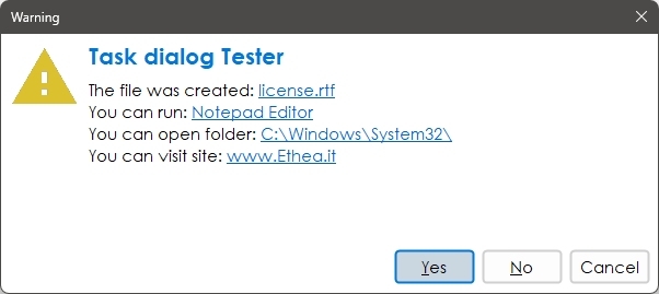
++Warning Dialog with italians Captions in AcquaGraphite Style++
To change language of button captions (for example in italian) you must change StyledComponents.inc file and activate: {$Define ItaMessages}
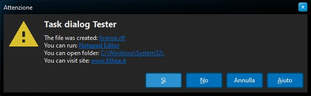
++Error Dialog in Windows10 Vcl Style++
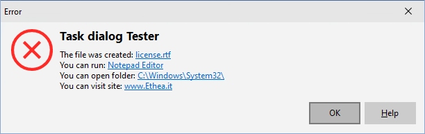
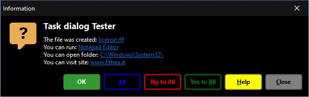
++Custom Message Dialog++
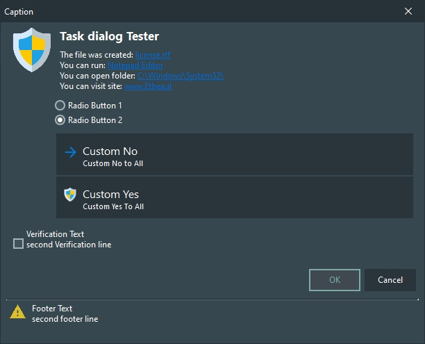
++Use StyleTaskDialog component++
...with RadioButtons, CommandLinks, Verification Text and Footer Text
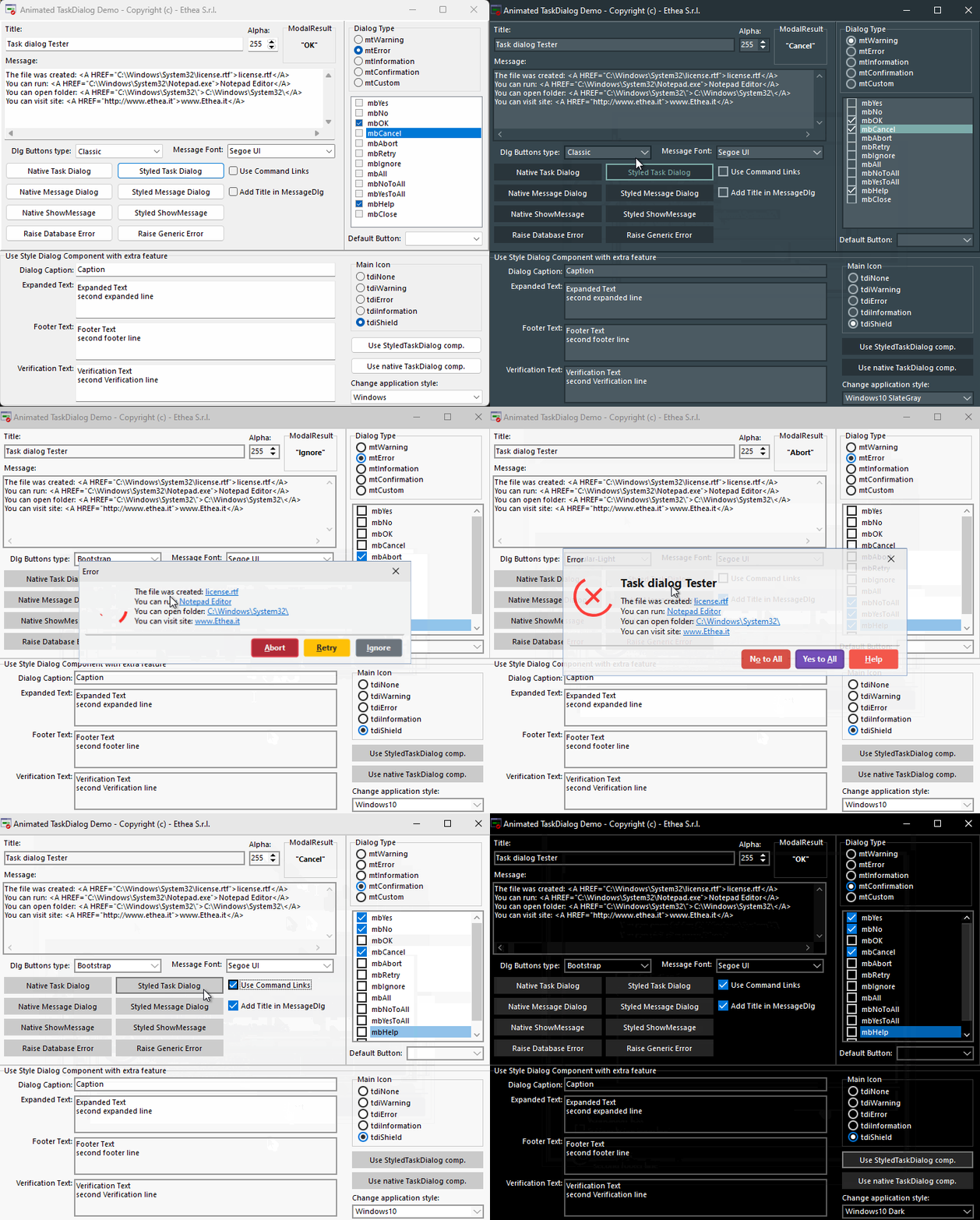
Demo of AnimatedStyledTaskDialog
If you are have Skia4Delphi installed, you can also try the AnimatedTaskDialogDemo, with nice animations:
Available from Delphi XE6 to Delphi 13 (32bit and 64bit platforms)
Related links: embarcadero.com - learndelphi.org
AUTOMATED TEST SUITE
The Test folder contains a DUnitX console test suite (Delphi 13, Win32 and Win64) covering rendering (shapes, notification badge), the style families contracts (every Class/Appearance assigns its colours, Classic Disabled visibly differs from Normal), buttons (Assign, StyleFamily change, dialog keys), containers (StyledToolbar BeginUpdate/EndUpdate, StyledPanel ParentBackground with and without VCL styles, StyledButtonGroup/CategoryButtons items) and StyledTaskDialog. It also contains performance benchmarks (StyledPerfTests) that count heap allocations and time per paint and fail above a ceiling, locking the 4.3.0 optimizations against regressions. Run Test\run_tests.cmd [Win32|Win64] [Debug|Release]: it builds the project and writes a NUnit XML report in Test\Bin\<Platform>\<Config>.
RELEASE NOTES
9 Nov 2026 - version 4.6.2
- Support for the new VCL style "Windows Modern Dark SE" of Delphi 13.2: it is now in the colour tables of the Classic family used by the buttons (StyleClass and AsVCLComponent) and by TStyledPanel with AsVCLComponent; before, the components fell back to the light colours of the Windows class. Its colours, measured on the .vsf file, are the ones of Windows11 Modern Dark
- Fixed the colours of the Windows Modern styles of Delphi 13.1, measured on their .vsf files: "Windows Modern Dark" had the colours of Windows11 Modern Dark (button #373737 instead of #262626, Hot #405560 instead of the blue #017CE6, panel #373737 instead of black #000000); the panel border of Windows Modern Blue, Green, Purple, SlateGray and MountainMist is now the shadow side of the bevel painted by the style (it was the panel colour itself), and the panel colour of Windows Modern Blue and SlateGray is now the exact one
- The test suite now has 161 tests; the slow TextBlink tests that show the dialog are switched off with [Ignore]
All the release notes: README on GitHub
License
Copyright (c) 2022-2026 Ethea S.r.l.
Licensed under the Apache License, Version 2.0 (the "License"): you may not use this software except in compliance with the License. Unless required by applicable law or agreed to in writing, software distributed under the License is distributed on an "AS IS" BASIS, WITHOUT WARRANTIES OR CONDITIONS OF ANY KIND, either express or implied. See the License for the specific language governing permissions and limitations under the License.