
DBAwareLabeledComponents


An extended TDBGrid plus classic Delphi-VCL Editors with Boundary-Label (DB-Aware and Standard) including NumberBox
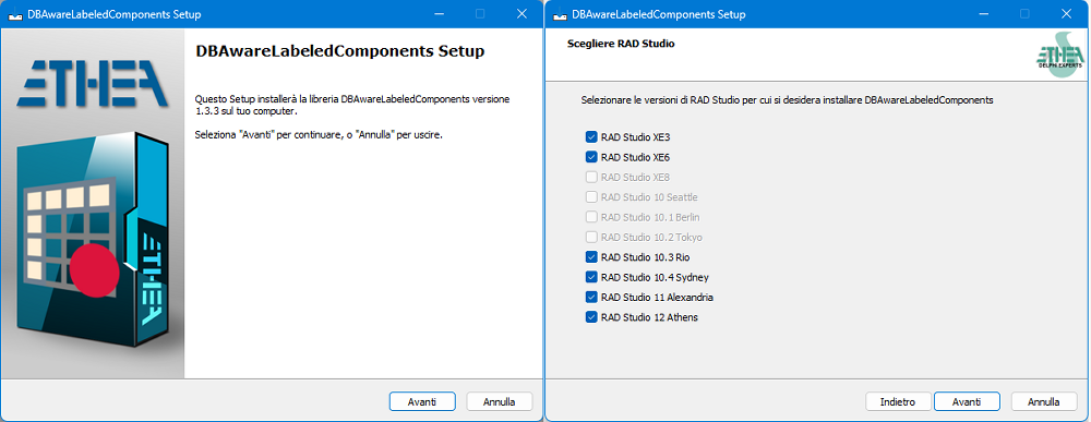
New Setup for automatic installation of components
From 1.3.3 version a new "Installer" read-to-use is located in the Release area: Download the Installer.
The Installer automatically detect your Delphi versions, install sources, build and install packages and add source paths.
Installation with DPM (Delphi Package Manager)
The library is also published on delphi.dev as the package EtheaDev.DBAwareLabeledComponents (Delphi XE3 to 13, Win32 and Win64): you can install it with DPM, the Delphi Package Manager, as an alternative to the Setup. From the IDE, right click on your project in the Project Manager and choose Manage DPM Packages, or from the command line:
dpm install EtheaDev.DBAwareLabeledComponents <path of your project>.dprojDPM downloads the package, builds it for the Delphi version and the platforms of your project and adds it to the project.
Documentation
Follow the Project Site to known how to use those components to modernize your Delphi VCL applications and the features of the advanced DbGrid.
An advanced TDbGrid component:
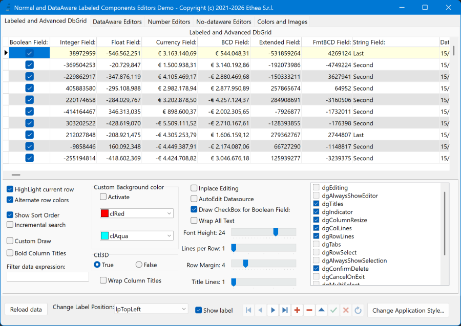
TLabeledDbGrid is an advanced version of classic TDbGrid with a boundary Label, plus some extra features:
- ShowSortOrder: shows an indicator of sorting column
- Embedeed CheckBox for boolean fields
- Incremental search, when typing into a ReadOnly DbGrid
- Alternate row-color
- Custom row-colors
- Show sort order
- Incremental search
- Lines per Rows (to show memo fields with multiple lines)
- RowMargin (to enlarge heigh of any row)
- WrapColumnTitles (word-wrap of the column titles)
- TitleLines (set the title-row height in number of text lines, with titles always vertically centered)
*Example of a TLabeledDbGrid (with some extended functionality like inplace checkbox and sorting) with the label aligned TopCenter (inside the client area of the grid aligned alClient).
This library contains also the classic VCL editors (standard and data-aware) with the addition of a "label" attached to the component itself (like the native component TLabeledEdit).
It is no longer necessary to keep the Label "connected" and "aligned" by hand to the editor: on every component you can specify 3 simple properties:
- BoundCaption
- BoundLabel.Labelposition (default lpTopLeft)
- BoundLabel.LabelSpacing (default 1)
The label can be positioned with 12 alignements: lpTopLeft, lpTopCenter, lpTopRight, lpBottomLeft, lpBottomCenter, lpBottomRight, lpLeftTop, lpLeftMiddle, lpLeftBottom, lpRightTop, lpRightMiddle, lpRightBottom
New components not present in VCL:
TLabeledButtonEdit and TLabeledDBButtonEdit are a classic editors with a button inside (on the right). For Date Fields the button opens automatically a Popup-Calendar.
Support for new NumberBox component
TNumberBox component (available from D10.4.2) is the new component for advanced numeric input. In this library you can find:
- TDBNumberBox: the standard component with classic DataAeware support (DataSource + DataField) without Label.
- TLabeledNumberBox: a TNumberBox component with boudary label
- TLabeledDBNumberBox: a TDBNumberBox with boudary label
Examples
Look at those examples, showing all the components with different Label alignments: the demo is available into Demo Folder
| Sample | Description |
|---|---|
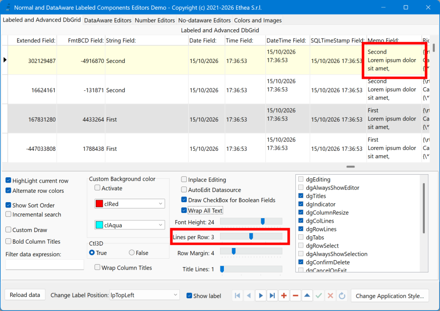 | Example of LabeledDbGrid with LinesPerRow = 3 to show multiline content of memo fields |
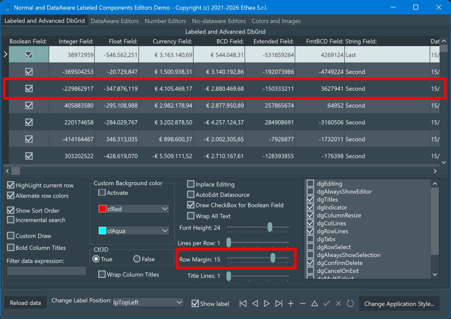 | Example of LabeledDbGrid with RowMargin = 15 to to change height of grid Row. Fully compatible with Styles (light and dark) |
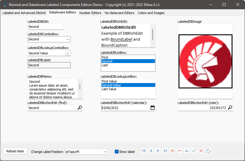 | Example of collection of Dataaware components with label aligned to "TopLeft" |
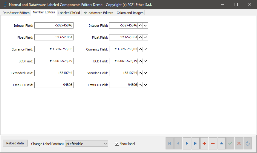 | Example of LabeledDBCurrencyEdit and LabeledDBNumberBox (only for 10.4.2): Dataware components for numeric input (from right to left) with label aligned to "LeftMiddle" |
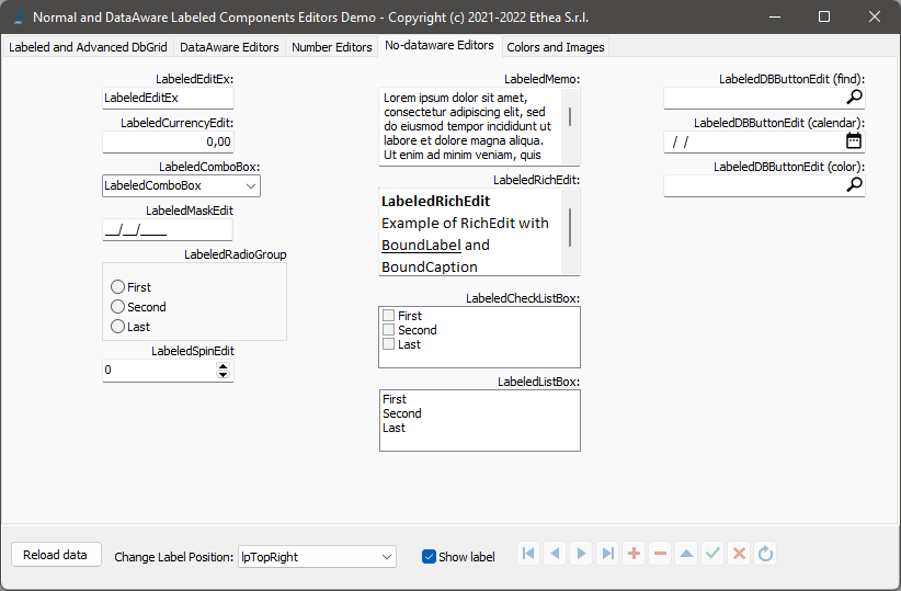 | Example of collection of Standard components with label aligned to "TopRight" |
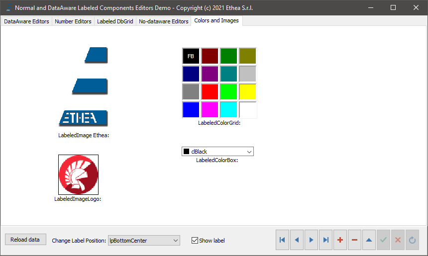 | Example of collection of components with label aligned to "BottomCenter" |
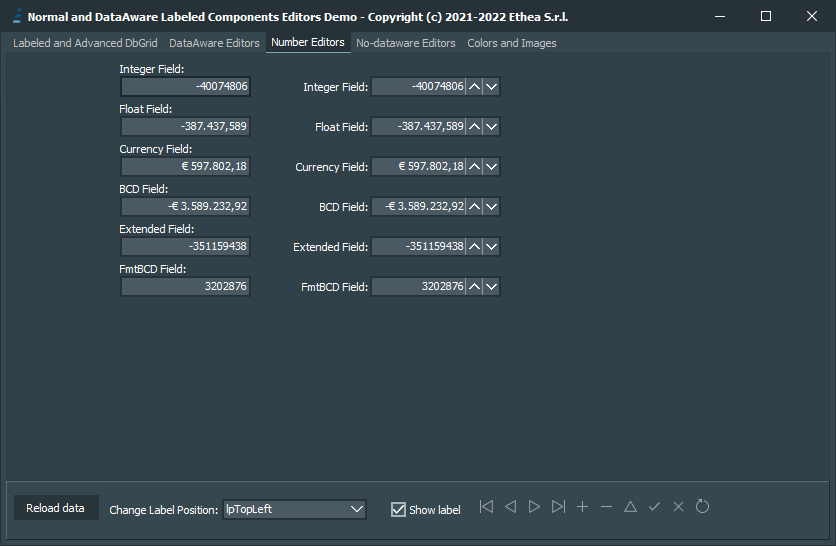 | All components are fully VCL styles compatible |
A complete Demo is available in Demo Folder.
Available from Delphi XE3 to Delphi 13 (32bit and 64bit platforms)
Related links: https://www.embarcadero.com/ - https://learndelphi.org/
RELEASE NOTES
15 Oct 2026: ver.1.4.1
- Fixed TLabeledDbGrid.TitleFont not stored in the DFM (e.g. Bold style set in the Object Inspector was lost at runtime)
- Fixed TLabeledDbGrid inside a TFrame: scaling no longer resets the TitleFont style, name and color
- Demo: added "Bold Column Titles" option, executables in Bin32/Bin64 folders, new BuildDemo.ps1 script
All the release notes: README on GitHub
License
Copyright (c) 2021-2026 Ethea S.r.l.
Licensed under the Apache License, Version 2.0 (the "License"): you may not use this software except in compliance with the License. Unless required by applicable law or agreed to in writing, software distributed under the License is distributed on an "AS IS" BASIS, WITHOUT WARRANTIES OR CONDITIONS OF ANY KIND, either express or implied. See the License for the specific language governing permissions and limitations under the License.