Welcome to StyledComponents Library for Delphi (VCL)
Components similar to Delphi VCL Buttons, Toolbar, DbNavigator, BindNavigator, ButtonGroup and CategoryButtons with Custom Graphic Styles, and an advanced, full-customizable TaskDialog, also with animations!
A brief description
StyledComponents is a set of VCL components for Delphi (32 and 64 bit) that allow you to overcome the limits imposed by standard VCL components, maintaining 100% compatibility of the properties.
You can easily use them, as a replacement for the standard ones, as well as to provide new features.
The main limitations of the buttons and components of the VCL are the shape and color, defined by the operating system.
With StyledComponents you can overcome these limits in a simple way. You can:
- Control the shape of the button
- Control button and border color (without limits) for every button state.
- Use "families" of predefined styles as in the WEB environment (e.g. Angular or Bootstrap)
- Adapt to the colors of the VCL styles, keeping the shape of the button consistent
- The appearance is identical in “Windows” mode or by applying VCL styles to the application
Last, but not least, with StyledTaskDialog you can control appearance of your Message Dialogs in any aspect. Using Skia4Delphi you can also add animated Icons to your messages.
…all available from the Delphi XE6 version (which allows the use of GDI+, used for button drawing).
The most important properties
using only few properties you can setup your Button in a very simple way.
Color attributes:
With three values, you can select predefined ready styles for button color, border and font color:
- StyleFamily: the "Family" of a Style (eg.Classic or Bootstrap or Angular)
- StyleClass: a collection of predefined button style of the selected Family
- Style Appearance: eg.Normal or Outline
Shape attributes:
- StyleDrawType
btRoundRect (default) | btRect | btRounded | btEllipse |
|---|---|---|---|
 |  |  |  |
- StyleRoundedCorners: used for RoundRect and Rounded DrawType
- StyleRadius: used for btRoundRect DrawType
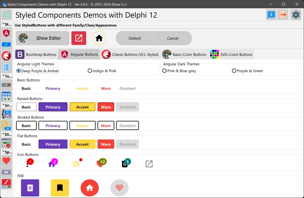
In this picture you can see the StyledComponentsDemo application with some examples:
Special Properties:
StyledComponents offers more options then standard components, such as:
- Down, AllowUp and GroupIndex to use them in "group"
- Caption alignment (left, centered, right)
- Presence of Captions (with alignment) and customizable icons via ImageList in TStyledDBNavigator and TStyledBindNavigator
- Ability to change icon position and caption alignment in TStyledButtonGroup and TStyledCategoryButtons
- Different appearance for buttons Items of TStyledToolbar, TStyledButtonGroup and TStyledCategoryButtons
- Notification Badge for all StyledButtons
- AutoClick event (after a Delayed time)
- Animated icons using, TStyledAnimatedButton
…finally, a component for Dialogs is available, completely customizable, which uses custom images or animations and StyledButtons within it, to be 100% consistent with the rest of the application.
Notice: by default the cursor for all Styled Buttons is crHandPoint.
List of available Components:
| Component | Description |
|---|---|
 | TStyledGraphicButton is a "pure" Graphic Button with Styles (eg. Classic, Bootstrap, Angular, Basic-Color, SVG-Color) with support of ImageList, Action and full configuration of five states: Normal, Pressed, Selected, Hot and Disabled. You can use it also into a TVirtualList component. |
 | TStyledButton is classic "button control" with Styles (eg. Classic, Bootstrap, Angular, Basic-Color, SVG-Color) with support of ImageList, Action and full configuration of five states: Normal, Pressed, Selected, Hot and Disabled, plus Focus and TabStop support. You can easily replace all of your TButton components. |
 | TStyledToolbar is a Toolbar that uses StyledToolButton, with full customizable of every button style and full control over the size of the buttons, also when Captions are visible. The width and height of the StyledToolButtons inside, do not depends on Caption size, as in classic TToolBar. |
 | TStyledDbNavigator is a special "DbNavigator" component, with Styles (eg. Classic, Bootstrap, Angular, Basic-Color, SVG-Color), plus Button captions and better "move" icons in vertical mode. |
 | TStyledBindNavigator is a special "BindNavigator" component, with Styles (eg. Classic, Bootstrap, Angular, Basic-Color, SVG-Color), plus Button captions and better "move" icons in vertical mode. |
 | TStyledButtonGroup is a special "ButtonGroup" component with Styles (eg. Classic, Bootstrap, Angular, Basic-Color, SVG-Color) plus ImagePosition, CaptionAlignment and Flat properties, for adding more controls to the appearance of Buttons. |
 | TStyledCategoryButtons is a special "CategoryButtons" component with Styles (eg. Classic, Bootstrap, Angular, Basic-Color, SVG-Color) plus ImagePosition, CaptionAlignment and Flat properties, for adding more controls to the appearance of Buttons. |
 | TStyledTaskDialog is a special "TaskDialog" component (to replace MessageDlg and TaskDlg) with custom Button Captions and Icons. Using a special Form you can show a full customizable Dialog. Using Skia4Delpghi you can show animated dialogs! |
For "backward compatibily", you can also use those components.
| Component | Description |
|---|---|
 | TStyledSpeedButton derives from TStyledGraphicButton, and introduce Layout, Margin and Spacing properties, to control Drawing (Icon and Caption) as a standard TSpeedButton. You can also use Glyph and NumGlyphs. |
 | TStyledBitBtn derives from TStyledButton, and introduce Layout, Margin and Spacing properties, to control Drawing (Icon and Caption) as a standard TBitBtn. You can also use Glyph and NumGlyphs. |
Those components uses some properties to Draw Icon and Caption in a different way:
- A Glyph and NumGlyphs for the Icon of the button (not reccomended, because doesn't scale)
- The position of the caption, using ButtonLayout instead and Margin (instead of ImageAlignment and ImageMargins)
- The space between the Icon and the Caption, defined by spacing.
TStyledAnimatedButton Component (using Skia4Delphi):
| Component | Description |
|---|---|
 | TStyledAnimatedButton is Styled Button with with "animated icon" using a Skia TSkAnimatedImage component inside. You can select the events that starts the animation, like: AnimateOnMouseOver, AnimateOnClick, AnimateAlways, AnimateOnFocus. |
List of available StyleFamily
- Classic: a collection of Styles similar to VCLStyled TButton
- Bootstrap: a collection of Styles similar to Bootstrap buttons
- Angular-Light: a collection of styles similar to Angular buttons
- Angular-Dark: a collection of styles similar to Angular buttons
- Basic-Color: a collection of styles based to Delphi "normal" and "System" Color collection
- SVG-Color: a collection of styles based to Delphi "AlphaColors" Color collection
Special Features
Styled Components has special features compared to classic VCL Controls.
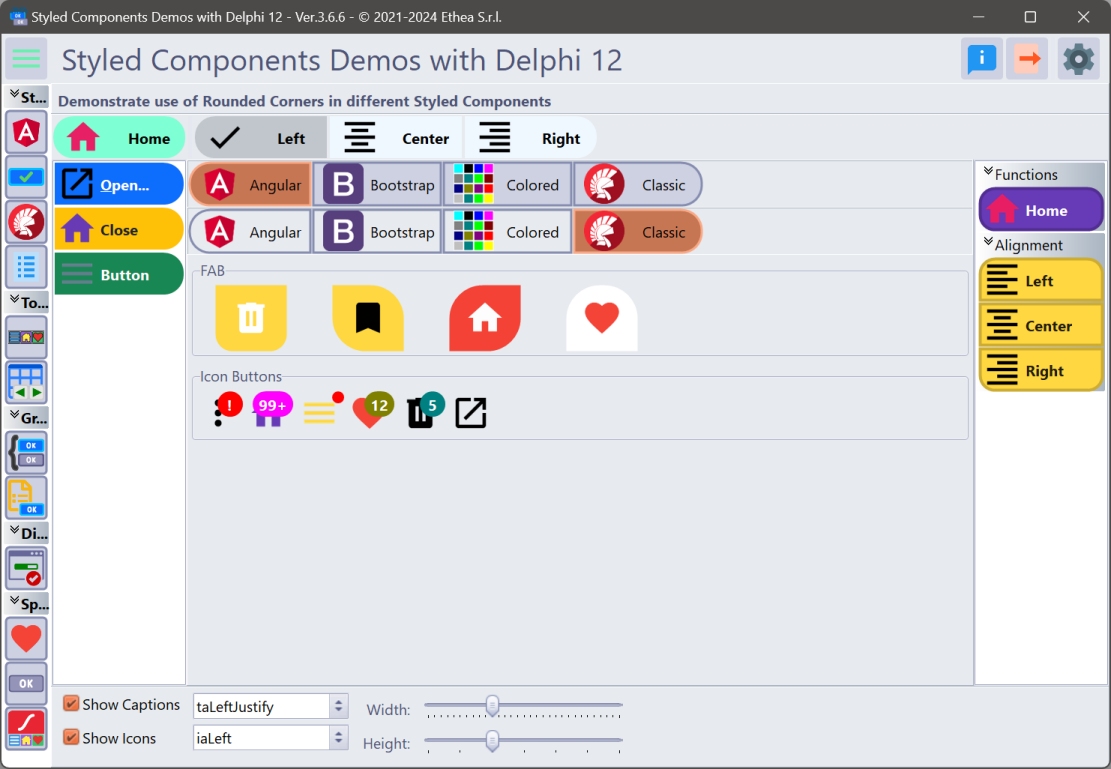
RoundedCorners options
You can define RoundedCorners property, to enable/disable Rounding drawing, as showed in this example:
Notification Badge for buttons
All styled Buttons can show NotificationBadge above them, with custom label/color and shape.
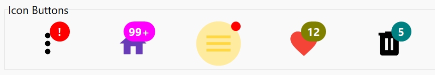
Read Notification Badge guide to explorer how it works...
AutoClick/AutoClickDelay for buttons
You can activate the AutoClick flag to invoke the Click event of the StyledButton, after a AutoClickDelay time, as showed in the AutoClick Demo:
Also the StyledTaskdialog can use this function to AutoClick and close the Dialog.
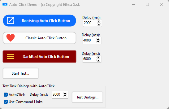
Read AutoClick/Delay guide to explorer how it works...
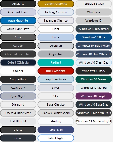
Rounded Button Style
_In this picture an example of "full-rounded" buttons applyed to all "VCL-Styled" buttons: a feature not available in VCL Styled buttons.
Use the "StyledComponentsDemos" to see all the components in action!
In the Demos folder you can find subfolders for every Delphi version that contains the project:
StyledComponentsDemo.dproj
The demo is organized to launch different Forms "embedded" into the main form client area or outside.
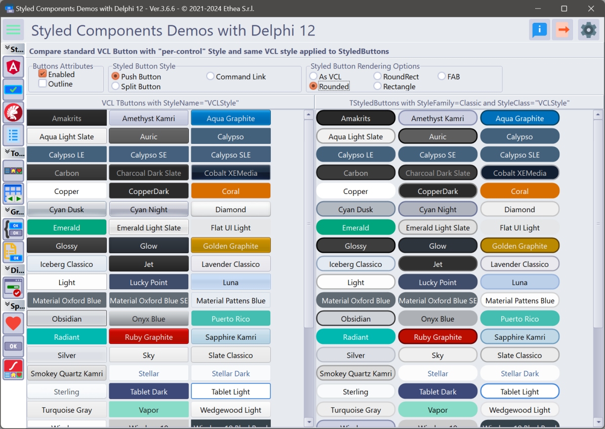
Demos\StyledButtonsDemo\Delphi10_4+\StyledButtonsVCLStyled.dpr
Using standard VCL Buttons you can apply different colors only from Delphi 10.4, using "per-control" option, but you cannot control other aspect of Buttons.
With StyledComponents you can have Buttons with the active VCL-Style also in previous versions of Delphi, and you can control all the aspect of the button, like Rounded shape, as you can test in the Demo.
The same demo, compiled with an old Delphi version (like XE6) show that you have this feature available!
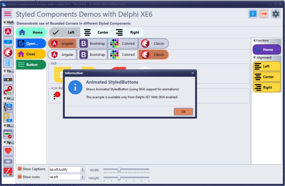
Enabling Skia4Delphi to see the Animated Buttons Demo in action
If you have Skia4Delphi installed, you must install also the Packages contained into Vcl.StyledAnimatedComponents.groupproj.
Then you must "Enable SKIA" in the "context-menu" of StyledComponentsDemo project, so you can see the StyledAnimated Buttons in action.
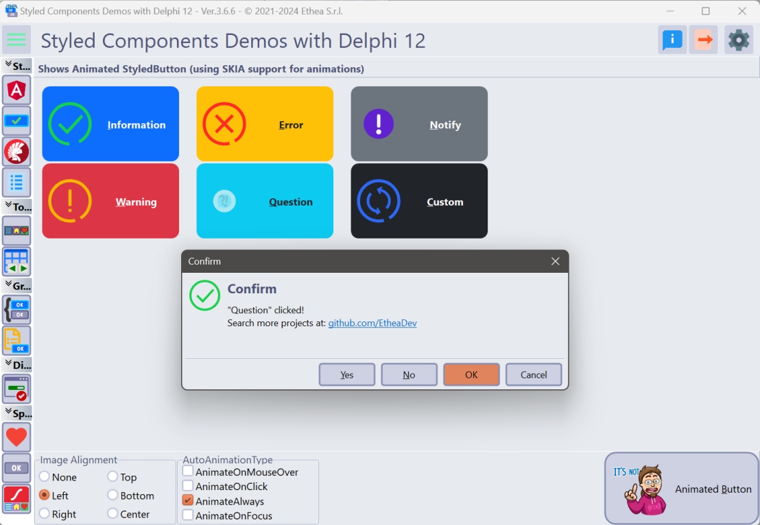
Notice that this feature is not available in Delphi XE6.
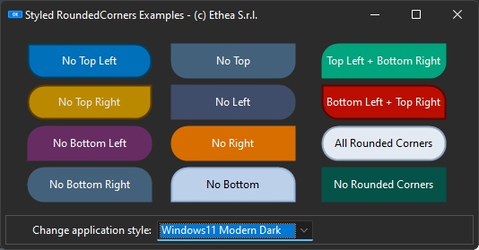
RoundedCorners Demo
A simple way to show StyledRoundedCorners options applied to many Styled Components.
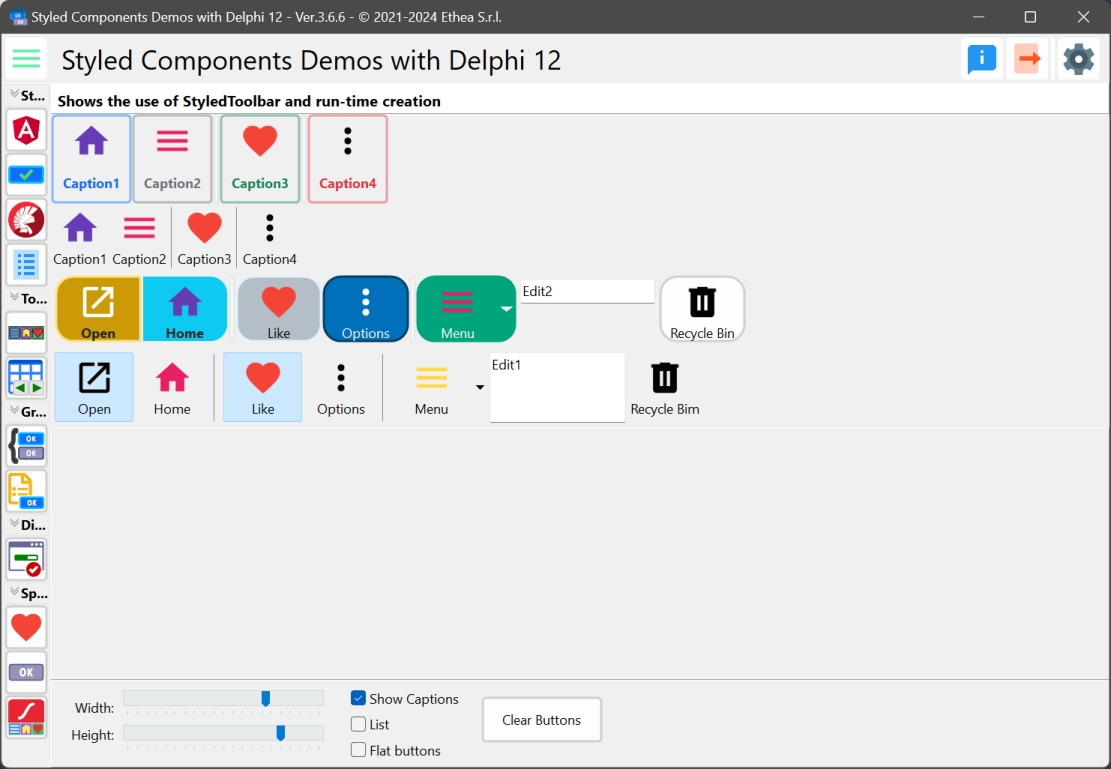
Description of StyledToolBar
TStyledToolbar (and TStyledToolButtons) shows a Toolbar like a classic TToolbar but with the same Style attributes that can be assigned to Styled Graphic Buttons.
In the StyledToolbar demo, you can see how to use this component, compared to the classic Delphi TToolBar.
The major differece is based on the control of the "size" of buttons when "ShowCaptions" is True: in standard Toolbar, the dimension is defined by the larger caption. In the StyledToolbar the dimension is always defined by "ButtonWidth" property.
In this picture, the Toolbar Demo compares the StyledToolbar and the classic Toolbar
Description of StyledDbNavigator and StyledBindNavigator
TStyledDbNavigator (with TStyledNavButton buttons) shows a Navigator like a classic TDbNavigator but with the same Style attributes that can be assigned to Styled Graphic Buttons.
TStyledBindNavigator (with TStyledNavButton buttons) shows a Navigator like a classic TBindNavigator but with the same Style attributes that can be assigned to Styled Graphic Buttons.
In the TStyledDbNavigator demo, you can see how to use those components, compared to the classic Delphi TDbNavigator and TBindNavigator.
In this picture, the StyledDbNavigator and StyledBindNavigator with a custom imagelist for images and Captions visible
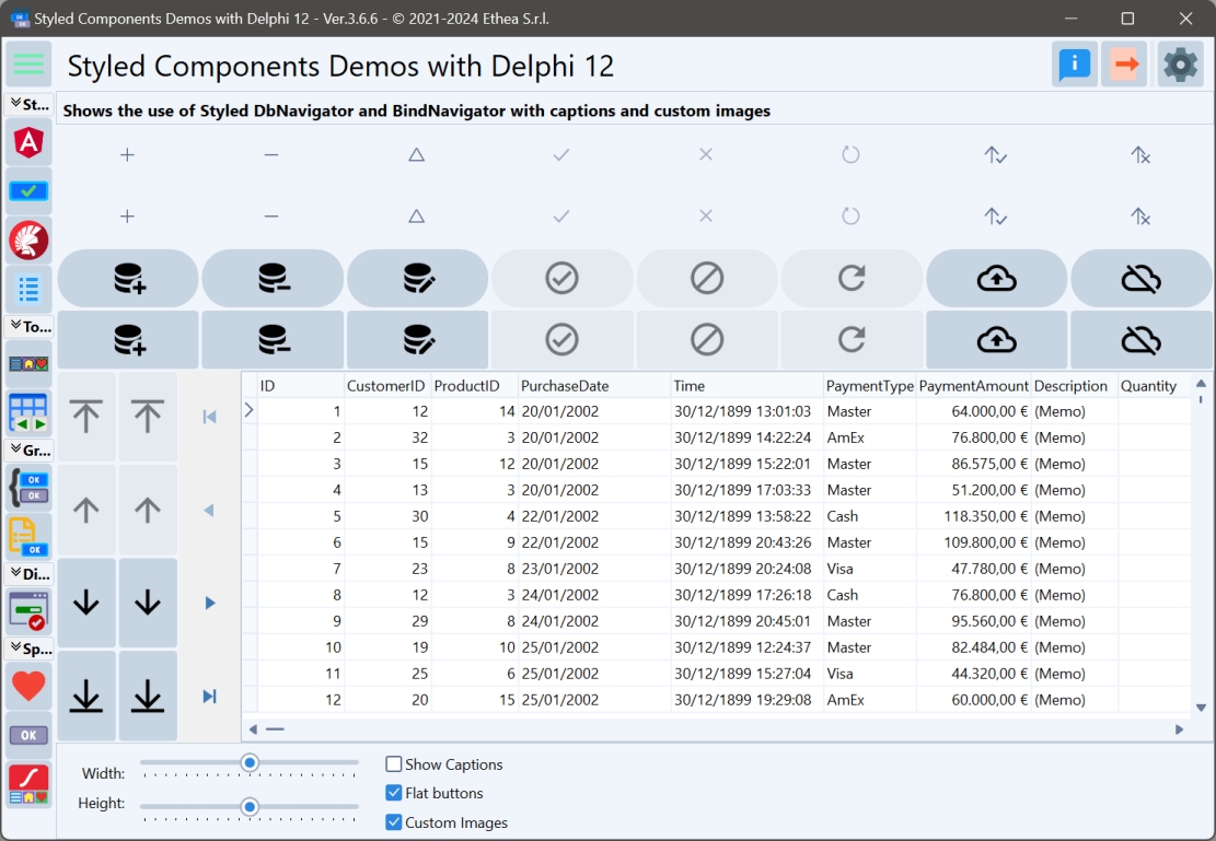
The major differences are:
- the possibility to set and show Captions on the StyledDbNavigator.
- The "Icons" with up/down directions when the navigator is displayed in vertical position.
- The icons are more readable (like the "Edit" one) and customized form VCL Styled in light and dark mode.
- It's possible to use a Custom Imagelist, to show other images on the buttons.
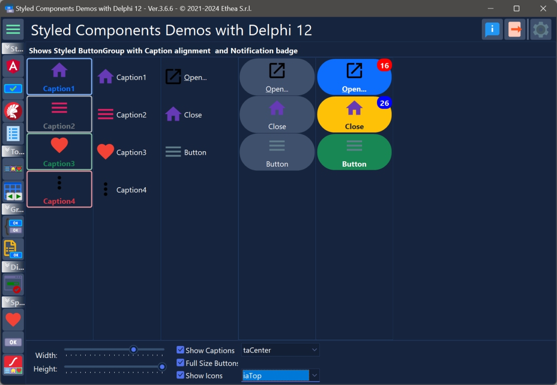
Description of StyledButtonGroup and StyledCategoryButtons
TStyledButtonGroup and TStyledCategoryButtons shows a list of buttons with flow or full-size layout, like a classic TButtonGroup or TCategoryButtons. You can define StylesFamily/StyleClass/StyleAppearance for every buttons at component level or change the Style on a single "Button" Item.
TStyledButtonGroup inherits from TButtonGroup, so you can continue to use it as the VCL component as showed in the Demo:
TStyledCategoryButtons inherits from TCategoryButtons, so you can continue to use it as the VCL component as showed in the Demo:
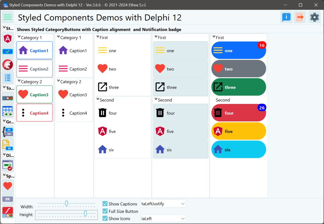
The major differences are:
- You can define a custom style for every buttons in the "Group" or "Categories"
- You can use a custom style for each button.
- You can specify Flat buttons.
- The Buttons caption can be aligned also at center or right.
- The Buttons icons can be aligned left, top, bottom, right, center.
- Additional Spacing and ImageMargins to control exact position of the Buttons icon and the Caption.
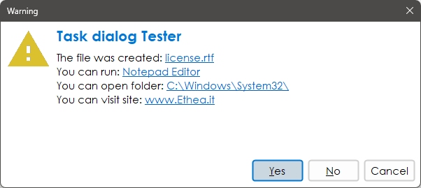
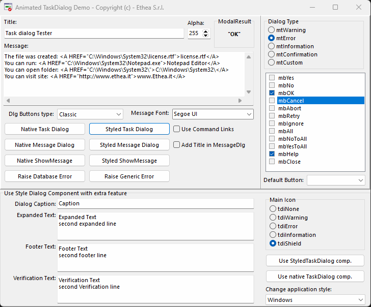
Description of StyledTaskDialog
TStyledTaskDialog is designed to expand message/task dialog functionalities, fully customizable and also animation.
You can test Styled Dialogs with different "StyledButton set" (Classic, Angular, Bootstrap).
Also, you can use a custom form (inherited from "TStyledTaskDialogForm") to show your complete custom Dialog.
How to replace standard MessageDlg and TaskDialogs
You can use the StyledTaskDialog in you application to replace MessageDlg and and TaskDialogs.
Add the unit Vcl.StyledTaskDialogFormUnit.pas your application.
If you are using Skia4Delphi and you want to use Animated Dialogs, add the unit Skia.Vcl.StyledTaskDialogAnimatedUnit.pas
then you must add the unit Vcl.StyledTaskDialog to your units and change the calls to standard Dialogs/TaskDialogs: MessageDlg -> StyledMessageDlg TaskDialog -> StyledTaskDialog
How to change Dialogs attributes (Font/Buttons Style)
By default, StyledDialogs uses Segoe UI Font with Size 9 (stored into Vcl.StyledTaskDialogFormUnit.dfm). If you want to use another font/size you can call InitializeStyledTaskDialogs like in this example:
  //Resize Standard Message Font to an higher size and select Arial character
  Screen.MessageFont.Size := Round(Screen.MessageFont.Size*1.2);
  Screen.MessageFont.Name := 'Arial';
  //Inizialize the styled dialogs using "Bootstrap" styled buttons and the Screen.MessageFont
  InitializeStyledTaskDialogs(True, Screen.MessageFont, BOOTSTRAP_FAMILY);
StyledTaskDialog Demo
A simple demo to show how to use StyledTaskDialog with custom icons using ImageList.
The main form is useful to test every format / buttons and type of dialogs.
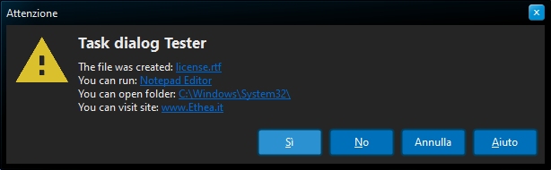
++Confirmation Dialog with custom font/size and English buttons++
++Warning Dialog with italians Captions in AcquaGraphite Style++
To activate button captions is to change StyledComponents.inc file and activate
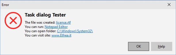
++Error Dialog in Windows10 Vcl Style++
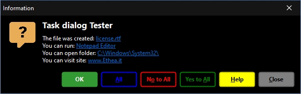
++Custom Message Dialog++
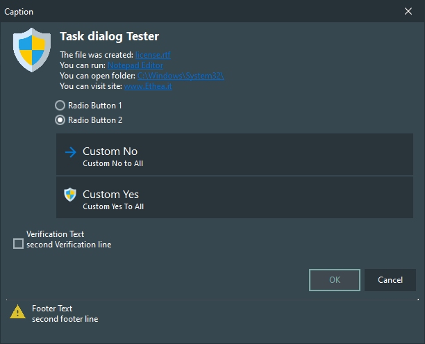
++Use StyleTaskDialog component++
...with RadioButtons, CommandLinks, Verification Text and Footer Text
Demo of AnimatedStyledTaskDialog
If you are have Skia4Delphi installed, you can also try the AnimatedTaskDialogDemo, with nice animations:
Available from Delphi XE6 to Delphi 13 (32bit and 64bit platforms)
Related links: embarcadero.com - learndelphi.org