VCL Demo Application
Overview
The SVGIconImageListDemo is the main demonstration application for the VCL components. It showcases all the key features and capabilities of the SVGIconImageList library, including dynamic resizing, color customization, VCL style integration, and visual effects.
Location: Demo\DXXX\SVGIconImageListDemo.dpr (where DXXX is your Delphi version folder)
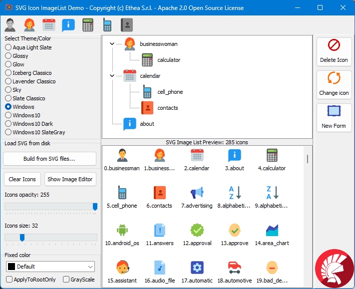
Features Demonstrated
1. Icon Resizing
The demo shows how to dynamically resize SVG icons at runtime:
- Use the trackbar to change icon size from 16x16 to 128x128 pixels
- Icons scale perfectly without pixelation or blurring
- Works with all components simultaneously
procedure TMainForm.TrackBarChange(Sender: TObject);
begin
  SVGIconImageList1.Size := TrackBar1.Position;
  UpdateIconSizeLabel;
end;
2. VCL Styles Integration
Test icon visibility across different VCL styles:
- Windows style (default)
- Windows 10 Dark
- Aqua Light Slate
- Carbon
- And many more...
The demo automatically updates icon colors to match the selected style's theme using FixedColor property.
3. TSVGIconImage Component
A large Delphi logo demonstrates the TSVGIconImage component capabilities:
- Displays single SVG images
- Perfect scaling at any size
- Maintains aspect ratio
- Can be loaded from file, stream, or embedded resources
procedure TMainForm.LoadLogo;
begin
  SVGIconImageLogo.LoadFromFile('DelphiLogo.svg');
  SVGIconImageLogo.Proportional := True;
  SVGIconImageLogo.Center := True;
end;
4. Visual Effects
Apply effects to icons dynamically:
- GrayScale: Convert colored icons to grayscale (perfect for disabled states)
- FixedColor: Change all icon colors to a specific color
- Opacity: Adjust transparency (0-255)
- AntiAliasColor: Match background for better rendering
procedure TMainForm.ApplyGrayScale(AGrayScale: Boolean);
begin
  SVGIconImageList1.GrayScale := AGrayScale;
end;

procedure TMainForm.ChangeIconColor(AColor: TColor);
begin
  SVGIconImageList1.FixedColor := AColor;
end;
5. Component Editor Integration
The demo includes a button to launch the Advanced Component Editor at runtime:
- Edit icons while the application is running
- Add, remove, or modify SVG icons
- Test changes immediately
- Useful for debugging design-time issues
This is particularly helpful when troubleshooting component editor issues in the IDE.
6. Multiple Image Lists
The demo uses different icon sizes in various controls:
- Toolbar icons (typically 16x16 or 24x24)
- ListView small icons
- ListView large icons
- Button glyphs
Running the Demo
Prerequisites
- Delphi XE6 or later
- SVGIconImageList components installed
Steps to Run
- Navigate to
Demo\DXXX\folder (where DXXX matches your Delphi version) - Open
SVGIconImageListDemo.dpr - Build and run (F9)
- Experiment with the controls to see icon transformations in real-time
Demo Icons
This demo uses free SVG icons from Icons8:
- Location:
Demo\flat-color-icons\folder - License: Free to use
- Source: https://github.com/icons8/flat-color-icons
The icon set includes common UI icons: home, settings, save, open, edit, delete, and many more.
Key Learning Points
1. Icon Management Strategy
The demo shows the classic TSVGIconImageList approach:
- Self-contained component
- Icons stored within the ImageList
- Simple to use for smaller applications
- Compatible with Delphi XE6+
For modern applications (Delphi 10.3+), see the Virtual ImageList Demo for the recommended TSVGIconImageCollection + TSVGIconVirtualImageList approach.
2. Style-Aware Applications
Learn how to make icons adapt to different VCL styles:
procedure TMainForm.StyleChanged(Sender: TObject);
begin
  // Update icon colors to match style
  if TStyleManager.ActiveStyle.Name.Contains('Dark') then
    SVGIconImageList1.FixedColor := clWhite
  else
    SVGIconImageList1.FixedColor := clBlack;
end;
3. Performance
The demo demonstrates that SVG icon rendering is fast enough for interactive use:
- Real-time resizing without lag
- Instant color changes
- Smooth style switching
- Efficient bitmap caching
4. DPI Awareness
Although not explicitly demonstrated, the components handle DPI scaling automatically when Scaled := True (default in Delphi 10.3+).
Troubleshooting
Icons appear blurry
- Ensure
Scaled := Truein component properties - Match
AntiAliasColorto the background color - Check that
Sizeproperty matches your control's expected icon size
Component Editor doesn't open
- Run the demo application
- Click the "Component Editor" button to debug at runtime
- This bypasses potential IDE integration issues
Wrong icon colors
- Check
FixedColorproperty - Verify
ApplyFixedColorToRootOnlysetting - Test with a simple monochrome SVG first
Related Demos
For more comprehensive demonstrations, see:
- Demos - Detailed - Complete overview of all demo projects
- SVG Viewer Demo - Compare rendering engines
- SVG Explorer - Browse large icon collections
- Virtual ImageList Demo - Modern architecture (Delphi 10.3+)
- TControlList Demo - Advanced list control integration
Source Code
All source code is available in the GitHub repository:
- Main form:
Demo\DXXX\MainSample.pas - Project file:
Demo\DXXX\SVGIconImageListDemo.dpr - Icons:
Demo\flat-color-icons\*.svg
See Also
- Component Overview (VCL) - Complete component documentation
- Usage Guide (VCL) - Practical usage patterns
- Component Editor - Design-time editor guide
- VCL Reference - Complete API reference